Quantcast
Channel: Indigo Kir Royale
Viewing all 377 articles
Browse latest View live

WEEKEND HAULIN'

$
0
0
 As mentioned in my previous post, I was on a long weekend road trip/getaway during Easter (you can also see some pictures from that trip on my Instagram if you're interested).  Part of that was spent catching up with family in Sydney, which was awesome and of course, I can't visit Sydney without a bit of shopping - especially, in Sephora (the first and only Sephora in Australia)! ^_^  Last time I was there was actually on their opening day (you can see my gigantic haul that day here), so I was looking forward to returning to see what's new, pick up any items I really wanted, but resisted the first time, and also to repurchase a few items I'd ran out of since.

Sephora Purchases
The first photo above show everything I got from Sephora, which include:

// Sephora Pearl (Whitening and Brightening) Mask

// Givenchy Prisme Quatuor (Eyeshadow Quad) in Caresse (1) and Ecume (2)

// Becca Shimmering Skin Perfector Spotlights:  set of 3 of their cult liquid highlighters in the shades - Pearl, Champagne Gold and Opal in mini tube packaging with a convenient doe-foot applicator).  I have been a fan of these for years.  The Pearl and Opal in their original packaging have been swatched and reviewed here.  The shade in Moonstone is reviewed here.

// Sephora Cream Lip Stain in 'Always Red' (01) - purchase inspired by Amelia Liana.

// Sephora Express Nail Polish Remover for Feet

// Bite Neutral Luminous Crème Lipstick Duo ('Musk' shade on one end and 'Lychee' shade in the other).

// Bite Agave Lip Mask - a cult product, so I'm excited to see what the fuss is about.

// Sephora Daily Makeup Brush Cleaner
I repurchased this and bought a backup since I was almost out of my first one.  I wish the bottle were bigger!

I also wanted to repurchase my current favourites for hair care: Sachajuan Volume Shampoo, Conditioner and Hair Repair, but unfortunately they were out of stock.  I can't do without these so will have to purchase these from Netaporter online.

Sephora GWP and Samples
I wasn't aware of the GWP at the time, but apparently I spent enough (or too much! ;) ) to receive their GWP packaged in the cardboard box (above picture) containing:

// IT Cosmetics Brow Power Universal Brow Pencil in travel size

// Sephora Outrageous Curl Mascara (sample)

// Marc Jacobs Highliner Gel Eye Crayon in Blacquer (same petite size as in this holiday set reviewed and swatched here).

// Benefit They're Real Push-Up Liner (sample)

// Ole Henriksen Pure Truth Melting Cleanser (2 x sample sachets) - as additional samples.

Mecca, David Jones & Myer Purchases
From Myer, I repurchased my favourite hand sanitiser from Aesop - their Resurrection Rinse-Free Hand Wash.  I also spotted a new brand addition to Mecca stores - RMS, so I picked up their Lip2Cheek in Smile.  I tried it on in store and this coral/pink shade looked so pretty and youthful!  There was also a pink shade called Demure, but I resisted picking up yet another pink blush. >_<  Last, but not least, I picked up two more Chanel Rouge Coco lipsticks from DJs in the shades: Adrienne (402) - swatched here, and Cécile (432), which are beautiful nude/natural toned lipsticks, which I don't have or wear enough of!

Can't wait to play with all these new goodies (while my wallet tries to recover)! >_<


Thanks for looking! ^_^ xo


What is in your latest haul?  Have you tried any of these products?  If so, do share your thoughts below. :)


SPRING NAILS | DIOR LADY (294) - A CLASSY, YET SEXY NUDE! + ECLOSION TOP COAT

$
0
0
Dior Lady (294) is a limited edition nail polish from the Kingdom of Colors Spring 2015 collection.  It truly is a beautiful "nude-type" of shade that will suit many skin tones - even on my medium to tan, olive skin.  It's a neutral to slightly cool-toned, soft, muted/dusty pink with a mauve undertone.  It can be hard to find a nude/neutral shade that's work-appropriate, but Lady is now one of my few favourites in that category.  In fact, it's probably the only one that I'd call a classy, yet sexy nude! :-o  Likened to a pair of sexy nude pumps perhaps...  Try it on, you'll know what I mean. ;-)  It's a beauty.
I applied a sufficient two coats of Dior Lady on its own with no base or top coat in these photographs.  All shots were taken indoors under artificial lighting and using a strobe.
Lady has a cream, but glossy finish.  It goes one smoothly and evenly, and coverage is achieved in just a couple of layers.
The brush applicator is one of the easiest to use due to its large size, and square, flat shape.  This allows for greater coverage in just a few strokes.  Of course, it may be more tricky to use if your nails are narrow, small or naturally taper at the cuticles.
Below are photos of how Dior Lady looks with the top coat in Eclosion - also limited edition.  Eclosion is a clear top coat containing a mix of pastel confetti.  It's a cute and fun way to celebrate the spring season.  It's easy enough to apply.  I find it pairs well over pastel, or softer shades like Lady.  My only slight gripe with it (and other confetti or glitter nail products) would be that I don't particularly like the gritty feel it leaves on my nails.
Bottom Line
While I'm usually drawn to bright or metallic, more glitzy, complex nail polishes, I absolutely adore Dior Lady and I'm so glad to have it in my collection.  This is not just for neutral lovers - it's a must-have. ;-)  Eclosion is a nice-to-have, fun addition.


Hope this was helpful...


Thanks for looking! ^_^ xo


Are you a neutral/nude nail polish lover - what are your faves?  Will/have you picked this up?


SNEAK PEEK! MY PICKS FROM TOM FORD SOLEIL SUMMER 2015 COLLECTION

$
0
0
Hi guys!  Hope all things are well with you and surviving the hump day!  Thought I'd share a sneak peek of recent arrivals on the Indigo Kir Royal HQ...namely my picks from the Tom Ford Soleil (Sun) Summer 2015 makeup collection. ^_^  (You can see the entire collection at TomFord.com).
Above: Tom Ford Cream and Powder Eye Color in Naked Peach (front) and Naked Bronze (back).

The new Cream and Powder Eye Color is packaged in two-tiers: the top is the white round compact that houses a mirror and the sparkling celestial powder eye shadow and the bottom jar houses the ultra-pigmented, metallic cream shadow.  Both can be applied on their own separately or with the powder layered on top of the cream eye shadow for added dimension and complexity.

I adore the previously released Tom Ford Cream Color for Eyes (featured here).  The cream shadow of Golden Peach is apparently a re-promote of the 2013 limited edition Pink Haze - a gorgeous rose gold, so I couldn't resist a backup as it's such a unique and flattering shade in my opinion, and a great staple for everyday wear.  I also picked up Naked Bronze, which has the re-promoted cream shadow in Spice - a warm, copper bronze which I'm now looking forward to trying for the first time. :)  Cream and Powder Eye Color is entirely packaged in plastic, which is more travel-friendly (albeit slightly less luxurious feeling) compared to the glass jars of the Cream Color for Eyes.
Above: Tom Ford Small Bronzing Powder in Terra (front) and Tom Ford Cream Cheek Color in Pink Sand (back).

I'm sooo pleased that Tom Ford have released their bronzing powders in smaller, clutch-sized compacts!  And...they are permanent - woohoo!  I've been wanting to try the shade in Terra ever since Rae from the The Raevewer (see her review and swatches here) has been raving about it.  I think the smaller compact is just perfect for me - I'm more likely to use it up, it's much more travel-friendly in size and more affordable for those who aren't prepared to splurge for the larger compact initially (despite getting less product for your money).

Last, but not least, I picked up the new Tom Ford Cream Cheek Color in Pink Sand.  The shade is so right up my alley and the cream formula is just perfect for the current cooler climate down-under when I tend to gravitate more towards more creamy, moisturising products to help nourish my normal to dry skin.

I absolutely enamoured with the by the ivory and gold-colored compacts with ivory velvet pouches.  So adorable! >_<
 Above: soft, ivory velvet pouch to house the gorgeous compacts.

As much as a lot of people would think that the star of the collection is the Eye and Cheek Compact in Pink Glow (see last summer's "Unabashed" compact here), I decided to give it a miss as I just wasn't personally drawn to the burnished, plum shades.  /:-\  It just seemed very retro for my personal taste (reminds me of the gorgeous Farah Fawcett look, which was great in the 70s)!  Still, there's no doubt lots of people will be drawn to it and I can also see it work beautifully on darker skin tones. :-)

Anyway, will share my review and swatches of my picks soon, so if you're keen do keep your eyes peeled.  ;-)

BTW, I purchased the Tom Ford goodies from Selfridges.com.  All my picks are limited edition except for the Small Bronzing Powder.


Hope this was helpful.


Thanks for looking! ^_^ xo


What do you think of this collection?  Any that take/took your fancy?


COMING SOON... BURBERRY LIP & CHEEK BLOOM BLUSHING COLOURS

$
0
0
Introducing the latest from Burberry Beauty for spring!  It's their Lip & Cheek Bloom Blushing Colours.

Here's what Burberry say about these new gorgeous pots of colours:
"An airy, petal-soft flush of colour inspired by the hues of an English country garden. 
Effortlessly buildable across lips and cheeks for a subtle sheer wash or an intense result, the velvet texture remains transparent on the skin, gently blurring imperfections.
Mistake-proof Burberry Lip & Cheek Bloom can be gently applied with fingertips for an instantly moisturised feeling."
 There are six shades available and I purchased four:
// No. 01 Rose
// No. 03 Hydrangea
// No. 09 Poppy, and
// No. 11 Purple Tulip

The other two shades are:
// No. 05 Peony
// No. 07 Orange Blossom

Below are some sneak peek photographs...
Above: No. 03 Hydrangea (bottom left), No. 09 Poppy (bottom right), No. 01 Rose (top left) and No. 11 Purple Tulip (top right).
 I will post swatches and my thoughts on these soon, so stay tuned! ;-)  Hopefully this weekend (fingers crossed). >_<


Meanwhile, happy Friday! ^_^ xo


P.S. These are available now from David Jones (where I purchased online) in Australia and Net-A-Porter.com


BURBERRY LIP & CHEEK BLOOM IN ROSE, HYDRANGEA, POPPY & PURPLE TULIP

$
0
0
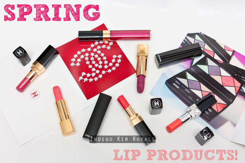
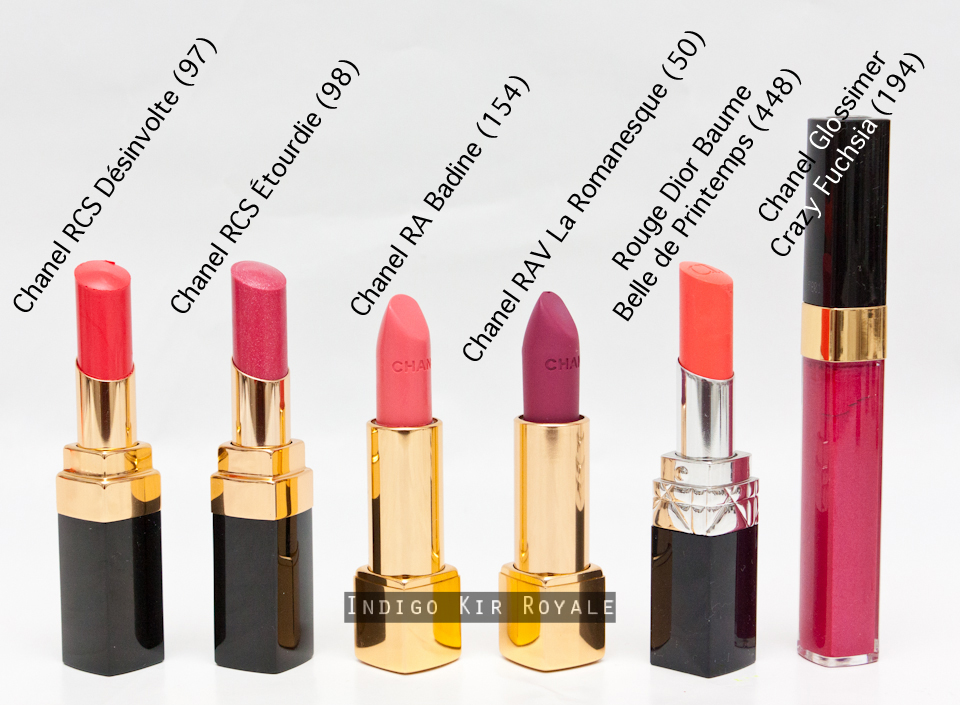
Happy Mother's Day!  ^_^  As promised in my previous sneak peek post, here are my thoughts, swatches and (plenty!!) more photos of the new 
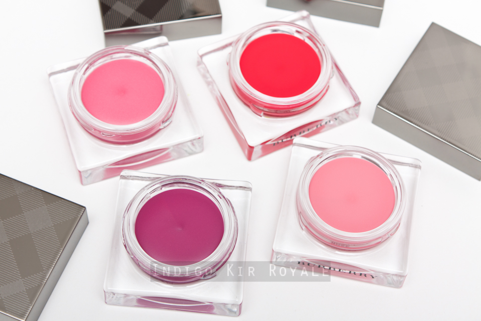
Burberry Lip & Cheek Bloom.  I picked up four of the six shades available...
Above: No. 03 Hydrangea (bottom left), No. 09 Poppy (bottom right), No. 01 Rose (top left) and No. 11 Purple Tulip (top right).

The other two shades available are Peony (No. 05) and Orange Blossom (No. 07).  The Beauty Professor has swatches of Orange Blossomhere.

"An airy, petal-soft flush of colour inspired by the hues of an English country garden."

But, first let's have a look at the packaging...

Packaging
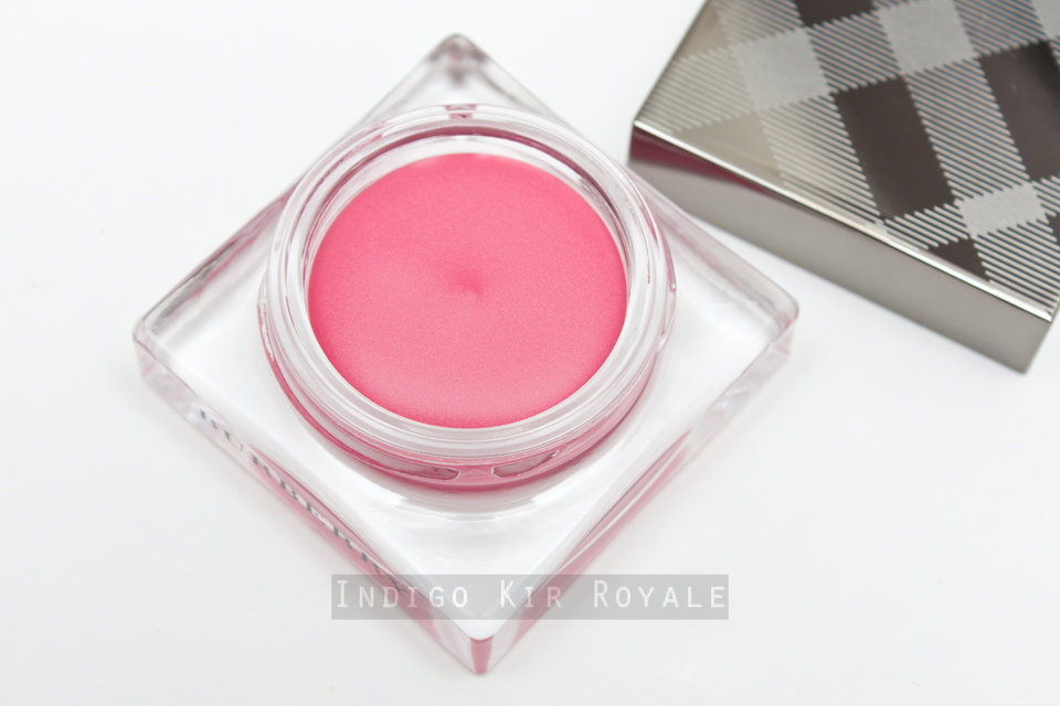
The packaging from Burberry usually never fails to impress me.  The Lip & Cheek Blooms are no exception.  They come in a luxurious, square glass jar with a plastic cap embossed with the iconic Burberry check and the ever-so-sleek, signature gunmetal finish.  I will say, however, that being a square-shaped it can be a bit tricky to ensure you have the cap placed correctly before twisting to close.  I'm sure that if you start twisting without realising the cap isn't actually level with the jar, you would eventually damage the plastic cap!  So just thought I'd share the caution - fortunately, I haven't come to the point of damaging it, but it can be tricky and a bit annoying when you find it's not twisting correctly! >_<  I think it would have been more practical to have round jars to avoid this issue, but I'm sure Burberry wanted to make their whole beauty line aesthetically pleasing and consistent by having everything square.
Size
There's 3.5g / 0.12 oz of product in each jar.  Below is the size of the jar with respect to my slightly smaller than average hand. ;)
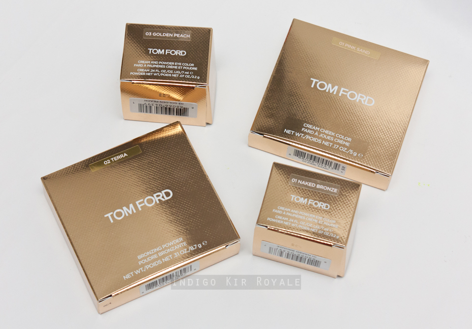
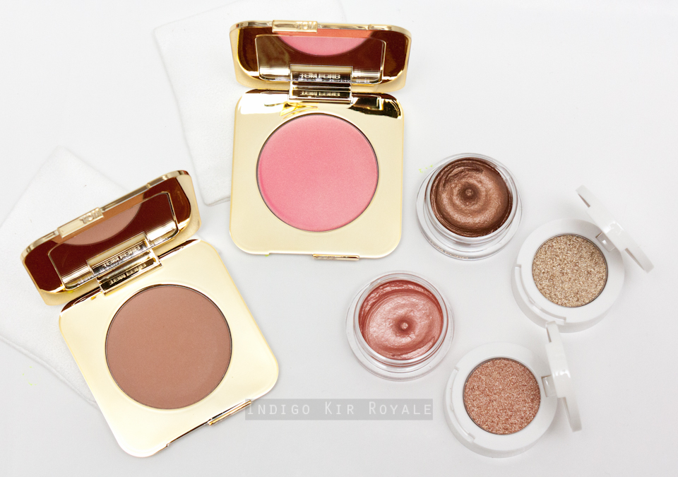
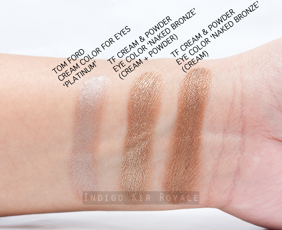
Here's how it compares to the Tom Ford Cream Color For Eyes.
The Lip & Cheek Bloom (below right) is only slightly smaller in length than the Burberry Sheer Eye Shadow compacts (below left).
Below are the product description labels on the bottom of the glass jars and also allows you to see the actual product and hence, shade itself.
Made in France.

More happy snaps! ^_^
Pigmentation, Texture, Feel & Application
All of the shades have excellent pigmentation, and you need particularly very little of the more vibrant shades such as Poppy and Purple Tulip.  The Lip & Cheek Bloom have an interesting and unique texture.  It is a bit like the Chanel Cream Blushes in that they have a cream to powder-like feel, but also have a slightly airy, mousse-like consistency.  This combination makes it very velvety and appears transparent on the skin so the colour although intense, can easily still look like a natural, glowing flush that fades seamlessly towards the outer edges.  They have a close-to-powder-dry to powder-dry finish (no tackiness or dewiness).  When dabbed with a clean finger on the lips, the more vibrant shades of the Lip & Cheeks (like Poppy and Purple Tulip) look like you've been eating berries - really gorgeous.  It seems to naturally leave a more intense colour in the inner centre of the lips (where pigment tends to stick much more easily) fading softly towards the outer edges of the lips making your lips look more full and youthful. *Joy* :)

When swatched, you will notice it seems the product doesn't go on as evenly (see heavy swatches below), but on the cheeks, it applies much more easily with either a clean finger or a stippling brush.  As with general makeup application, it is best to build the colour intensity by starting with as little product first and apply more layers as required.  I find the best way to apply it is with circular motions starting from the apple of the cheeks where the colour should be more intense and then blending out the edges (preferably with another clean finger or brush).  If you have dry/dehydrated skin like I do at present and/or have any dry, flaky patches on the skin or lips (if you're applying on the lips), I recommend exfoliating and prepping them with moisturiser/lip balm before-hand so the product doesn't cling to them and emphasise them when viewed up close.

Surprisingly, these did not feel drying on my currently chapped, dry lips.  It felt very velvety smooth, weightless and comfortable whilst on, despite not necessarily feeling more nourished after it has faded.

Longevity
I found that these had supreme longevity on my normal to dry cheeks.  I wore it for a full twelve hours and it had little fading by the end of that period before removing and cleansing.  So I'm very impressed with this as it matches the equally long-lasting Chanel Cream Blushes.  I haven't fully tested the longevity on the lips though as I did have a very (olive) oily (hence, delicious! LOL) pasta dish for lunch, which pretty much removed it after the meal.  I suspect if you didn't have oily food then it would be fairly long-lasting, too.

Colours & Finish
Rose (No. 01) is a light pink with no shimmer.  This shade would suit fair to light skin tones.  I was hoping this would be very similar to my much loved Chanel Cream Blush in Inspiration, but unfortunately, this one does look to ashy (as it has more of a white, pastel leaning) against my medium to tanned (~NC30-35) skin and too light on my naturally, blue-toned, very pigmented lips.  So, I prefer to make use of it by mixing it with one of the other deeper shades such as Hydrangea.   I'm not sure why, but this shade is a little more wet/tacky in texture than the other shades I have - it may just be the one I received or may be the case for all Rose shades (I'm not sure).  Not that it really matters, because it still feels almost close to powder-like dry on the cheeks once blended out.  Just an observation. ;-)  (Let me know if you experienced the same thing in a comment below!)
Hydrangea (No. 03) is a medium, blue-toned pink with no shimmer.  This shade would suit many skin tones and great for a no-fuss, every day wear.
Poppy (No. 09) is a gorgeous, uber bright, lively, cheerful poppy red.  I'd say this is my favourite of the lot if I had to pick one. ^_^  I think it would suit many if not all skin tones.  If you love bright blushes like I do, you will definitely *need* this. ;-)  [#enabler]  I was initially worried that from seeing online promotional images, it was more coral as I don't particularly suit coral shades, but this doesn't really have any coral or orange leaning at all to my eye.  It's very much red, but a light and bright version that really lifts your complexion and face entirely. :D  Gotta love that especially for those with olive, yellow-toned skin like I do which tend to look dull/sallow.  I don't have anything that is red and quite as brightening as this in my collection so I'm loving it. ^_^
Purple Tulip (No. 11) is a beautiful, pink-purple shade - it's very much akin to the name (i.e. the flower)!  This one also has no shimmer (I suspect all the shades available do not have shimmer - let me know otherwise in a comment below if you pick up or see any of the other two shades in person).   I'd say this is a very close second favourite of mine out of the four (*maybe* equal with the everyday, non-fuss Hydrangea) >_<  It's a fantastic colour to wear on both cheeks and lips for autumn, winter and spring in my opinion and a shade that is unique in my collection.

 Heavy Swatches
For reference, all swatches are applied on my olive, medium to tanned skin (~NC30-35) and photographed indoors using a strobe.  A clean finger was used to swatch/apply and no primer was used to enhance or affect any of the shades.
 Comparison Swatches
Swatches (Blended Out)
Below are how the shades look when applied and blended out (roughly how I would apply on my cheeks).
On My Lips...
Below are how the Lip & Cheek Bloom shades look on my naturally, blue-toned, pigmented lips.  You can easily build the colour intensity more if you wish by adding my layers - but this is how I would normally prefer to wear them for day.
Ingredients
My Favourite Way to Wear Lip & Cheek Bloom
I find the best and most flattering way to wear these (especially the more vibrant shades) is simply to showcase them on the cheeks and lips, and by keeping a fresh looking face with a light to medium coverage base (nothing too heavy/full coverage or overly matte/flat - it's ok to keep your natural skin showing through a little - including any cute freckles! ;-) - conceal any obvious blemishes), and well-groomed (fill-in any gaps very subtly, definitely nothing too defined or "drawn on") eye brows.  You can either leave any naturally, darker pigmentation on the eye lids as it is, or add a wash of a brown (neutral to warm) eye shadow that is a bit darker than the rest of your face (such as Burberry Sheer Eye Shadow in Almond for my skin tone) for natural-looking definition.  I prefer to leave my naturally very straight eye lashes uncurled (yes you read right!), and without mascara (yes you read right again!) - leaving these as is make you look so much younger and more natural).  That's it! The overall look just focuses on the cheeks and lips and an overall, effortless, very youthful, lively complexion.  All-in-all - the result is a very Burberry-esque look...and a look that I personally love and prefer.  Have a go and let me know what you think!

Overall
I am loving these!  I highly recommend the vibrant shades in particular: Poppy (a must for everyone), Purple Tulip (another must-have if you love a wearable, unique purple for cheeks and lips) and Hydrangea (for more every day wear) in that order.  Burberry have truly excelled in the delivering the vibrant shades especially, with gorgeous, unique textures that blend out effortlessly and seamlessly to make the skin look fresh and alive without looking comical or unnatural.

Availability
Available now for Aussies from select David Jones stores (I purchased mine online), Net-A-Porter.com who ship internationally and Nordstrom for USA customers.  I've not found any indication yet as to whether or not these are limited edition, so I assume they are permanent - do comment below if you know for sure.


Hope this was helpful. :)


Thanks for stopping by! ^_^ xo


Which colours of the Lip & Cheek Bloom will you be getting?


UNBOXING | SECOND MECCA BEAUTY LOOP L3 BOX OF 2015

$
0
0
The second Mecca Beauty Loop Box of 2015 is now available (since 7th May) and thought I'd give a sneak peek of what's inside the Level 3 box and quote their product descriptions:

// Samples of the new By Terry Densiliss Trio (Concealer, Primer and Foundation)
"Terribly Densiliss delivers instant and long lasting correction with or without colour for dull and lacklustre complexion, wrinkles, fine lines, redness, dark spots.  Densiliss technology, with serum concentration injects the skin with in depth age-repair correction that firms all the way to the surface.  Wrinkles and imperfections vanish to make way for a faultless finish.  Impossibly smooth, naturally plumped and fresh-faced - all over again."
// Radical Skincare Advanced Peptide Serum (deluxe sample)
"A powerhouse anti oxidant collagen boosting anti-wrinkle serum that shields against the free radicals responsible for skin aging that repairs past damage and defends against future damage. The only serum fighting the 16 causes of aging with 10 fruits in one bottle with clinically proven results. Designed for sensitive skin to fight breakouts and get the red out."
// The new Mecca Cosmetica Soft Focus Primer (full size)
"This high-performance primer not only improves the application and staying power of your foundation but it also smooths and nourishes your skin, instantly blurring the appearance of any fine lines or visible pores. Antioxidant vitamin Coenzyme Q10 protects against free radicals while Hyaluronic acid keeps your skin happily hydrated."
// The new Diptyque Florabellio Eau de Toilette (2ml sample)
"An intriguing fragrance. Opens with a mist of salty sea spray, before unfolding around soft and sensual apple blossom and apricot and warming into roasted coffee and toasted sesame accents. The Eau de Toilette is encased in a beautiful transparent bottle."
I've not tried any of these, except for the By Terry Densiliss Foundation, which I did try a sample of a while ago and really liked the strong coverage it gave despite being quite a thin, lightweight texture - making it look seamless and natural on the skin rather than mask-like.  This foundation could possibly be the one to purchase next once I finish my current and long favoured By Terry Cover Expert Foundation.  I'm most excited to try the rest of the Densiliss range, especially the concealer. :)  So far, I've had a quick single spritz of the Diptyque Florabellio and I think it's lovely - fresh, very wearable and not too "in-your-face" - and as I'm currently pregnant (you may have heard this rather big(!) news on my Instagram account ;-) ), my nose isn't that keen on many fragrances (even the ones I have!) at the moment, so that's saying something.  The only one that I still enjoy wearing from my collection is Jo Malone's Peony and Blush Suede!  So, Florabellio might well just tempt me...

If you're eligible for a Beauty Loop Box make sure you pick yours up.  They're available to collect from your nearest Mecca store or online from 7th to the 21st of May, or while stocks last!

Hope this was interesting / helpful. :)


Thanks for stopping by! ^_^ xo


What was in your Beauty Loop 1 or 2 box?  Have you tried any of these products?  Do share your thoughts below.


You might also like...

SPRING 2015 LIP PRODUCTS | SWATCHFEST & THOUGHTS

$
0
0
There's no doubt that this season has been all about the lips!  Not that a lipstick bandit like myself can complain. ;-)  It was hard to resist the plethora of bright, happy shades in various formulas made available for spring.  Here are the selection of lip products I picked up and used over the season mostly from Chanel (coz they just make some of the prettiest shades and most flattering, sophisticated sparkles) and one from Dior.  Hope you find my brief thoughts on them, swatches and comparison swatches useful.
Rouge Dior Baume in 'Belle de Printemps' is described as a "luminous coral".  I reckon it's more of a coral peach, which makes it more wearable for me as I'm not a huge fan of corals.  In fact, I really enjoy the colour and the brightness is just enough for spring - a nice change to my usual pink lipsticks!  This is my first to try the Rouge Dior Baume formula.  It's definitely balm-like in texture, though I didn't feel it was moisturising - it was actually a touch drying.  The pigmentation was fairly decent (semi-sheer to medium coverage) for this type of formula and does well enough to cover most of my naturally-pigmented lips.
Chanel Rouge Allure in Badine (154) (left) and Rouge Allure Velvet in La Romanesque (50) (right).

Badine is a Rouge Allure lipstick, so it has a luminous, satin finish.  I do appreciate a soft, baby pink for day now and then, but unfortunately Badine, is just too light for my skin tone when worn with enough layers for good coverage, and it also appears much more blue-toned (similar to my natural pigment undertone) compared to how warm it appears in the tube.  In general, the sheerer or more translucent ones tend to be more wearable for me (such as Chanel's Rouge Coco Shine in Chance - see swatch comparison below) - these give an overall softer look.  I recommend trying Badine in person before buying.

Rouge Allure Velvet is amongst my favourite lipstick formulas (they have a luminous, velvet matte finish) and La Romanesque is just one of my favourite type of colours.  I was worried it would be too similar to one of the other shades in my collection (I am indeed fond of this bright fuchsia-plum-purple colour family), but fortunately, there's not an exact dupe. :)  I love it.  Particularly flattering for those with yellow/olive skin tones.
Chanel Rouge Coco Shine in Désinvolte (97) (left) is a medium coral and Étourdie (98) (right) is a sparkling, medium raspberry.  Désinvolte was another attempt at me trying to branch out to other shades, but I was hoping it would be more like Pygmalion (reviewed HERE).  Alas, it is definitely much more coral - more than I am comfortable with.  I'll most likely mix it with more peach or raspberry shades to get it to work for me.  Étourdie, on the other hand, is a winner for me. :)  When swatched, it looked sheer and unimpressive, but as soon as I applied it on my lips, I was truly wowed.  The combination of gorgeous raspberry, amazingly beautiful sparkles, and juicy finish on the lips made it unique and stunning.  The sheerness of it also allowed my natural lip colour to show through adding another layer of hue that is unique to to my own lips.  This lipstick makes my lips look more plump and pretty - i.e., "my lips but stunningly better!" ;-)
Chanel Glossimer in Crazy Fuchsia (194) - another unique lip gloss in my collection.  This one packs a punch in both colour and that Chanel sparkle.  Another one that makes me smile when I wear it. :)  So pretty!

Packaging
Swatches
Below are swatches of the lip products on my medium, olive (~NC30) skin tone.  Photographed indoors using a strobe.
Below are the same swatches but photographed in low light (without a strobe) to depict the shimmers.
Comparison Swatches
Overall
My favourites are Crazy FuchsiaÉtourdie, La Romanesque and Belle de Printemps.  I would say the two most unique in my personal collection are the first two and therefore, are must-haves for me. :)

Hope this was helpful.


Thanks for looking! ^_^ xo


CHARLOTTE TILBURY EYES TO MESMERISE LONG-LASTING EASY COLOUR IN MONA LISA, MARIE ANTOINETTE & NORMA JEAN

$
0
0
Charlotte Tilbury on her new Eyes to Mesmerise range:
"Through years of experimenting with different shades to off-set certain eye colours, textures, pearls and finishes I have discovered a way to ensure your eyes always look their most effervescent, sparkling, alert and alluring.  I’ve taken all of this know-how and poured them into 6 molten metallic cream Eyes To Mesmerize pots."
Packaging
The Eyes to Mesmerise Long-Lasting Easy Colours are housed in frosted glass jars with a plastic cap.  Below is the size of the jar with respect to my hand.
The jars are smaller in diameter, but slightly taller compared to the Tom Ford Cream Color for Eyes jars (see also product weight comparison below).
Below left is the Tom Ford jar and Charlotte Tilbury's on the right.
Size
Each pot contains 7ml / 0.24 fl. oz. of product compared to Tom Ford's 6g / 0.21 fl. oz.

Made in Italy.

Formula, Application & Longevity
"With a unique water-infused formulathey are super hydrating for an easy-blend, easy to apply finish, set and then do not smudge or smear down your face until you’re ready to take it off.  Like all my products, they also do good for you as you wear them – this formula is enriched withapricot oil for smoother eyelids in the long run." 
~ Charlotte Tilbury
The formula also has added vitamin E to soothe and hydrate the eye area and to help give a seamless and smooth application.  I do find its consistency to be very similar to Tom Ford Cream Color for Eyes, but perhaps Charlotte Tilbury's is ever so slightly more whipped and creamy.  It does indeed go on the eyes smoothly and melds with the skin really well.  It blends and sits naturally on the skin - making it fool-proof for any one to use whether it be with a clean finger or an eye brush.  I did find that it takes quite a while for the product to set so there's plenty of time to play around with it and blend, but really you don't need much effort or time to do so.

I wore these cream eye shadows for 6-7 hours and didn't notice any fading or transfer by the end of it, so it certainly lives up to the brand's claim (at least for the period I wore them for).  However, I did notice that it tended to crease (or settle into the crease of my eye lids) a bit.  This surprised me, because I don't usually experience any creasing with most of the eye shadows I've used in the past (including Tom Ford's Cream Colors, etc).  I wonder if it has something to do with the added oil and moisturising properties of the product making it more emollient and settle into the crease?  For reference, I have normal skin condition (neither oily or dry) on my eye area and I don't usually have to use an eye primer (only the left-over, thinnest layer of my foundation, or concealer to even out the skin tone).  To help minimise if not prevent creasing, I recommend to apply it on clean, bare eye area (so there's less product overall that's likely to settle into the crease), or using an eye primer.  Nonetheless, I will say, that my eye lids do feel more moisturised throughout product wear, so particularly great if you have dry skin around the eye area!

Pigmentation, Colours & Finishes
There are six shades available and each represent a "strong, empowered woman of legend, who has not only inspired Charlotte Tilbury in her work, but also intoxicated the world".  Below are the three I purchased from the range up close.  Like the Tom Ford Cream Colors, I found all of these to have excellent pigmentation and a little goes a long way.
"A wisteria-chocolate bronze that recreates the soft-focussed smokey stare of da Vinci’s leading lady with that unbreakable a gaze." This rich, plum-infused, chocolate bronze imparts a lovely sheen finish to it and it's not metallic like the other two below, so it's perfect for applying in the crease and outer corners of the eyes for definition and depth for day or night.
"An antique oyster gold hue inspired by the hypnotising beauty of the infamous Queen of France." Marie Antoinette has a metallic finish.
"A gorgeous, sparkling-pink champagne inspired by the iconic beauty Marilyn Monroe." Norma Jean also has a metallic finish.

Swatches
Here are the swatches applied without a primer on medium, olive skin tone (~NC30).  They're photographed indoors using a strobe.
Comparison Swatches
 Below are swatches photographed in low light (without strobe) to capture the shimmers.
Overall
Love the pigmentation, colours, finishes, ease of use, blendability and longevity of this new product.  I can definitely very easily achieve a smokey eye look with at least just a couple of the shades with a clean finger in just a minute!  This is what Charlotte Tilbury intended and definitely achieved in this regard.  My only gripe is the tendency for the product to crease, which hardly happens to me!  Being lazy and having minimal time, I prefer not to ever have to apply an eye primer as another step to my daily routine.  Still...I may just have to so I can enjoy the way these look on the eyes.  The three shades I chose in particular are all universally flattering!  Mona Lisa is my favourite as I don't have a cream eye colour like it in my personal collection.  The other two are probably more dupable and you may have something similar to them that don't crease.

Availability
I purchased mine from Net-A-Porter.com.  Also available now from CharlotteTilbury.com and Selfridges.com


Hope this was helpful.


Thanks for looking! ^_^ xo


What do you think of these new CT products?  Did you experience the same creasing as I did?


LOVE AT FIRST SNIFF | BYREDO OLIVER PEOPLES EAU DE PARFUM

$
0
0
Byredo have a new, limited edition fragrance released this summer in collaboration with the American luxury eye-wear brand Oliver Peoples.  There's the perfume and sunglasses in a bespoke box set that you can purchase where the hue of the perfume bottle and sunglass lens match and come in a custom-made case and pouch, or you can just purchase the perfume or sunglasses on its own in a selection of three different bottle and lens hues: champagne/amber, green and indigo blue.  The sunglasses frames come in either semi matte black or beige crystal.  The collaborative creation is for both men and women.
"Oliver Peoples and Ben Gorham's Stockholm based fragrance house, Byredo announce an exciting collaboration that explores the cross between sight and smell.  As leaders in the niche segment of their respective industries, and sharing a dedication to an understated".
I found the perfume while perusing on a Saturday afternoon in my local Mecca store and it was absolute love and excitement at first sniff.  I succumbed to its unique beauty and returned the very next day to make it mine. I chose the champagne/amber bottle for it just looked so sexy, mysterious and expensive. *sigh*  Well, it is also indeed expensive, but I fell in love with it and wanted to smell of it all day long.  I thought I wouldn't love another Byredo perfume other than Bal d'Afrique (mini review HERE), but I was wrong and I'm rather pleased about that.  Bal d'Afrique is also warm and sweet albeit up a notch to the gourmand level in comparison to Oliver Peoples - but overall both quite different and both well-worth having in my perfume collection for regular (very addictive) spritzes.

Packaging - Happy Snaps
I'm a big fan of Byredo's packaging.  It's minimalist, black and white and modern.  I think the fonts are awesome.  The outer cardboard through which the box inserts even has fancy detailed embossing (as can be seen from the first photograph above), so it looks lush and feels nice to hold.  The box itself is extremely thick, strong and sturdy - keeping that expensive perfume safe and sound.  So, I couldn't resist taking a lot of happy snaps (plus I was having fun with my 50mm lens that I should use more often).
The perfume bottle is unisex, sexy and luxurious.  The magnetic cap keeps it very strongly secured and gives a very satisfying clasping sound.  I do appreciate attention to detail. ;)
Fragrance Notes, Sillage & Longevity
Top Notes: Juniper Berries, Californian Lemon
Mid Notes: Orris Butter, Patchouli Fraction
Dry Notes: Musk, Warm Sand Accord, Helichrysum

To me,  Oliver Peoples is a unique, olfactory experience of masculine, warm, sweet, musky, powdery and fresh green scents.  It smells expensive and oozes class and most of all, modernity.

It has great sillage, so really only need just a single spritz or two of it at a time.  On me, I found it to have moderate longevity so you may wish to touch up later in the day.

Size
Available in 50 ml / 1.6 fl. oz. only *bwah*

Made in France.

Ingredients
Overall
I've not been able to enjoy many of my usual fragrances during my pregnancy (hormones and such make me very sensitive and often want to gag!  Eeep!) save for my other very different, top fragrance in Jo Malone's Peony & Blush Suede…until Byredo Oliver Peoples tickled my nose.  So that must be saying something good!  If I could afford it, I'd buy another bottle…or twenty.  Wait…husband loves this unisex fragrance too…perhaps I can convince him he needs a bottle for himself (and occasional secret extra spritzing on myself ;-) )?  The fact that it's limited edition makes it all the more a must-have and makes me sad all at the same time.  What am I to do when it runs out?! *sheds tears*  As Scarlett O'Hara would say… I can't think about that right now. If I do, I'll go crazy. I'll think about that tomorrow*sniffles*

Availability
Available now for a limited time.  Mecca for Aussies and Byredo online for EU and USA customers. 


Hope this was helpful.


Thanks for stopping by! ^_^ xo


Have you tried this or any other Byredo products?  Do share your thoughts!


TOM FORD SUMMER 2015 CREAM & POWDER EYE COLORS IN 'GOLDEN PEACH'&'NAKED BRONZE'

$
0
0
Tom Ford released a new range for summer 2015 and it's their Cream & Powder Eye Colors.  These are very versatile eye colours that allow you to use the cream or powder on their own or with the powder layered on top of the cream for added dimension and complexity to flatter the eyes even further.  I purchased two of the four shades released - Golden Peach and Naked Bronze.  The Beauty Look Book has swatches of all four shades here.

"This two-tiered eye color pairs two coveted formulas in one to create a lustrous and sexy summertime eye.  The ultra-pigmented, metallic cream shadow glides onto lids with a rich, molten glow and the sparkling celestial powder intensifies the look with alluring shimmer." 
~ TOM FORD

Packaging
The Cream & Powder Eye Colors are packaged in white just like the rest of the summer collection and it's all made of plastic.  I personally prefer plastic for the convenience of travelling with something lighter over the more hefty (albeit more luxurious) glass packaging.  There are two compartments that screw on top of each other: the top containing the powder color and the bottom transparent jar containing the cream color.
There's a handy little mirror underneath the lid of the top powder compartment.
The packaging is similar to the Tom Ford Eye Primer Duo from Fall/Autumn 2013 (reviewed HERE).
Below is how it compares to the Tom Ford Cream Color for Eyes.  The latter is in a glass jar.
Golden Peach
The cream is a warm pinky peach with a coppery metallic finish.  The powder consists of warm, peachy pink / rose gold glitter particles.
Below are swatches of Golden Peach.  For reference I have medium, olive skin tone (~NC30) and unless specified, all photos were shot indoors using a strobe.
Below are the same swatches photographed in low light (without a strobe) in order to capture the sparkle and iridescence in the product.
Below are comparison swatches of Golden Peach and the Tom Ford Cream Color For Eyes in 'Pink Haze' (the 2013 limited edition reviewed here).  They're very similar. :)
Naked Bronze
The cream is a warm, rich molten bronze with a metallic finish.  The powder consists of a cool-toned, brown gold glitter particles.
Below are the same swatches of Naked Bronze, but photographed in low light (without a strobe) in order to capture the sparkle and iridescence in the product.
Below are comparison swatches of Naked Bronze and the Tom Ford Cream Color For Eyes in 'Platinum', which is one of my favourite taupe cream eye shadows and is much cooler in comparison.  Apparently Naked Bronze is the same shade as the Tom Ford Cream Color For Eyes in 'Spicy', but I don't have that one in my personal stash to compare it with.
Size
Cream: 7 ml / 0.24 fl. oz.  Powder: 2.2 g / 0.07 oz.

Application, Pigmentation & Longevity
Tom Ford cream eye shadows are one of the best I've come across.  They apply easily with either a clean finger or a brush, have excellent pigmentation (that you can either apply as a wash of colour or easily built up to full opacity), and they do not crease or settle into the crease of my eye lids.  They also have great longevity - lasting all day on my eye lids which have normal skin condition (neither oily or dry).  A little goes a long way with these so they will last you for ages (of course you will have to be aware of the use-by-date, especially given that it's a cream product, and it's unlikely that you'll be able to use it up before then!).  Don't be put off or frightened by the metallic and glittery powder product - these are just gorgeous on the inner corners of the eyes or layered on top of the cream (concentrating on the middle, high point of the lids).  It's definitely a stunning, sophisticated, glitter for adults. ;)  The glitter particles are flat, so they go on smoothly and don't feel gritty.  Another great plus is that it adheres to the skin very well so I experienced no fall-out during the day.  (Best applied using dabbing motion with your clean finger or flat brush to avoid fall-out instead of a sweeping motion with a brush).

Overall
Out of the two shades, I love Golden Peach the most - it's great for every day wear and really brightens up the eyes.  The original 'Pink Haze' is one of my most favourite, unique cream eye shadow shades - super flattering on many skin tones, so I couldn't resist grabbing Golden Peach.  Naked Bronze would look more flattering and dramatic on those with fair to medium skin tones.  I highly recommend Tom Ford's cream eye shadows and 'grown up' glitter in general, so definitely pick one or more up when you get the chance.  Yes, they are very expensive given it's a luxury brand, but if I had to recommend anything from this year's Tom Ford summer collection it would have to be their cream and powder eye colors!

Availability
Limited edition.  I purchased mine from Selfridges.com but they are also available from Harrods,com - both ship internationally.  Unfortunately, it appears that Golden Peach and Naked Bronze are the most popular shades and are currently out of stock! :(  The other two shades are still available though.


Hope this was useful.


Thanks for stopping by! ^_^ xo


MECCA COSMETICA - THE JET SET TRAVEL COLLECTION & A DUPE FOR ANYA HINDMARCH INFLIGHT CASE?

$
0
0
Mecca Cosmetica have released their new, limited editionJet Set Collection - a must-have for flights, holidays and weekends-away.  It contains travel-sizes of their beauty products in a gorgeous, sleek Jet Set Travel Bag that is very much like the coveted Anya Hindmarch Inflight Case (see further below for comparison photos and is also featured in another post HERE) in that it has two zip compartments in a splash-resistant fabric.  Note, the Mecca Cosmetica Jet Set Travel Bag is also sold separately and is also a limited edition for only AU$50!  Had I known this was available at the time, I would have chosen to just purchase the bag as it was really the only thing I was keen on!  This is way more affordable compared to the Anya Hindmarch case, which retails for over AU$200. >_<
Travel Beauty Products Included
 The set includes six Mecca Cosmetica travel beauty essentials conveniently housed in carry on-compliant sizes.
A. Clean Slate Face Washing Cloth - one side is muslin and the other is micro-fibre.  I bought a pack of these before and I can't say I'm a huge fan of the micro-fibre side, which is a lot more like what you use to clean eye glasses with (it almost feels like the material repels water so it takes a bit to make it wet).  My fave cleansing cloth is still Emma Hardie's (featured here) - its "microfibre" side is more soft and fluffy - more like your traditional wash cloth and it also has a muslin side.

B. To Save Face SPF 30+ (30 ml) - I've not tried this yet, but Mecca say it "provides broad spectrum protection against UVA and UVB rays in a hydrating matte finish cream. Containing SPF 30 with hyaluronic acid, pomegranate extract and vitamin E in a non-oily and non-whitening formula, this weightless SPF formula acts as the perfect makeup base".

C. Soft Focus Smoothing Primer (15 ml) - Another one that I've yet to try.  It's described as a "high-performance primer not only improves the application and staying power of your foundation, but it also smooths and nourishes your skin, instantly blurring the appearance of any fine lines or visible pores. Antioxidant vitamin Coenzyme Q10 protects against free radicals while Hyaluronic acid keeps your skin happily hydrated".

D. Clean Slate Remover (35 ml) - mini review of it here.

E. Beauty Sleep Artistry Eye Brightener - a "highlighter/inner rim liner double ended product that lightens and brightens eyes to reduce the tell-tale signs of fatigue".  My mini review and swatches at the end of this post.

F. Lip de Luscious SPF 25 Lip Protectant (7 ml) - I'm not usually a fan of lip products in pots (for hygiene reasons), but I really like the actual product so far.  I love the texture and feel on the lips.  It's very nourishing and plumping.  It also has a very subtle, beautiful pink iridescence to it, which gives a beautiful finish on the lips.  Love the sun protection factor, too.  The product contains "shea butter, hyaluronic filling spheres, pomegrandate seed oil and vitamin E".

Comparison to Anya Hindmarch Inflight Case
I have the Anya Hindmarch Inflight Case in the clementine shade (but, it also comes available in other colours including black) to compare.  It's a clear plastic with clementine patent leather trim and gold-tone hardware.  It has a patent leather tassel, patent leather trims with embossed nameplates for 'Take-Off' and 'Touch-Down', and Anya Hindmarch gold-tone bow.  Inside it has embossed fabric lining, patent leather embossed Anya Hindmarch logo,  elastic holders to keep bottles upright.  Dimensions are 9 x 22.5 x 12 cm.  Easy to clean with a damp cloth.

The Mecca Cosmetica Jet Set Travel Bag is also clear, so you can easily see the contents with a black trim and rose gold label and finishes.  The size of the teeth in the zipper is larger than those in Anya Hindmarch's.  I don't have the exact dimensions, but I can say they are comparable in size. :)  I can't tell if it has a patent leather trim or not - it doesn't say anywhere, but I'm guessing for the price point it probably isn't.  Though with a patent finish it's not really obvious how to tell any difference between the two cases!  It would be interesting to see how well both cases hold up over time with lots of use and travel.  I've been using Anya Hindmarch's for about a year and it's still looking pretty good.

Both cases have one smaller compartment and a larger compartment.
Beauty Sleep Artistry Eye Brightener - Review & Swatches
This dual-ended pen has an illuminating cream highlighter on one end (the thicker end pictured below), which can be used "around the eye and brow area to lighten and conceal shadows and dark circles".  I haven't used this to conceal darkness under my eyes as I feel like any shimmer in that area would be too obvious and draw attention to my under eye bags, but I have used it on my naturally dark pigmented eye lids, inner corners and on the brow bone.  The effect is indeed brightening and natural-looking for every day.  My only gripe is that product tended to crease or settle into the crease of my eye lids (even though I have normal - neither oily or dry eye lids), so I will try this over primer next time and see how I go.
The other thinner end shown below is a flesh coloured pencil that can be applied on the lower inner rim and corner of the eye to conceal redness and create the illusion of wider, brighter eyes.  Both products can be wound up to release more product, or wound back down to close.  I usually avoid lining the inner rims of my eyes as I'm extremely sensitive, but I really liked how easy and comfortable this pencil felt as it glided so smoothly and effortlessly without tugging or pulling.  The colour is a great, very natural-looking shade (compared to white or pink-hued ones out there) that gets rid of redness without making you look anime-like!  The pigmentation was good and applied evenly, too.  However...I was devastated to find that all of it had disappeared after just wearing it out to dinner!  So, unfortunately I don't recommend this product due to the lack of longevity it gives. :-(
The inner rim liner swatch is shown on the bottom left and the cream highlighter swatch is on the right.  For reference, I have medium, olive (~NC30) skin tone and this was photographed indoors using a strobe. 
Below, the same swatches but photographed in low light without a strobe to show the iridescence of the highlighter.
Jet Set Travel Collection Availability & RRP
Limited Edition from Mecca Cosmetica online or at your nearest counter.  AU$110

Overall
A nice set that's ready to use on your next getaway.  There's a few good products in there and great if you want to try the Mecca Cosmetica range for the first time without splurging on the full sizes straight away, or perhaps get travel sizes of your favourites from the range.  My favourite is the travel case itself of course, which is a much more affordable version of Anya Hindmarch's (which has been my go-to cosmetic case since I purchased it).  I like that it comes with a draw-string, black dust bag with a rose gold logo, too for extra protection during travel (seen in the very first photo above).  I highly recommend you grab the travel case while you can before it's gone forever!


Hope this was helpful. :)


Thanks for stopping by! ^_^ xo


What are your Mecca Cosmetica product favourites?  Do share in a comment below! :)


SNEAK PEEK | MY PICKS FROM THE CHANEL MÉDITERRANÉE & LES BEIGES SUMMER 2015 COLLECTIONS

$
0
0
Chanel released two collections this summer: Collection Méditerranée and Les Beiges.  Both are now available in Australia.

Collection Méditerranée
"The vivid skies and blue seas of the Mediterranean inspire a vibrant makeup collection. Bronzed skin and mesmerizing eyes create a radiant Summer look, while bold nails and colourful lips complete the effect."

Pictured above are all the items I purchased from the Collection MéditerranéeChanel nail colours in 'Méditerranée' (707) and 'Lavanda' (727), and Chanel Stylo Eyeshadow (Fresh Effect Eyeshadow) sticks in 'Laurier Rose' (127) and 'Caroube' (147).  The latter two are limited editions.  The Stylo Eyeshadows were first released back in summer 2013 (see review and swatches here) in a whole range of gorgeous, bright colours, so it's nice to have them back in new shades this year - three fun brights and one more on the neutral side.  To see the entire collection click here.

Les Beiges
"Natural beauty glows on with a versatile, lightweight makeup collection that effortlessly creates healthy colour. Multi-shade compacts enhance the complexion, while creamy colour sticks brighten and contour cheeks."
I only bought one thing from the Les Beiges collection (to see the entire collection click here), which is the Healthy Glow Sheer Colour Stick in Blush No. 21 (pictured above).  These come in three shades: a bronze, a peach and a pink peach shade which I chose coz it was the most brightening one for my olive skin.  Chanel cream blush (in the compact - reviewed shades here and here) are one of my fave cream blush formulas so I'm very excited for these sticks, which are compact and conveniently packaged.  I will let you know how the stick formula compares with the compact cream formula in an upcoming review. ;)

Keep an eye out for swatches and my thoughts on these products if you're interested.


Meanwhile, hope you're having a great weekend!  Thanks for looking. ^_^ xo


What are your picks from the Chanel summer collections?


CHANEL MÉDITERRANÉE SUMMER COLLECTION 2015 NAIL POLISHES | LAVANDA (727) & MÉDITERRANÉE (707)

$
0
0
Chanel released four new nail polish shades as part of the summer 2015 Méditerranée Collection - only one of them is a limited edition.  I picked up Lavanda (727) and Méditerranée (707).  (See this previous post for all my picks from the Chanel summer releases).

727 | Lavanda
Lavanda (727) is a truly yummy, vibrant, royal purple with a glossy, jelly-to-cream finish and contains no shimmer.  It's the shiny gloss that prevents this fun, gorgeous colour from looking childish for adult wear.

Packaging
All Chanel nail polishes come in the square-shaped glass bottles.  The square cap at the top can be removed and used to rest your finger tip on as you apply the nail polish.
The applicator brush is thin allowing for precise application.  It makes it particularly easy for those with little or narrower nails.

Lavanda requires at least two coats for decent coverage.  It applies relatively smoothly and evenly.

Below are shots of Lavanda on my nails in two coats (no base or top coat used).  For reference, I have medium, olive (~NC30) skin and all images were photographed indoors using a strobe.
Comparison Swatch
I'm pleased to find Chanel Lavanda is unique in my collection.  The closest I have is OPI's I carol About You, which is slightly darker, is more red-toned and has very subtle shimmer (visible only under sunlight).
707 | Méditerranée
Chanel Méditerranée (707) is a bright, very summery aqua blue with a cream finish (no shimmer).  This one has a slightly thicker consistency, but applied more easily than the jelly-like Lavanda.  You can get away with a single coat if applied a little more thickly as I have done on my nails in the photos below.  For added longevity, it would be best to apply in two thinner coats.  Unfortunately, I haven't worn either of the shades long enough to test for their longevity, but Chanel nail polishes in general tend to be quite long lasting on me - at least a week (without any base or top coat) with minor tip wear. 
Comparison Swatches
Again, I don't have an exact dupe of Méditerranée in my collection.  The closest in hue that I have is Dior's Bahia (see full review), but Bahia is 2 or 3 shades darker (more of a petroleum blue) as you can see in the swatches below.
Key Ingredients & Formula
"A bioceramic-based active ingredient, phycocoral, delivers calcium, iron, zinc and magnesium to the nails to strengthen them.  Ceramides to help hydrate the nails. - A high concentration of pigments and/or pearlescent pigments for an intense lacquered result.  A formula enriched with a cotton-derived resin for a sheer, shiny and resilient coat of colour. Formulation free of toluene, formaldehyde, dibutyl phthalate (DBP) and camphor. Dermatologist tested."

Size
13 ml / 0.40 fl. oz. of product.

Availability
Available now at Chanel counters and Chanel beauty boutiques in Australia.  Thankfully both these shades are permanent (only one of the four new summer 2015 nail shades called Terrana is a limited edition).

Verdict
Both are must-haves in my opinion. :)  Lavanda surprised me with its glossiness and its perfect balance of vibrance and depth making it wearable all year round.  If you want something that absolutely screams summer then Méditerranée is for you.


Hope this was helpful.


Thanks for looking! ^_^ xo


Will you be picking these shades up for summer?  Or do you have other summer favourites?  Do share in a comment below. :)


SNEAK PEEK | NEW BURBERRY EYE COLOUR CREAM BUILDABLE EYE SHADOWS

$
0
0
Hello there new Burberry Eye Colour Creams!  *_*

Oh, Burberry Beauty!  You know me all too well and have made my dream come true with the release of a cream eye shadow formula in your already gorgeous makeup range. :D  Oh joy!  I've always loved Burberry Beauty - it's one of my fave beauty brands.  Luxurious, chic, understated with textures and colours that are just simply exquisite.  Here's some sneak peek happy snaps of this new range (now available Burberry.com and Net-a-Porter.com).  The eye colour creams currently come in 7 8 shades.  I've ordered all of them (of course!  How could I resist?! >_<), but only 3 of the shades have arrived so far: Gold Copper (No. 100), Pink Heather (No. 106) and Dusky Mauve (No. 108). Nonetheless, I thought I'd share my excitement and what they look like.  They're packaged in the glass jars - the same as their Lip & Cheek Blooms - reviewed here) and come with little applicator brushes similar to those of Chanel Illusion D'Ombre Long Wear Luminous Eyeshadows that can be used to apply the cream eye shadows on the lids as well as line the eyes.  I shall update you with the rest of the shades when they arrive! ;)  These are: Mink (No. 102), Dusty Pink (No. 104), Damson (No. 110) and Pale Grey (No. 112).  Update (10 July 2015): there's now a new shade up on the Burberry website called Charcoal (No. 114)!  Meanwhile, I shall get to playing with these and post swatches and my thoughts on these, so do keep your eyes peeled if you're interested!  (Update: Review and swatches of the 7 shades are now up! Click here).
"A creamy, blendable eye shadow that delivers an effortless wash of luminising colour. The cushion-soft, lightweight cream eye shadow glides across the skin to deliver illuminating colour that can be easily blended to create a bespoke finish. The long-lasting, crease-free formula can be worn alone to add tone, depth and shadow or combined for a more dramatic result. Using the unique, flat-angled brush, it can also be applied as an eyeliner along the upper or lower lash line."


Hope this was exciting news. ;)


Thanks for stopping by! ^_^ xo


Will you be picking up any of these new cream eye shadows?


REVIEW & SWATCHES | BURBERRY EYE COLOUR CREAM BUILDABLE EYE SHADOWS

$
0
0


 As promised in my previous sneak peek post here's my thoughts and swatches of 7 shades of the new Burberry Eye Colour Cream Buildable Eye Shadows that I purchased (there's only 1 other shade currently available that I haven't purchased).

Packaging
I purchased 4 of the shades from Burberry.com (the rest were from Net-a-Porter.com) and it was my first time to order online with them and each eye colour cream came in their usual box (on the right above) and then were also enclosed in larger sized individual boxes shown on the left of the picture above.  Those boxes are extremely thick an sturdy - very luxe and impressive, and good to note the packaging is sourced responsibly, too.  Burberry.com have free shipping although their products were a lot more expensive than at Net-A-Porter.com, but the latter currently only have limited shades.
The Eye Colour Creams are packaged in the glass jars with the plastic cap that has the signature gunmetal finish and iconic Burberry check - the same as their Lip & Cheek Blooms - reviewed here.  A little applicator brush is provided similar to those of Chanel Illusion D'Ombre Long Wear Luminous Eyeshadows that can be used to apply the cream eye shadows on the lids as well as line the eyes (see a photo of the brushes in my previous sneak peek post).
Size
3.6 g / 0.13 oz. of product.

Made in Canada.

Formula, Application & Longevity
"A creamy, blendable eye shadow that delivers an effortless wash of luminising colour. The cushion-soft, lightweight cream eye shadow glides across the skin to deliver illuminating colour that can be easily blended to create a bespoke finish. The long-lasting, crease-free formula can be worn alone to add tone, depth and shadow or combined for a more dramatic result. Using the unique, flat-angled brush, it can also be applied as an eyeliner along the upper or lower lash line." 
~ Burberry
I must say the texture and formula of the Burberry Eye Colour Creams are somewhat unique.  They are not exactly like any other cream eye shadows I've come across which are either very creamy, mousse-like (think Tom Ford Cream Color for EyesCharlotte Tilbury Eyes to Mesmerise), light, airy and sponge-like (think Chanel Illusion D'Ombre), or pressed-pigment-like (think Giorgio Armani Eyes to Kill Intense Eyeshadows).
At first glance in the jar, Burberry's looks like it is going to be soft and cushiony, but for most of the shades they feel much firmer than expected.  They are closest in texture to the DiorShow Fusion Mono Eye Shadows (limited edition from Fall/Autumn 2013 - I'd forgotten about these and managed to find them right in the back of my stash!), but the latter is slightly more smooth in feel and this may be due to it having a lot more shimmer than the Burberry ones.  The Burberry Eye Color Creams feel more dense - almost clay-like, but are still quite smooth and fine to the touch that's not wet and glides on the skin like velvet - almost to a powder eye shadow finish.  It does indeed go on the eyes smoothly and melds with the skin really well - a bit like applying powder eye shadows with a damp brush.  It blends and sits every-so-naturally on the skin - making it fool-proof for any one to use whether it be with a clean finger or an eye brush.  Only at least a couple of the shades felt softer compared to the others (at least after a couple of uses) - i.e., leaning towards the texture of Chanel Illusion D'Ombre cream eye shadows.  These shades were Dusky Mauve and Damson.  I'm not sure if this inconsistency in texture is just due to the specific batch I received, or if they will change over time with more uses.  Do let me know in a comment below what your experience is with these eye shadows!

As for longevity, I wore these eye colour creams for 9 hours and didn't notice any fading, transfer or creasing by the end of it, so it certainly lives up to the brand's claims (at least for the period I wore them for)!  So I'm extremely impressed.  For reference, I have normal skin condition (neither oily or dry) on my eye area and I don't usually have to use an eye primer (only the left-over, thinnest layer of my foundation, or concealer to even out the skin tone).

Pigmentation, Colours & Finishes
There are currently 8 shades available.  Below are the seven I purchased from the range up close (the Charcoal No. 114 shade became available a few days after I'd placed my order.  Doh!  Otherwise, I would have purchased that as well and showed it to you).  Consistent with the rest of Burberry's makeup line, I found all of these to have decent pigmentation even though the more neutral shades tend to be softer shades rather than loud colours.  For a soft wash of colour, apply with a clean finger tip onto the eye lids as this gives thinnest layer.  As Burberry claims, the intensity of colour and finish is very easily built up by applying with the brush provided.  Yes, these brushes actually come in extremely handy!  Blend out the edges with a clean finger tip or a synthetic or goat-hair blending eye brush.  Most of the neutral shades here can be worn on their own for an every day, simple, understated look; as a base for powder eye shadows; or layered with other cream eye shadows.

Gold Copper (No. 100) is a light to medium copper with a golden hue and a sheen finish.  Lovely on its own or on the lids layered with other shades.  It's also great as a base for powder eye shadows.  It's not too warm so it would suit a lot of skin tones.
Mink (No. 102) is a medium to dark taupe brown with a sheen finish.  A great colour for many skin tones.  Again, beautiful enough to wear on its own on the lids or on the crease, or on the outer corners of the eyes for added depth and definition for day wear.  Definitely one to keep as a staple.
Dusty Pink (No. 104) is a light dusty pink with a satin/light glow to almost matte finish.  I thought this was going to be way too light for my medium to tan, olive skin tone, but it actually helps to brighten up the eyes and it's a good one to use as a base on the lids as it's almost matte.
Pink Heather (No. 106) is a medium to dark, warm-toned rosy brown with a satin/light glow finish.  This is a gorgeous shade that I'd happily wear on its own for natural, slightly rosy, neutral eyes for day, or layered with powder eye shadows in the same rose-toned colour family like Burberry Sheer Eye Shadows in Rosewood, Antique Rose (click here for swatches) for added intensity and wear along with a deeper brown shade for depth and definition.  Another new staple in my collection.
Dusky Mauve (No. 108) is a cool-toned dusky mauve or mauve taupe with a sheen to frost finish.  When layered with other shades, I like to dab this just in the centre of the lids as the frosty finish gives a highlighting effect.
Damson (No. 110) is a deep vibrant purple plum with a satin/light glow to sheen finish.  This is a beautiful one to use if you wanted a pop of colour or drama to the eyes.  I might try using this as a base to help intensify the shades in something like the Burberry Complete Eye Palette in Plum Pink - No. 06 (see swatches here).
Pale Grey (No. 112) is a grey with a satin/light glow to sheen finish.  Great for a subtle to more dramatic smokey eye if you paired it with a darker shade like Charcoal (No. 114).

Swatches
Here are the swatches applied without a primer on medium, olive skin tone (~NC30).  They're photographed indoors using a strobe.
 Below are swatches photographed in low light (without strobe) to capture the shimmers.
Comparison Swatches
I don't have any exact dupes of any of the Burberry Eye Colour Creams in my collection in terms of shade and finish, but here's a comparison of some which were the closest I had or just swatched just as a reference point should you have those same shades yourself.  Note, Dusky Mauve is definitely more mauve in real life compared to Tom Ford Cream Color for Eyes in Platinum.  Chanel Illusion D'Ombre in Utopia is more lilac with a very shimmery finish compared to Dusty Pink.
Below are swatches photographed in low light (without strobe) to capture the shimmers.
Ingredients
Overall
If you love well-executed neutral colours with subtle finishes, or if you're after something different from the majority of cream eye shadows released out there at present which are usually much more shimmery or metallic in finish, or a fan of Burberry makeup like I am then you will definitely enjoy these new cream eye shadows.  If you're a beginner or want something fool-proof (these are impossible to overdo due to the shades and texture!!) and want to splurge on Burberry Eye Colour Creams then these are perfect.  They are definitely easily buildable, are long-wearing and do not fade, crease or budge!  If I had to pick my favourite shades, it would have to be Mink, Pink Heather and Damson.  However, Pale Grey, Gold Copper and Dusty Pink are a great addition to my collection as I don't have anything similar to those shades in my cream eye shadow stash.  Actually, I don't have any exact dupes for any of the 7 shades.  Taupe lovers will enjoy Dusky Mauve if you don't mind the frosty finish.

Availability
I purchased mine from both Net-A-Porter.com (currently limited shades) and Burberry.com (all shades).


Hope this was helpful.  Thanks for your patience - I know quite a few of you have been wanting me to post swatches (straight away or sooner). :)  Things are getting more and more challenging to get done as I get closer to the end of my third trimester in pregnancy! >_<


Thanks for looking! ^_^ xo


CHARLOTTE TILBURY HAUL & SNEAK PEEK OF MY PICKS FROM HER NORMAN PARKINSON SUMMER 2015 COLLECTION

$
0
0
Hi folks!  I hope you're enjoying your summer so far (you lucky devils), or if you're down-under like me, keeping toasty in this freezing weather.  Brrr!  The closest thing to summer I can get right now is the arrival of my CharlotteTilbury.com purchases. #MondaysMadeBetter. ^_^

I've been eyeing the new summer vintage-inspired summer collection created from Charlotte Tilbury and Norman Parkinson collaboration for some time and it's finally made available on her website for Australians to access!  And...there's free express shipping until July 17th!!  Of course, I had to take advantage of this.  I ordered on the 7th of July and arrived in 6 days - all beautifully packaged.

The collection comprises of makeup and accessories dedicated to and decorated with the legendary British fashion photographer's iconic images.  "They are like mini pieces of art you will be proud to use in public" Charlotte says, and I agree!  Amongst the collection is:

// a newFilmstar Bronze & Glow - Suntan & Sunlight
Photograph: JAMAICA BLUE & BEAUTIFUL, BRITISH VOGUE, MAY 1975. Styled by Grace Coddington. Model Jerry Hall, in her first Vogue cover shoot, shot on Montego Bay, Jamaica by Norman Parkinson

// Colour of Youth - Lip & Cheek Colour
Pretty coral pink cream colour for lips and cheeks.  Photograph: CLOTHES IN THE SUN, MAY 1956. Editor: Audrey Withers, Model: Wenda Parkinson. Shot on Pigeon Point, Tobago by Norman Parkinson.

// Dreamy Glow Highlighter
Photograph: NEW HOLIDAY LOOKS IN THE BAHAMAS, VOGUE, 1959. Editor: Audrey Withers. Model: Carmen dell’Orefice. Shot on Love Beach by Norman Parkinson.

// Matte Revolution Lipsticks in two shades: Miss Kensington (English-rose petal pink for fair skin tones, "inspired by the quintessentially English, ‘haughty but naughty’ girls of the swinging ‘60s in Chelsea and Kensington and the pastel hues in Norman Parkinson’s pictures of his muses: Audrey Hepburn, Twiggy and his wife Wenda") & 1975 Red (super bright, retro, orange-red).

// 'On Call' Makeup Bag
Photograph: JAMAICA BLUE & BEAUTIFUL, BRITISH VOGUE, MAY 1975. Styled by Grace Coddington. Model Jerry Hall, in her first Vogue cover shoot, shot on Montego Bay, Jamaica by Norman Parkinson.

// The Bathing Beauty Bag 
Clutch-come-wash bag.  A Photograph: TO RUSSIA WITH NORMAN PARKINSON & JERRY HALL, VOGUE, 1975 Styled by Grace Coddington. Model Jerry Hall. Shot on the edge of the Black Sea by Norman Parkinson.

There are also two new and exclusive looks, which are makeup wardrobe sets that you can purchase that include items from the collection to achieve a certain look.  These looks are: Miss 1975 and Miss Kensington, and are inspired by Parkinson's timeless photographs.

I would love to have picked up everything *sigh*, but for the sake of my wallet, limited my purchases to three items from the collection: Colour of Youth - Lip & Cheek ColourMatte Revolution Lipstick in 1975 Red, the absolutely huge and gorgeous Bathing Beauty Bag (I swear, it almost fits my laptop, but I know this will come in handy whenever I travel, and I'm sure I'll even use it as a giant clutch.  I love that it's easy to wipe clean.  Most of all, you gotta love that amazing photograph!).

Last, but not least, I also picked up the Goddess Skin Clay Mask which is part of her permanent skin care range.  Ruth from A Model Recommends raved about this (read her review here), so I'm very excited to use it.  I'm hoping it will make my skin look alive even though underneath I'm so exhausted from the effects of third trimester pregnancy (namely insomnia and the wonderful onset of carpal tunnel syndrome!).

I also received sample sachets of Charlotte's Magic Cream (which I've tried already in a mini/deluxe size as part of the very first set I bought from her - click here to see), and Supermodel Body Slimmer Shimmer.

I will try to post swatches and my thoughts on the items I purchased as soon as I've had a chance to try them out. :)


Thanks for stopping by! ^_^ xo


Did/Will you pick up anything from the collection?


CHANEL LES BEIGES HEALTHY GLOW SHEER COLOUR STICK IN BLUSH NO. 21

$
0
0
This summer, Chanel released some new additions to their Les Beiges range (click here to see the entire new collection).  Among these are the new Healthy Glow Sheer Colour Sticks, which are creamy colour sticks for cheeks and contouring.  Chanel cream blush (in the compact - reviewed shades here and here) are one of my fave cream blush formulas so I was extremely excited for these sticks, which are compact and conveniently packaged.  The Healthy Glow Sheer Colour Sticks come in three shades: Blush No. 20 (a bronze for contouring), No. 21 (a warm-toned, coral/peach pink) and No. 22 (a peachy coral).  I chose Blush No. 21, which is one of the shades I tend to gravitate towards as it helps to brighten my olive skin.
"With its luminous velvet finish, it sculpts and enhances a natural healthy glow by adding a touch of colour to the cheekbones. A silky second-skin texture for a light, powdery sensation under your fingers." ~ Chanel.
The colour sticks are packaged in a sleek, portable black case with beige ‘CC’ monogram on the lid.  You simply twist the the case up to release more of the product and twist down to retract.
Texture, Pigmentation, Finish & Longevity
The texture of the Sheer Colour Sticks is velvety smooth - similar to the Le Blush Crème de Chanel - a powder cream formula so it's not dewy, too emollient or sticky.  They're a little less pigmented than the Le Blush Crème de Chanel and on my medium, olive skin tone, I need at least a couple of swipes on my cheeks to get a good colour.  They have a subtle luminous finish to give you that healthy glow.  Le Blush Crème de Chanel is one of, if not the longest-wearing cream blushes I've tried so far and I'm happy to report that the Sheer Colour Sticks pretty much last just as long (without a primer underneath). :)  For reference, I currently have normal to dry skin and tested these sticks under the wintry conditions of the Southern Hemisphere.

Swatches
Comparison Swatches
Blush No. 21 is slightly more luminous, brighter, lighter and a touch more pink than Le Blush Crème de Chanel in Révélation (63).  Tom Ford Cream Cheek Color in Pink Sand (01) is more cool-toned, more of a baby pink in comparison, and also has a more glowing, shimmery/sheen finish.
Ingredients
"Enriched with cotton and rose extracts, as well as beeswax for melt-away comfort."

Scent
There's a slight fresh perfumed scent to the product which is consistent with the rest of the Les Beiges line (such as their existing powders reviewed here), but it isn't noticeable once applied on the cheeks.

Size
8 g / 0.28 oz.

Availability
Fortunately, many of the newly released products in the collection including these Healthy Glow Sheer Colour Sticks are permanent!  (The multi-colour Marinière Powders, Healthy Glow Hydrating Lip Balm and All-In-One Health Glow Fluid Broad Spectrum SPF 15 Sunscreens (see my review here from last year) are limited editions). 

Verdict
Worth getting if you want long-wearing cream blushes that aren't sticky in texture, have decent pigmentation, and give you a healthy, subtly glowing flush.  The packaging makes it such a breeze to apply and travel with.  I recommend Blush No. 21 as it's a very pretty shade that would flatter and brighten most skin tones.

Hope this was helpful. :)


Thanks for looking. ^_^ xo


SUMMER 2015 | CHANEL FRESH EFFECT EYESHADOWS IN LAURIER ROSE (127) & CAROUBE (147)

$
0
0
Chanel released five new shades of their Stylo Eyeshadow / Fresh Effect Eyeshadow Sticks as part of their summer 2015 Méditerranée Collection.  They first introduced this limited edition range back in summer 2013 and I really enjoyed them (see past review here), so I'm glad they brought them back this year in new, fab colours - including a vibrant purple (Campanule - 107), an aqua blue (Azulejo - 117) and an olive green (Olivine - 137).  I purchased two that I thought would pair well together and knew I'd get a lot of use out of: Laurier Rose (127) - a gorgeous rose gold with a metallic finish, and Caroube (147) - a, rich taupe brown with a golden sheen.  Rose gold always looks stunning against bronzed or tanned skin for summer (especially with that metallic finish that glistens in the sun), but in general, both shades are great for every day wear all year round.
"A lightweight, water-infused formula glides on effortlessly and cools lids at the touch for instant comfort." 
~ Chanel.com

Packaging
Convenient pencil form that you can carry in your pocket.  You can easily dispense more product by twisting the pencil up, so no sharpening needed and therefore, no product wastage.  You can also twist it back down when you're finished or have dispensed too much (unlike say the Stila Smude Stick Waterproof Eye Liners!!  Grrr!)
Below are comparison swatches of Laurier Rose with a few other cream eye shadows in my collection that have a similar hue.  For reference, these were swatched with no primer against my medium, olive (~NC30) skin tone and photographed indoors using a strobe.
Below is a heavy swatch of Caroube.  Despite it being a rather neutral looking shade, I couldn't find anything quite like it in my stash!  It's a beauty.
Texture, Application, Pigmentation & Longevity
Like the original set released in 2013, these Stylo Eyeshadows have a creamy texture that allows you to blend easily before it sets.  They glide on smoothly, which means there's no tugging especially when you want to use the to line your eyes with.

Application can't get any easier - just swipe it across the lid and dab, dab, dab lightly with the finger tip to blend out any edges.  For me, it gives a pretty decent colour pay off in a single swipe, so you won't be using up the entire product so quickly - add another swipe for more intensity if desired.  If you use them as an eye liner, it's fairly easy enough by just using the outer edges of the thick pencil tip to line the eyes with.  Also, the cream product has a cooling effect on the eyes when you apply it - kinda refreshing for summer!  ;)

I found these last all day on my eye lids on their own (no primer) with hardly any fading by the end of it (for reference, I have normal skin condition on my eye lids - i.e., neither oily or dry).  I also did not experience any creasing or settling of product in the eye lid crease area.
 
Made in Italy.

Availability
Limited edition. Available now while stocks last in select Chanel beauty counters in David Jones and Myer, and Chanel beauty boutiques in Australia.

Verdict
I highly recommend Caroube and Laurier Rose as I've been using them most days for super quick and easy way to apply eye colours that pair well together or can use on their own.  The packaging is so practical and take up little space, especially when you're off on a summer holiday (that I'm currently dreaming of as it's the middle of winter here down-under!  Brrr!  >_<)  Anyhoo...love these! Glamorous and practical - how often do you get both?! ;)


Hope this was helpful!


Thanks for stopping by and hope you're enjoying your weekend. ^_^ xo


UNBOXING | THIRD MECCA BEAUTY LOOP L3 BOX OF 2015

$
0
0
The third Mecca Beauty Loop Box of 2015 is now available (my!  Hasn't time flown!) and as usual, I thought I'd give a sneak peek of what's inside the Level 3 box and quote their product descriptions in case you were interested ;)  There's four products this time round - no full-sized products unfortunately!  Still, I'm pretty excited to try all four of these deluxe-sized products that I haven't tried yet and glad to see there's an even mix of skin care and makeup. :)  

// Ren Vita Mineral Active 7 Eye Gel (3 ml / 0.1 fl. oz)
"A light and cooling gel to treat, revive and brighten the delicate eye area.  Reduces the appearance of puffiness, dark circles and helps the eye area to look smoother and firmer".  Sounds like something I'm in need of especially getting close to the birth of my first child and in the coming months when I'll be experiencing many a sleepless night!  LOL.

// Darphin Exquisage Beauty Revealing Cream (5 ml / 0.17 oz)
I've not tried this brand before, but apparently this particular product is "packed with Probiotics improves skin elasticity for a firmer complexion.  Find lines and wrinkles are softened, radiance is enhanced and moisture is replenished."

// Too Faced Better Than Sex Mascara (4.8 g / 0.17 oz)
Apparently Mecca's best-selling mascara.  "This collagen-fuelled formula leaves lashes defined, full and stretched to unbelievable lengths".  Despite its much hated name, I've heard many rave reviews of this mascara online, so here's hoping I'll be just as impressed and will find my new go-to for long, curly and voluminous lashes.

// Hourglass Icon Opaque Rouge Lipstick
How adorable is this mini-sized lipstick?!! *_* Instant love just for the cute-sized packaging!  Hehe...  It has a little sponge applicator.  "A full coverage liquid lipstick delivering 14 hours of continuous wear, vivid colour pay-off, and a velvet matte finish".  Can't wait to try it!


Hope this was interesting / helpful.


Thanks for stopping by! ^_^ xo


Have you collected your Mecca Beauty Loop Box yet?  I'd be interested to know what's in the Level 1 and 2 boxes.  Have you tried any of these products or brands?  Do share in a comment below. :)


NEW CHANEL JOUES CONTRASTE BLUSHES IN 'VIBRATION' (270) &'GOLDEN SUN' (280)

$
0
0
Chanel have two new Joues Contraste Powder Blush shades in Vibration (270) and Golden Sun (280).  I've been told these are released as part of the Chanel Beauty Diary collection(?), which also includes a limited edition orange-toned illuminating/highlighting palette called Infiniment Chanel Illuminating Powder.  It features an orange in the interlocking Cs Chanel logo.  See an image of it below, which was kindly sent to me by a lovely sales assistant at Chanel Bondi.  I believe the two blushes will be permanent.  I've since seen the illuminating palette in person at my local Chanel counter in Myer.  It is very soft and super subtle and can be used more to brighten areas of the face such as underneath the eyes where it gets a bit shadowy - rather than as your more traditional powder highlighter which is more obvious on the skin and used to accentuate bone structure or the high points of the face.  If you like these subtle types of smooth, silky powders and are a fan of Chanel - this might be worth a look.  I, on the other hand, decided to resist its charms.  Phew!  ;)
Above: the product description labels underneath the Chanel blush powder compacts.

Vibration (270)
Vibration (270) is a gorgeous, brink pink or coral pink that is very saturated and uber bright in colour!  Of course, I had to have it!  Unlike most Chanel JCs, which have shimmer, this one doesn't at all.  I'd say it has a satin to matte finish.  You have to be extremely careful and light-handed with this shade and I would probably avoid using the usual brush provided in the compact as its bristles are relatively thick and tends to pick up too much of the powder!  At the same time I would also avoid using too soft and fine a brush like the Suqqu Cheek Brush as I find this blush is way too pigmented and does make it a bit tricky to blend out properly with a very soft, fine brush.  I would recommend something like Nars Yachiyo Brush, which has a pointed tip and isn't too dense or too fine so it blends out strong colours extremely well and efficiently.  A stippling brush like the Hakuhodo G544 that has a tapered or rounded shape is also a good alternative.
Below are swatches against my medium, olive (~NC30) skin tone and photographed indoors using a strobe.
Golden Sun (280)
Golden Sun (280) is a shimmering, neutral bronze with the slightest rose undertone.  I personally appreciate that it's more neutral than warm, so I find it more wearable on me.
Below is Golden Sun photographed in direct sunlight.
Below are the same swatches of Golden Sun, but photographed without a strobe to capture the iridescence.
Below are comparison swatches of Golden Sun with Chanel JC in Jersey (80) and Reflex (82) - both photographed with a strobe and without so you can see the shimmers.
Verdict
Although I don't usually tend towards neutral blushes like Golden Sun, I'm glad I picked up both. Vibration is such a happy colour, which I'm immediately drawn to (also it's usually a necessity since my naturally, dull, yellow/olive skin needs something bright to make it look more alive).  I love to wear Vibration on the apples of my cheeks with Golden Sun just underneath the cheek bones for more of a natural gradient look.  Beautiful!  I'm sure I will wear both on their own or together a lot especially as spring/summer comes along. :)

Availability
Permanent.  Available now at Chanel Beauty counters in Myer and Chanel Beauty Boutiques in Australia.


Hope this was helpful.


Thanks for looking & Happy Friday! ^_^ xo


Viewing all 377 articles
Browse latest View live