Quantcast
Viewing all 377 articles
Browse latest View live

MY PICKS | CHRISTMAS CANDLES FROM DIPTYQUE & BYREDO FOR 2015

DIPTYQUE HOLIDAY CANDLE TRIO
This year's limited edition candle trio for Christmas from Diptyque is "dedicated to the aromatic repertoire of trees" - including Sapin (Pine tree), Liquidambar and Oliban fragrances.  Each candle is 70g.  This set is out now at Mecca Cosmetica.  It's also available for sale individually in 70g and 190g sizes.
Sapin
The base of a pine tree which draws back to childhood, to the beauty of winter and the memories of a Christmas gone by. The fragrant resin crystals are infused with a hint of mandarin: a familiar yet unprecedented meeting of citrus and woody notes.
Liquidamber
A celebration of nature’s delights, which embraces the redness of this large autumnal tree. Its enveloping liquid amber is spiced with nutmeg and cinnamon, then cloaked in the scent of muscovado sugar, providing a sweet and warm veil of gourmand accents.
Oliban
A thousand and one mysteries are released through the sweet oriental vapours of incense. The woody accents are set against fresh notes and balmy tones within this warm and soothing aromatic gem.
All three are beautiful scents and perfectly apt for the season.  Liquidamber and Oliban are very warm and cozy scents - perfect for autumn/winter.  Oliban, in particular, is the most "traditional" smelling with its oriental incense aroma typical of Christmas.  I'm perhaps slightly more drawn to Sapin, which is most unique of the three in my opinion and it's fresher in comparison, so it's slightly more suitable for the warm/hot Christmas here in Australia.  I'm quite tempted to also get the larger size of Sapin as a result!  I would also love to burn Liquidamber every winter here (not just Christmas)!


BYREDO SUB ZERO COLLECTION
Byredo's trio of candles for the festive season is designed to fill the home with the "heavenly glow and comforting aroma of delectable festive scents".

"Inspired by 3 of nature's most luscious fruits, frozen and preserved in a unique wintery shade of white frosted glass, the sweet snowy compositions will unfurl with the flicker of candlelight creating a delightful festive ambience."

These are also out now at Mecca Cosmetica and are available for sale as individual candles.  Each are 240g in size.

Of course, since I absolutely adore gourmand scents that are on the sweeter side, I had to pick: Prune Glacée and Cassis Glacé.  For those who love the scent of fig - definitely check out Figue Glacée.

Prune Glacée
With a fruity woody scent, this white waxed candle is encased in white frosted glass to embody the look as well as the scent of a European winter. As the candle burns notes of velvet plum, acai, date, davana, birch tree and patchouli are dispersed.
Cassis Glacé
With a fruity floral scent, this white waxed candle is encased in white frosted glass to embody the look as well as the scent of a European winter. As the candle burns notes of juniper berries, blackcurrant, magnolia, frosted geranium and lychee tree are dispersed.
Prune Glacée is the sweeter fragrance of the two.  I'm sure I will get addicted to this!  So plummy and delicious!  And, who doesn't love a bit of cassis?!  I could have that in all forms - liqueur, chocolate truffle, etc, thank you. :)

Overall, I think all of these candles are fantastic for the candle collector or as amazing, luxurious Christmas gifts for someone you wish to spoil this season.  Diptyque and Byredo are two of my favourite fragrance brands, so I can't recommend them enough if you have yet to try either.  I would hurry and snatch them while you can as I'm sure they will sell out fast!


Hope this was helpful. :)


Thanks for stopping by! ^_^ xo


BY TERRY GOLD JEWEL LIP KISS PALETTE FOR CHRISTMAS 2015

"This irresistible palette contains a collection of 5 velvet matte and 5 shimmering lacquers in nude, pink and red shades. Use shades on their own or mixed together for a custom-designed shade.  Includes a double-ended brush to contour the Cupid's bow and fill in lips."
Packaging
Gorgeous packaging as you would expect from a luxury brand.  Of course, being a holiday/Christmas edition, its encased in a very traditional, festive gold and it's perfectly complemented with touches of silver and purple (By Terry's signature shade).  The top of the palette has a rubberised texture so that part won't get scratched.  A palette may not be the most practical in terms of having to carry it around in order to re-apply throughout the day/night if needed.  However, it does contain a lip brush and a handy mirror already and this is great for applying the velvet matte lipsticks in particular, because they are quite bright and very pigmented and require precise application (unlike sheer lipsticks which you can get away with applying without a mirror or lip brush).  Applying with a lip brush also allows you to apply the lipstick in thin layers and really get the pigment into the crevices of the lips so the colour stays on much longer compared with applying it direct from the bullet of a traditional lipstick tube.  The palette is fairly lightweight, too which is convenient.
Below is the palette itself.  The palette has the same dimensions as By Terry's recently released eye shadow palettes (reviewed herehere and here), but it's a little lighter - also because there's less weight in the lip product provided compared to the eye shadows.
Below is the product description label on the bottom of the palette.  The palette also comes with a velvet pouch (in By Terry's signature purple colour) to keep it safe in your hand bag.
The palette comes with a large mirror and a good quality, dual-ended lip brush.  The bristles have tapered ends for precise application.
The top row of the palette are the matte lipsticks and the bottom row are the lip glosses or "shimmering lacquers".
Colours
Lipstick colours from left to right in the palette:
// Medium to dark cool toned red
// French rose pink 
// Bright cherry (cool toned) red
// Bright orange (warm toned) red
// Dark neutral red

Shimmering lacquers from left to right in the palette:
// Sheer shimmering light beige
// Sheer shimmering cherry red
// Medium to almost full coverage bright orange red with subtle shimmers
// Medium bright, cool toned pink with lots of shimmers
// Medium shimmering light to medium tan

Swatches

Below are swatches applied with the palette's lip brush on my medium, olive (~NC30-35) skin tone. All photographed indoors under artificial lighting and using a strobe unless specified otherwise.

Lipstick Swatches
The first two photographs below are swatches of the lipsticks in the palette.  Swatches from left to right on my arm are from right to left (i.e., opposite direction) of the palette.
Below are the same lipstick swatches photographed in indoor natural lighting.
Lip Gloss / Shimmering Lacquer Swatches
Swatches from left to right on my arm are from right to left (i.e., opposite direction) of the palette.
Below are the lip gloss swatches captured in low light (without a strobe) to show the iridescence.
Below are lip gloss swatches photographed in indoor natural lighting.
Ingredients
POLYBUTENE, OCTYLDODECANOL, HYDROGENATED POLYISOBUTENE, POLYETHYLENE, CERA MICROCRISTALLINA/MICROCRYSTALLINE WAX, HYDROGENATED DIDECENE, CAPRYLIC/CAPRIC TRIGLYCERIDE, SYNTHETIC BEESWAX, STEARALKONIUM HECTORITE, PROPYLENE CARBONATE, ETHYL VANILLIN, ALUMINA, MAGNESIUM OXIDE, +/- [CI 77491 / IRON OXIDES, CI 15850 / RED 7 LAKE, CI 15850 / RED 6, CI 77891 / TITANIUM DIOXIDE, CI 15985 / YELLOW 6 LAKE, CI 45410 / RED 28 LAKE, CI 19140 / YELLOW 5 LAKE, CI 77499 / IRON OXIDES]. INGREDIENTS (COCTAB) : POLYBUTENE, OCTYLDODECANOL, ETHYLHEXYL METHOXYCINNAMATE, SILICA, CERA MICROCRISTALLINA/MICROCRYSTALLINE WAX, BUTYL METHOXYDIBENZOYLMETHANE, CALCIUM SODIUM BOROSILICATE, SYNTHETIC FLUORPHLOGOPITE, AROMA / FLAVOR, ETHYL VANILLIN, LECITHIN, TIN OXIDE, TOCOPHEROL, ASCORBYL PALMITATE, CITRIC ACID, +/- [CI 19140 / YELLOW 5 LAKE, CI 77891 / TITANIUM DIOXIDE, CI 45410 / RED 28 LAKE, CI 15985 / YELLOW 6 LAKE, CI 15850 / RED 7 LAKE, CI 77491 / IRON OXIDES, CI 77492 / IRON OXIDES, CI 15850 / RED 6, CI 77499 / IRON OXIDES, MICA]. (T0330/A)

Size
1.3 g / 0.04 oz x 10.  For a lipstick lover like myself - I'll no doubt be able to finish the products in this palette (I rarely do with traditional full-sized lipsticks and lip glosses) - especially the lip glosses as these often need more touch-ups than the more pigmented lipsticks.

Pigmentation, Texture & Finish
The "lipsticks" or lip colours have a velvet matte finish with excellent pigmentation. The texture is very lightweight - particularly when applied with a brush in thin layers. As it's matte, the formula can be a little drying so it's best to condition your lips beforehand with a moisturising lip balm. As mentioned, having to apply with a brush means thin layers get applied so the colour lasts much longer. Obviously, it will get you through plenty of drinks and light meals, but perhaps not something oily like a curry! ;-)

The last three lip glosses or shimmering lacquers have decent pigmentation as far as lip glosses go, but especially the orange red. The first two are on the sheer side. The shimmer is more of a sparkly iridescence - quite fine and smooth - not at all glittery in texture. The second to last lip gloss (pink) is the most shimmery. They all coat the lips smoothly and doesn't feel thick, gloopy or too sticky - it just feels very comfortable. Though the more thick and tacky the lip gloss the longer lasting it tends to be, so you'll need to reapply these ones more throughout the day.

Scent
The lip products have a slight sugary, vanilla scent, but it's not that noticeable once applied.

Overall
An ultra-luxurious gift for Christmas for yourself or a very special person that loves lipstick (especially red!).  I think all the shades would suit most skin tones and if you need to, you can mix the shades to create one to your liking.  Although I'm not sure I would be mixing all that often as much as it sounds like fun, because you would end up contaminating the original colour in the pan (it's hard to avoid especially when you're out and about and need to touch up).  My only other issue is that I would have loved to see an orchid pink lipstick in the palette which is my all-time favourite lip colour, but I do understand that this palette is geared towards the festive season so it contains more reds.  Overall, a very festive and seasonally-appropriate lip colour selection and an absolute lipstick lover's dream!

Availability
Available now at Mecca Cosmetica in Australia while limited edition stocks last.  Hurry before they sell out - they are currently out of stock online so do check out your local store!  Otherwise, you may also find it in Space NK and Beautylish while stocks last.

Hope this was helpful.


Thanks for looking! ^_^ xo


MY PALETTE OF THE YEAR! SHISEIDO FESTIVE CAMELLIA PALETTE FOR CHRISTMAS 2015

Shiseido Festive Camellia Palette for Christmas 2015 is a limited edition palette created in collaboration with Y's - a brand produced by Japan's leading fashion designer Yohji Yamamoto.  This palette is such a joy to look at!  It really is unique and beautiful inside and out.

Packaging
Above is the outer box packaging for the palette and below is the palette itself again.  As you can see, Y's designed a holiday package with haute couture elegance - using the camellia flower as both muse and motif.  The top of the palette is padded (reminiscent of needle pads) in fine silk material just like in Y's clothes; and it has been specially printed in Kyoto, using bold and vivid colours - so, soooo pretty!  You will also note that the design is quite asymmetrical and adds interest and a modern take to its already gorgeous aesthetic.  The rest of the palette's packaging is made of cardboard so it's lightweight and travel-friendly.  It also has a very strong magnetic closure so it's nice and secure.  I like that there is no additional velvet pouch or applicator brushes provided as these often do not get used.  The only issue I found with the palette is that the eye shadow pans isn't as secure as I would like.  I received mine with a few of the pans not sitting as flatly as they should and for a moment I thought that the pans could be taken out and replaced with new colours (what a great benefit that would be to be able to reuse this palette over and over again in a customisable way!).  However, when I tried to pull them out I discovered that they were indeed glued on, but the glue had softened - perhaps due to the warm weather.  Luckily, I was still able to press them back into place as the glue was still soft and tacky.  So, just be cautious!
The creative inspiration:
“The camellia flower is always beautiful… at the moment when it blossoms with its greatest energy, and even at the moment when it dies. It does not die away by losing its petals like other flowers, but instead ends its life in its full blossom and form. By depicting this beautiful camellia, filled with dignity and vitality until the end of its life, I have related the camellia's most beautiful moments to those of a woman.”
—Yohji Yamamoto

Below are a couple of close-ups of the divine camellia motif.
The palette contains six shades of powder products (seen below) that can be used as an eye shadow or as face colours. A huge mirror - also asymmetrical in shape is provided. My only gripe would be that I wish the top lid with mirror could stand up on its own for convenience during application.
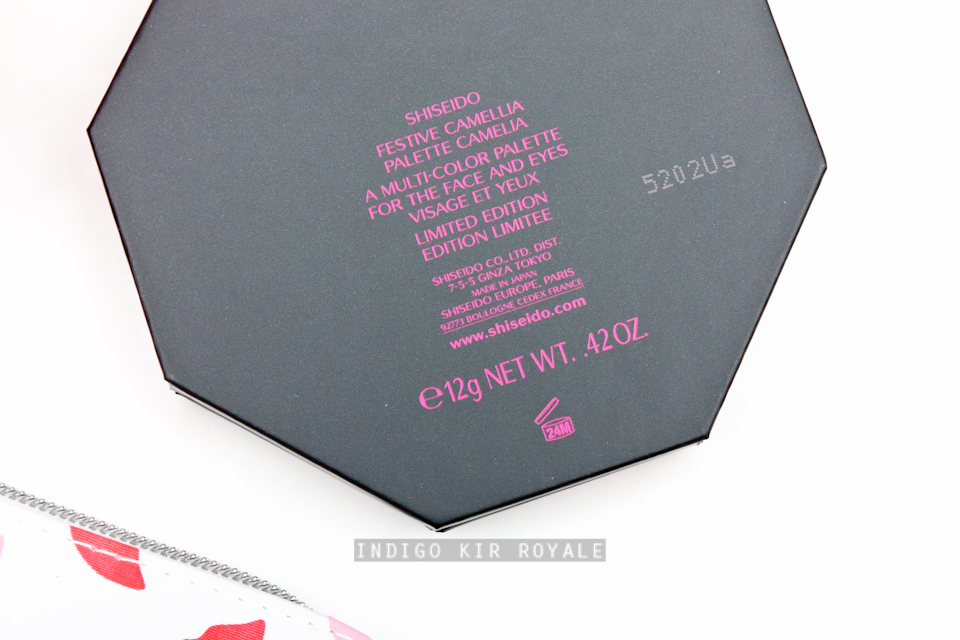
Below is the bottom of the palette that has the product description.
Colours, Finishes, Pigmentation & Texture
The shades are inspired by the camellia so they are gorgeous, colourful and fresh - perfect for spring and summer Christmas down-under.  They have great pigmentation and the texture is delectably silky smooth and exquisite - very typical of Japanese eye shadows.  So, they're extremely easy to apply and blend with no fall-out - making even the brightest shades super quick and easy to work with and are very wearable.  All the shades as mentioned can be used on the eyes and face (yes, even the vivid pink!) :)
Top row (L - R):
// Snow: a delicate silvery white with a subtle trace of cool lavender.  Beautiful for the inner corners of the eyes.  This has a lovely texture - not chalky at all like some white eye shadows can be.

// Velvet: a sensuous deep purple, slightly warm and semi-matte for elegant definition.  Lovely for the outer corners of the eyes and/or the lash lines.

Middle row (L - R):
// Japonica: a glimmering gold with a soft shine of reflected pink, which makes it stunning and unique.  Great as a wash of eye colour, for highlighting the high points of the face and on the middle of the eye lids as a top coat/highlight and in the inner corners of the eyes for added pop.

// Winter Rose: a clear, fresh pink shade.  Crisp and cool.  I'm very happy this is in the palette because it is my all-time favourite colour at least for the cheeks (really beautiful on olive skin tones).

// Petal: a warm semi-matte brown tone for subtle, natural definition and shading.  I like that this is brightened and slightly orange toned rather than your typical dull, brown colour - so you could certainly wear this on its own on the eyes and still look alive and it also means it pairs really well as an eye contour with the brighter, colourful shades if you wanted to.  And, despite it's orange tones, I find that somehow this is still works for contouring the face or as a bronzer.  I think it's because it blends really well and can be sheered out.  You would need to use it sparingly as it's quite pigmented and too much can make you look muddy.  It will work best on the face for those with warm skin tones.  Cooler skin tones may find it too orange or too warm.

Bottom row:
// Heart: a rich brownish-violet (mauve) enlivened with shimmering multi-coloured pearls.  My favourite shade in the palette, which I would gladly wear on its own all over the eye lids on a daily basis!  Beautiful!

Swatches
Below are swatches applied on my medium, olive (~NC30-35) skin tone.  The first set of swatches were photographed indoors using a strobe and the second set was photographed without a strobe (low light) to capture the iridescence.
Size
12 g / 0.42 oz of product in total so you get plenty of eye shadow in each shade!

Verdict
Get one for yourself and a loved one this Christmas!  For the beauty collector, this is back up worthy. >_<  I think this palette is probably my favourite in this year's Christmas collection releases and could (dare I say it) possibly even be the palette of the year!!  I think Shiseido is one of those brands that is quite under-rated, but from my few dabbles in the brand, they have some gorgeous soft brushes (reviewed here and here) and ultra smooth eye shadows and blushes.  The Festive Camellia Palette has certainly come out as a wonderful, refreshing surprise out of all the brands from my point of view.  What also makes it great apart from it's gorgeous design is that you get a lot of product, the quality is excellent, isn't overly expensive, versatile in that in can be used for both the eyes and face (an almost complete palette), the shades and finishes are interesting and not your typical, boring neutral colours, and last but not least, it's easily accessible for those of us in Australia and Asia (woot!).

[Too see how the palette applies, check out the lovely Linda from Silverkis who has created a couple of different looks using the palette.]

Availability & RRP
Available now at Shiseido counters in select Pharmacies, Myer and David Jones for a limited time while stocks last.  RRP is AU$70.  I purchased mine from Myer seeing as I had a Myer One voucher to use!  Yay! :)

Hope this was helpful. :)


Thanks for visiting and happy Sunday! ^_^ xo


DO NOT REPUBLISH CONTENT OR PHOTOS WITHOUT PERMISSION


TOM FORD LIPS & BOYS LIPSTICKS FOR 2015 | AUSTIN, MALIK, KINGSTON & THEO

"25 best selling favourites return alongside the arrival of 25 new boys, debuting in a luxurious metallic finish."
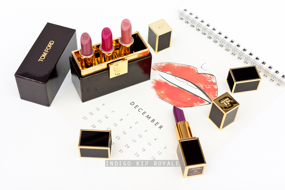
Meet my new boys! ^_^  Above are the ones that I picked up from the new Tom Ford Lips & Boys Lipsticks for 2015 (left to right): Austin (54), Malik (58), Theo (74) and Kingston (55).  These are a welcome addition to the two I picked up last year: Pablo (43) and Justin (27), which were reviewed and swatched in this post.  These are adorable, smaller clutch sized lipsticks at 2g / 0.07 oz compared to the 2.8 g / 0.01 oz full-sized Tom Ford Lip Color Lipsticks (you can see a photo comparing the two lipstick sizes on my previous post).  I believe these are now permanent rather than limited editions, which is great.  All the new shades contain shimmer with various finishes - luminous, pearly, frosty and metallic.  Here's a closer look at the shades I purchased as well as some swatches and comparison swatches further down below.
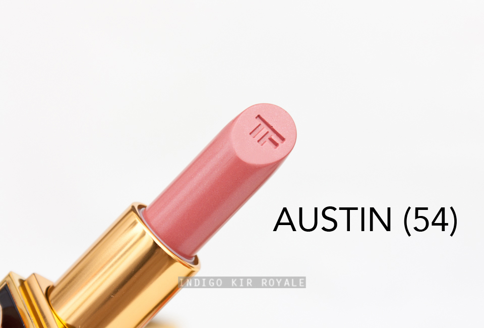
Austin (54) is a warm, rosy pink nude with a pearly to frosty shimmer finish.  Similar to the Spring 2014 Lip Color Sheers (reviewed here), when the lip colour wears off or you wipe it off, the shimmer particles do get left behind, which unfortunately I don't personally find too attractive (I look like I've just been eating shimmers! ;) ).
Malik (58) is a lovely and truly unique shade that's great for every day wear.  It's a dusty lavender rose nude with warm pink and gold frosty finish.  A beautiful shade, but unfortunately does leave shimmer particles behind as well.
Kingston (55) is an intensely bright fuchsia with a luminous, cool-toned fuchsia pearly finish.  Do I need another bright fuchsia?  Probably not...LOL..., but it does have a pearly finish that I don't think I have in my stash (they are either luminous or matte).  Excuses, excuses. ;-)
Theo (74) is a dark, cool-toned berry-purple with a luminous, violet pearl finish.

Swatches
For reference, I've swatched them on my current summer complexion - medium to tan (~NC30-35), olive skin tone and all were photographed indoors using a strobe.

Comparison Swatches
On My Lips...
For reference, my lips naturally have dark, blue-toned pigmentation - particularly around the lip line.  I applied all shades straight from the lipstick bullet (no lip brush or primer used).
Scent, Pigmentation & Application
I noticed all the four new shades I purchased had a slightly sweeter scent compared to the previously released Tom Ford Lipsticks - still vanilla scented though of a much nicer kind in my opinion compared to the Mac lipsticks for instance.  Both Kingston and Theo applied most evenly and smoothly, and with the best pigmentation and wear out of the four shades.  Malik and Austin were a little sheerer and didn't cling onto the lips as easily (they felt more buttery and slid more easily), so the finish wasn't quite as flattering and even as I'd hoped.  Still, they are workable because they are lighter in colour and allow the natural lip colour to show through more.

Overall
It's hard to resist these clutch-sized lipsticks.  They are truly tiny luxuries that every lipstick lover must have and they are more affordable than the full-sized lippies.  The challenge is choosing a shade/shades!  If I had to choose based on performance then obviously Kingston or Theo are the way to go.  Definitely, Theo for those who dare to wear something more bold!  But, do also check out Malik for its uniqueness. ;)  For me personally, I'm most excited by the purple-hued deliciousness in Malik and Theo. ^_^  (I just wish those pesky shimmers wouldn't hang around though!)

Availability
I purchased mine from David Jones two to three weeks ago.  Contact your local Tom Ford counter to check their stock as sometimes they only have a handful of each shade!


Hope this was helpful.  Try not to stress too much at the shops this Christmas! ;-)


[For more: Christine from Temptalia.com has the full set of brand new lips & boys lipsticks reviewed and swatched in her post].


What's your pick of boys for 2015?


BOBBI BROWN CHRISTMAS 2015 | DELUXE CHEEK & EYE PALETTE & RICH CARAMEL EYE PALETTE

Every holiday season Bobbi Brown releases beautiful palettes and I think they're usually packaged in a similar way with black lacquer casing and a gorgeous embossed crest.  This year is my first to finally try a couple!  :D  I picked up the Deluxe Cheek and Eye Palette and Rich Caramel Eye Palette.  Both are limited edition palettes.  There's also another eye palette that's a cooler version of the two should that tickle your fancy.
Below are the product description label on the bottom of each palette that has the names of each of the powder products - very useful! :) [Click on the images to enlarge].
Here are more close-ups of the products inside the palettes.  Both palettes are made of plastic so they're fairly light and easy to carry.  They also contain a handy mirror and a dual-ended eye brush.  One end of the brush has natural bristles for applying and blending eye shadow and the other is a flat synthetic brush for applying the darker eye shadow(s) as an eye liner.
The Deluxe Cheek & Eye Palette is two-tiered with the top tier housing all eight eye shadows and the bottom tier which conveniently slides out contains the two blush powders.
Top row of eye shadows (L - R):
// Ivory: creamy beige (matte)
// Cement: grey beige (sparkle)
// Lilac Haze: bronze heather (matte) - palette-exclusive shade.
// Mica: deep heather grey (sparkle)

 Bottom row eye shadows (L - R):
// Golden Bronze: pink champagne (metallic)
// Steel Grey: deep grey (matte) - palette-exclusive shade.
// Pale Rose: pale grey pink (matte)
// Caviar: rich black brown (matte)
Blushes (L - R):
// Desert Rose Blush: light dusty rose (matte)
// Pale Pink Blush: bright cool/blue-toned pink (matte) - one of my all-time fave eye shadows that has amazing longevity on the skin!
Eye shadows (L - R):
// Cream: creamy beige (matte)
// Rich Caramel: mid-tone brown bronze (shimmer wash) - palette-exclusive shade.
// Bellini: golden peach (shimmer wash)
// Toasted Cinnamon: rich copper brown (sparkle) - palette-exclusive shade.  I adore this shade and it's very festive!
// Rich Caviar: rich brown black (matte)

Swatches
For reference, I've swatched them (with a dry finger and without primer) on my current summer complexion - medium to tan (~NC30-35), olive skin tone and all were photographed indoors using a strobe.
Above: Deluxe Cheek & Eye Palette swatches.
Above: Rich Caramel Eye Palette swatches.

All the eye shadows swatched with moderate pigmentation and applied even softer on the eye lids with a brush, so some may not find these sufficient enough - especially if you have medium to darker skin tone.  There's not a great deal of contrast between the shades either.  I personally don't mind all this, particularly for every day wear when I just want to very quickly add a bit of definition without spending ages applying and blending away strongly pigmented colours.  There's always the option of applying them with a damp brush if needed.  On my eye lids that have normal skin condition (neither oily or dry) the colours lasted about six hours until they started to fade, which isn't too bad.

Overall
I'm fairly happy I finally got to try the Bobbi Brown Christmas palettes this year.  I think they're both fairly safe all-rounder neutral palettes that would suit most if not all skin tones if you don't mind the moderate pigmentation.  Both are great last-minute gift options.  However, I highly recommend the Deluxe Cheek & Eye Palette out of the two as it comes with an "all-rounder" (word of the blog post so far! ;) ) blush and one of my all-time fave pink blush.  ^_^

Hope this was helpful. :)


OMG!  Only SIX days 'til Christmas!!! >_<  Keep safe! x


PALETTE FEVER | URBAN DECAY GWEN STEFANI EYESHADOW PALETTE

I must admit I've been on a makeup palette high this year.  Before this I could never justify buying them as I always tended to use palettes that had at most four or five products in them.  More would overwhelm me with too many choices.  However, there's been a lot of gorgeous palettes released recently that even I couldn't resist them.  I'm pretty sure I've more than enough made up for the lost time here! LOL.  Urban Decay is known for their eye shadow palettes in the blogosphere, I have a couple of them (Naked 1 and 3) which to be honest I picked up to see what the hype was all about.  However, I never find myself using Naked 1.  Naked 3 is a bit more different in my collection due to the rose gold hues, so I have used that a few times, but still not as often as I should.  The texture and finishes (particularly those with sheen/shimmer) are not as refined as I'd like personally.  Also, I'm not a fan of the tin packaging. /:-\

When UD released their Gwen Stefani Eyeshadow Palette - again with a lot of hype - I tried to resist it.  Until...I saw that one blue eye shadow that's in it. >_<  Oh, golly, gosh...wot, wot?!  *_*  I immediately snatched it up at Selfridges who were also having free express international shipping at the time with a minimum 50GBP purchase. :D #win

About the Palette
The palette is the product of a close collaboration with Gwen Stefani - from the shades and most of their names (based on her songs) to the packaging.  It contains a range of neutrals with a few jewel tones to jazz things up and is overall a reflection of all the shades that help create Gwen's most iconic looks.  There are 15 of her must-have eyeshadow shades - 12 of which are brand new and 3 are from the UD shadow collection.  The palette case itself is unlike any of the other UD palettes - no tin!!!  Yesss!  This baby is very hefty and luxurious in comparison.  The design shows Gwen's love of black and white graphic prints and antique gold accents.
I even love the polka dot print on the inside of the box the palette was packaged in!
Below, the product description label on the bottom of the palette.
Below is a photo of the palette's huge mirror that has the words "Magic's in the Makeup" etched onto it - it's a nod to the No Doubt song.  And, I think it's a great little reminder of what makeup means to me - a fun, transformative tool that aids self-expression, creativity, boosts my confidence and most of all, enlightens my spirit. *sigh* ^_^ #gettingdeep.  Let me know what makeup means to you in a comment below!
Below are the shades themselves - aren't they beautiful? :)  The shade name appears above each eye shadow in the palette, which is useful.
Colours, Finishes, Texture, Pigmentation & Application
Below are the shade descriptions as provided by Urban Decay:

Top row (L - R):
// Blonde: pale beige w/pink iridescent shift
// Bathwater: pale beige with gold pearl
// Skimp: pale nude satin
// Steady: medium rose w/metallic gold shift
// Punk: reddish brown matte

Middle row (L - R):
// Baby: cool metallic rose
// Anaheim: light taupe-brown matte
// Stark: nude-pink matte
// Zone: medium brown matte
// Serious: smoky grey with iridescent floating pearl

Bottom row (L - R):
// Pop: pale coral with iridescent sparkle
// Harajuku: metallic blue-pink with iridescent micro-shimmer
// Danger: deep metallic royal blue with blue micro-sparkle
// 1987: bright metallic yellow-gold
// Blackout: blackest black matte.

Most of the shades in the palette would probably be most flattering on pale complexions similar to Gwen's.  As you can see there are a lot of pale and light to medium neutral shades.  Fortunately, the shade, Zone (which I am very impressed with coz it blends so beautifully!) is there to provide a fantastic everyday crease and transition colour for those with medium to tan skin tones like mine.  The right-most shades are great for more depth: PunkSerious and Black Out (an eye liner too).  Punk surprisingly appears more neutral on my skin tone than it appears in the pan so I could wear pair this with anything and makes up for the lack of a darker brown shade in the palette.  Harajuku is more wearable than I expected.  Stark is great for all-over-the-lid base shade on me.  Danger speaks for itself and unlike a lot of blue eyeshadows, appears on the eye lid as bright and vibrant as it does in the pan even without a primer or base or having to dampen the brush first!  Believe me, this is hard to come by with blue eye shadow!  It did not disappoint and I'm so happy I purchased this palette even if it was only for this gorgeous colour. *grin*  1987 and Danger paired together is somewhat reminiscent of the Nars Rated R eyeshadow duo, but not as neon bright.  1987 is probably the least wearable shade for me, but if I wear it, I would use it as a pop of colour on the lower lash line, or on the inner corners of the eyes.  Pop is essentially all white/silver relatively chunky glitter and no sign of any coral coming through so I would just use this as a sparkly topper on the middle of the lid using a clean finger - just dabbing it gently.

I found most of the shades to have decent to excellent pigmentation.  Serious is much softer and sheerer than I'd hoped when applied on the lids with a dry brush.  Harajuku is a touch drier in texture and not as intense as Danger, but still not bad.

I love how lightweight, soft, silky and finely milled the texture of the matte eye shadows are.  They feel very refined indeed and so apply evenly and blend amazingly well.  :)  However, I recommend doing your eye shadows first before applying all other makeup like foundation so you can clean up any fall out.

Swatches
For reference, I've swatched them (with a dry finger and without primer) on my current summer complexion - medium to tan (~NC30-35), olive skin tone and were photographed indoors using a strobe except for those shot in low-light mode to capture iridescence.

Swatches of top row in palette from left to right:
Low light swatches:
Swatches of middle row in palette from left to right:
Low light swatches:
Swatches of bottom row in palette from left to right:
Low light swatches:
Bottom Line
Highly recommend!  Even if you think you've got enough palettes like I do, you can't help but be entranced by that blue eyeshadow!!  It's a winner. :)

Availability
Limited edition.  I purchased mine from Selfridges.com.


Hope this was helpful.


Are you a palette lover?  What do you think of this one?


SEASON'S GREETINGS!

PREVIEW & SWATCHES OF THE UPCOMING URBAN DECAY GWEN STEFANI LIPSTICKS FOR SPRING 2016

Here's a sneak peek and swatches of the new Gwen Stefani Lipsticks that will be released this Spring 2016!  A sample pack was included when I purchased the amazing the Gwen Stefani Eyeshadow Palette (swatched and reviewed in this previous post) and it contains four of her must-have shades.  I'm sure Gwen Stefani fans will be excited for these as Gwen's iconic look is really all about the bold lip!
For some reason the lipstick samples were placed upside down in the cardboard packaging when I received it, so the names appear in the opposite direction to the shades!  Thankfully the correct names were printed on the inside of the samples themselves as well as on the bottom/back of the packaging (see image below).  The correct names of each shade are also in the swatches down below.

I love the look of the lipstick case though with its vintage gold and black stripes. :)

There are 8 lipstick shades available in the Gwen Stefani Collection as shown below (with correct names!).  They come in different textures and finishes.
// Rock Steady (Cream) - swatched below.
// Spiderweb (Cream)
// 714 (Mega Matte) - swatched below.
// Wonderland (Cream)
// Ex-girlfriend (Sheer) - swatched below.
// Firebird (Cream) - swatched below.
// Phone Call (Cream) - exclusive to urbandecay.com and their freestanding stores.
// Plain (Sheer) - exclusive to urbandecay.com and their freestanding stores.

Swatches
From left to right we have:

// Rocksteady (Cream) - very dark, cool-toned red.  Being very dark you have to be careful when applying it especially since it's a cream texture (it's easy to go outside of your natural lip line by accident!), but it does mean the creamy sheen gives dimension to your lips and prevents it from looking outdated and mean-looking if you have thin lips compared to a matte finish.

// 714 (Mega Matte) - bright, cool-toned red.  The depth of colour in this one will vary depending on your natural lip pigmentation.  This is definitely *mega* matte, but feels very lightweight especially when applied with a lip brush. 

// Ex-Girlfriend (Sheer) - light to medium rose brown nude.  The best MLBB shade with a texture and finish that makes my lips look fuller, healthy and just lush!  I need this in my life.

// Firebird (Cream) - bright, cool-toned pink orchid with violet micro-shimmers that appear more like a subtle bluish sheen on the lips.  This looked quite dramatic with the flecks of violet in the packaging, but is actually more wearable when applied.  The cream textures are very comfortable on the lips and feels and looks nourishing.  Love!  Needless to say this is my colour.
Image may be NSFW.
Clik here to view.
Swatches (L - R) above: Rocksteady, 714, Ex-girlfriend and Firebird.
For reference, I currently have medium to tan, olive (~NC30-35) skin tone.  All pictures were photographed indoors using a strobe.

On My Lips...
My lips are naturally blue-toned and pigmented, particularly around the outline of my lips, but I found all four shades - even the sheer Ex-girlfriend shade - to give enough coverage to cover them and give a fairly even layer of colour.  I applied all the shades with a lip brush.
Image may be NSFW.
Clik here to view.
Firebird
Image may be NSFW.
Clik here to view.
Ex-girlfriend
Image may be NSFW.
Clik here to view.
714
Image may be NSFW.
Clik here to view.
Rock steady
Overall
I'm really excited for these lipsticks.  This is my first time to try any Urban Decay lipsticks and I'm quite pleased with the samples I tried.  All four shades and textures were beautiful and I can see them being universally flattering.  The reds (as beautiful as they are - especially 714!) are probably not as unique, but Firebird is definitely unique in my collection (I have lots of shades in the same family because pink orchid is my favourite lip colour of all time(!), but nothing exactly like this one ;-) ).  The nude shade surprised me as nudes are always hard to wear for me and difficult to get a good match and formula in, but Ex-girlfriend is just perfect!  The texture is superb - I mean just look at my lips in the photo!  It just looks and feels so lush. >_<  Probably the best "my-lips-but-better" lipstick I've come across in a long time. :D  So, I'd say Firebird and Ex-girlfriend are definitely must-haves for me and I'll be trying to get a hold of the full-size of these as soon as they are released. *Fingers crossed* I don't miss out.  I'm even very tempted to get two of each if they're limited edition as I can see I would get a LOT of use out of both!  I would love to try more in the range!  If you have any recommendations from the UD permanent lipstick range do share them in a comment below (thank you!).

Hope this was helpful. :)


Excited for 2016?! >_<  Keep safe and hope you've had a wonderful festive season.


What shades are you eyeing on from this collection?


CIATÉ X OLIVIA PALERMO - THE SMOULDERING EYE PALETTE FOR AUTUMN 2015 + SNEAK PEEK OF MY PICKS FROM THE COLLECTION

British brand, Ciaté is famous for their nail products and recently, they've expanded into makeup.  For their autumn 2015 collection, they collaborated with the style icon and socialite Olivia Palermo to create a range of nail colours (of course!) as well as makeup.  I've many Ciaté nail polishes in my collection and I adore them (just do a search of this brand on my blog and you will find several blog posts on it), so I was a bit skeptical of how well they would do makeup considering all they did before was nail products - which they really do excel at.  I had seen a few photos of the Olivia Palermo range and wasn't really drawn to it until...I read Gaia's rave reviews on The Non-Blonde.  I just had to try them!  And, I am soooo glad I did, because OMG...!

Sneak Peek of My Initial Purchases
I first picked up the Cheekbone Cheat Duo in Bluff Point, the Smoked Out Gel Kohl Liner in Fig and what I think is the star of the collection (and reviewed in this post), the Smouldering Eye Palette - all pictured below (and first image above).  My picks were also inspired/enabled by Mallory1712's review on her YouTube Channel (she also has swatches).  I would have also loved to purchase the deeper nail colours in the range, but unfortunately couldn't find them anywhere that would ship them to Australia. :'(  I've since purchased more from the collection as I will reveal at the end of this post.
The Smouldering Eye Palette
I love the box that the palette comes in with its colourful, scalloped design.  So pretty! :)
Below is the back of the outer box packaging that has all the shades and their names.  Some might prefer to have these on the palette itself as a permanent and more convenient reference though!
Below is the eye shadow palette.  The top of the palette is packaged in pebbled black faux leather and the rest is in gold.  The packaging is ok - others might love it more than I do.  I personally don't like it when faux looks too fake and with this one, you can kinda tell straight away.  I also prefer silver to gold, but that's by the by... It's what's inside the palette that counts the most! ;-)
Below is the size of the palette with respect to my slightly smaller than average hand.
Here's the product description label on the bottom of the palette...
"Seriously soft-touch suede eye shadow..." I totes agree with that.  More on this later...
The large mirror and the 9 eye shadows in the palette below.
Colours & Finishes
The palette contains a great range of colours and finishes (matte, pearl and shimmer) for achieving different smokey eye looks - appropriate for day and night.
Top (L - R):
// Camo - deep olive pearl
// London - deep gray matte
// Pisces - light gray pearl
// Double Denim - blue shimmer pearl

Centre:
// Butler - bone matte

Bottom (L - R):
// Amaretto - aubergine/brown matte
// Mulberry - cranberry pearl
// Penny Jar - purple gray shimmer pearl
// Blondie - gray/purple matte

I love all the eye colours and finishes.  I initially thought the shades in the palette looked a little dated, but they are actually gorgeous and sophisticated when worn together.  Soooo flattering and timeless!  Well done Olivia! :D  (How could I have doubted the impeccable taste of this lady).  In particular, however, I've been surprisingly obsessed with using the more plummy shades in the palette (despite my love of blue!) - the Amaretto and Mulberry then Penny Jar as a light, shimmering top coat on the centre of the lid.  I'm really loving the red-toned plums - so flattering for those with brown eyes, green, blue and pale eye colours in particular.  The red doesn't make me appear sickly at all.  I truly can't get enough of it and have been wearing it whenever it's not too sweltering hot for makeup!  I also wore this combination for Christmas (see my Christmas makeup selections on Instagram).  I can't wait for autumn down-under!  Mostly so I can wear this more often.  Hehe.  >_<

The deep olive is also nice and contains just the right amount of green that I can tolerate. :)

Swatches
For reference, all swatches were applied on my current medium to tan summer (~NC30-35) olive skin tone.  Applied with a clean, dry finger and without a primer.  All photographed indoors using a strobe.
Pigmentation
All the shades have great pigmentation that lends itself to softer, smokey effects that the palette is designed for (as opposed to bright, bold pops of colour).

Texture & Application
Apart from the gorgeous shade selections, it is definitely the texture that you will notice the significant difference in compared to any other eye shadow you have ever come across!  BIG statement, I know!  Suede-like texture is definitely what it is.  Buttery, smooth...oh so, beautiful and thoroughly enjoyable to touch and apply!  I don't want to be rude or explicit here, but it's almost (dare I say it) orgasmic even.  Haha!  Oh my...what is my blog post coming to.  Basically, you need to try its amazing texture to know what I'm talking about. ;-)  It is simply exquisite and heavenly!  All this means, it applies and blends incredibly well and with little time and effort.  I find it best to pack on colour using a thicker/coarser natural-haired, flat eye shadow brush, or you can even use just a clean finger to apply the colour on the lids initially and blend with a soft, natural-haired brush to match the soft, buttery texture of the shadows.  Using this method, I didn't experience any fall out apart from the shimmer eye shadows where a little of the shimmer particles dropped.

Longevity
I found these eye shadows to last from morning until I remove it late at night with hardly any fading.  Very impressed - granted I do have normal skin condition on my eye lids (neither oily or dry).  This is also only with the thinnest layer of face primer and foundation over the eye lids (as I tend to do this to even out my skin tone all over).

Size
12 g / 0.42 oz.

Made in Italy.
Many of the gorgeous powder products I've encountered have been made in Italy.  Just my observation!

Overall
I am completely surprised and thoroughly impressed by the quality of the eye shadows.  Gobsmacked I tell you!  I'd hate to say it, but I'm probably even more wowed by them than the Burberry Sheer Eye Shadows, which are among my all-time top eye shadow formulations.  These are so buttery and suede-like to touch!  I did not know it was possible nor did I expect it from a brand that's fairly new to makeup.  They are that amazing.  You have to get this while you still can! >_<

I just LOVE the eye shadow palette so much that like Gaia, I had to purchase the other palette as well! >_<  The palette is called The Smokey Suedes and I am still waiting for it to arrive.  I am averse to green eye shadow (especially since I am naturally green(olive)-tinted already LOL), but I am very drawn to the rest of the shades in that palette and with the same gorgeous texture, I'm sure I won't be disappointed.  Lastly, I also picked up the Satin Kiss Lipstick in Praline from the collection as part of this second order (it was sold out initially, but then became available - yesss!  Nooo! Yells my wallet)  So...I'm dying to get my hands on these!

Not bad Ciaté, not bad at all.


Availability
Limited edition.  I purchased mine online from Look Fantastic, which ship internationally (free standard shipping).  They are also currently doing a gift with purchase at the time I have written this post.


Will/have you tried this palette?  Also, please share any recommendations you might have from the Ciaté makeup range.


DO NOT REPUBLISH CONTENT OR PHOTOS WITHOUT PERMISSION


CHANEL BEAUTY HAUL WITH MINI REVIEWS

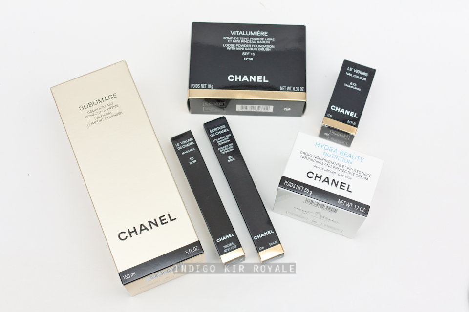
Happy 2016 peeps! :D  Hope you had an enjoyable, relaxing and safe holiday and feeling refreshed for the new year.  I thought I'd make my first 2016 post on a haul with some mini reviews on the products. :)  Myer had a 10% off all beauty around November / early December and I believe it is done every year and it is actually the only single time that Chanel is included!  So, of course, I was all over that. ;-)  It's a great time to purchase a few of my favourites from the brand as well as trying out a few new things I've been eyeing for some time.
Image may be NSFW.
Clik here to view.
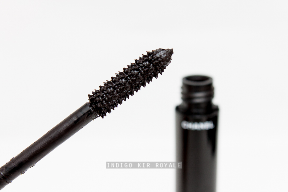
Above: The thick plastic brush applicator of Le Volume de Chanel Mascara in Noir (#10)
I repurchased my all-time favourite mascara - Le Volume de Chanel in Noir #10.  I've tried the waterproof version and the overall effect they give are completely different!  The non-waterproof version is the one to go for.  I've tried many mascaras this year and I still feel this is the one I enjoy using the most - I may do a blog post on that if time and baby permits.  But, this is the only one that gives me the most dramatic volume in an instant and it dries to a touchable, very flexible hold on the lashes (not stiff, crunchy or flaky), so it doesn't smear or smudge off.
Image may be NSFW.
Clik here to view.
Écriture De Chanel Eyeliner Pen in Brun (brown) #20.
Image may be NSFW.
Clik here to view.
The felt tip applicator of Écriture De Chanel Eyeliner Pen in Brun (brown) #20.
I also repurchased my favourite Écriture De Chanel Eyeliner Pen in Brun (brown) #20, which is great for every day wear as it's not as harsh as black.  It's also very quick and easy to use (even for someone like me!).  It has a felt-tip, which is relatively short and sharp, so it helps with precise application from thick to ultra-thin lines, and creating winged-lines.  It doesn't flake or fade on me.  It also never seems to dry out (unlike many liquid eye liners that tend to dry out so quickly)!!  Note, I only ever apply eye liner on my lash line rather than on my water line as my eyes are too sensitive for any makeup to go there.  Lastly, it isn't too difficult to remove, which is a huge plus.  I hate makeup that's so hard / near impossible to remove!  I just don't have the patience for it, especially when it's very late at night and I'm sooo exhausted.  This is the same, particularly for mascara.  I've had perfectly good mascaras that I just don't use because they're so difficult to remove.  Their usability goes straight out the door for me, especially when makeup removal is already my least favourite skin care ritual.  Anyone else on the same boat?
Image may be NSFW.
Clik here to view.
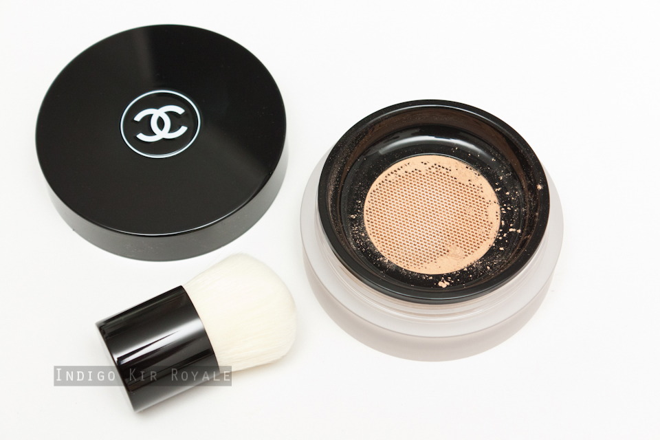
Chanel Vitalumière Loose Powder Foundation (pictured above is in 40 Beige).
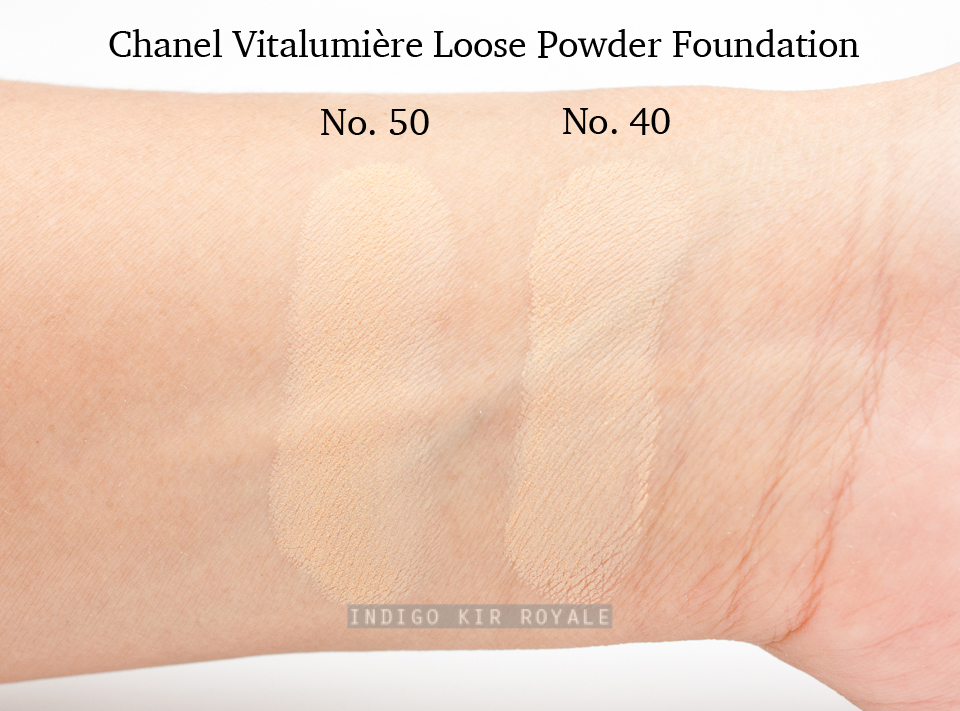
I bought another of my all-time favourite foundation - Vitalumière Loose Powder Foundation in a darker shade 50 Beige for summer (I already have one in 40 Beige, which I now prefer for winter).  I have previously reviewed this foundation here when it first came out (two years ago now!  My, has time flown!).  Note, I'm normally matched to the shade, B30 (or 30 Beige) in all other Chanel foundations in winter, but you may find that the Vitalumière Loose Powder range is a tad lighter in comparison, so you may find you can get away with getting it in one shade darker.  This foundation is the most flawless, natural-looking and flattering base I have ever used.  I find it even gets better as it wears throughout the day and it never looks cakey or powdery, nor does it emphasise any dehydrated parts of my skin.  It also stays on looking fresh even through sweat during summer!  I swear, it's like magic!
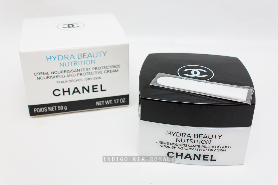
I thought I'd give a couple of skin care items a go for the first time: Sublimage Essential Comfort Cleanser and Chanel Hydra Beauty Nutrition.  I recently fell in love with the Chanel Hydra Beauty Micro Serum, which actually works for me unlike its predecessor.  So, I thought I'd give the moisturising cream in the same range a go, and it's very promising given that skin care expert Caroline Hirons loves it.  I have yet to open and try it out, so I can't say anything about it yet.  If I end up loving it, then I will sure to let you know!
With my current dehydrated skin (it's been like this since I moved to a much colder, drier state in Australia and worsened after pregnancy and breastfeeding), the Sublimage Essential Comfort Cleanser was recommended to me for something more nourishing for both morning and night time cleansing.  I've been on the hunt for a morning cleanser rather than a night time cleanser as I already have products and a routine that I love for that purpose.  I believe the Essential Comfort Cleanser is new to the Sublimage range which is Chanel's most luxurious skin care range.  It's an interesting one in that it dispenses as a kind of thick gel (it comes in a large tube, so it's convenient to use) and when massaged onto dry skin, it transforms into an oily texture, which you then remove with a dampened muslin cloth (provided).  So, you can also use it to remove eye makeup.  I've only tried it a few times, so I'm not sure what to think of it yet...so far, I'm not sure I would repurchase it.  It is very expensive for a cleanser and I'm not wowed by it at the moment. /:-\  So, my search for a great morning facial cleanser continues! >_<  If you have any recommendations for dry/dehydrated skin, please let me know.
Image may be NSFW.
Clik here to view.
Above: the provided Chanel muslin cloth.
Image may be NSFW.
Clik here to view.
Clear gel formula of the Sublimage Essential Comfort Cleanser as dispensed from the tube.
Image may be NSFW.
Clik here to view.
The gel formula's transformation into a fine, oily texture after massaging onto the skin.
Last, but not least, I noticed they had the limited edition nail polish in 'Troublante'(675) from the Rouge Allure 2015 Collection on display and was amazed at how beautiful it was in person - something you can only expect of Chanel.
It's a complex, duo-chrome of bright copper and deep burgundy with a metallic finish.  They actually did not have any in stock at my local counter, but Myer were kind enough to find one for me online and have it shipped to me. :)  I was told it was their last one!  Whew!  This one is a real beauty!  (You can also see how it looks on my nails on my Instagram account - please follow me there if you're interested. ^_^ ;-) )


What have you purchased recently that you would recommend?


DO NOT REPUBLISH CONTENT OR PHOTOS WITHOUT PERMISSION


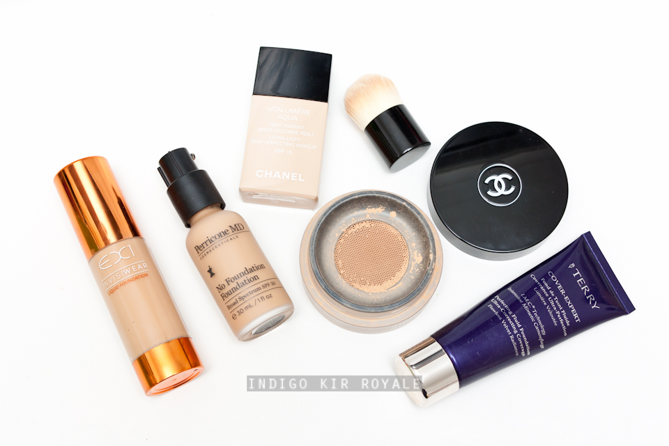
MY CURRENT TOP 5 FOUNDATIONS

Hey lovelies!  I thought I'd share with you my current top five foundations.  A few of them have been adored by me since they were first released years ago(!) and a couple of fairly new ones that I've tried just recently - i.e., in the couple of months that I've absolutely been loving that needed to be included ASAP! >_<  :D
Image may be NSFW.
Clik here to view.

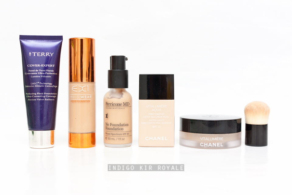
For reference, I have dry to dehydrated skin, so I find all these products work for me provided I prep my skin beforehand with a good moisturiser.  I also live in dry weather conditions - both in winter and in summer.  So, the wear and longevity of these foundations may vary depending on your skin condition type and weather conditions that you experience.

// Chanel Vitalumière Loose Powder Foundation
Out of all the foundations, this is my absolute favourite.  (Click here for my full review of it).  I have used this one the most in the last year.  This comes with an ultra-soft mini kabuki brush that's perfect for applying this powder.  It gives medium to full coverage.  The coverage can be built very easily and quickly by dabbing or pressing a little more powder onto the skin.  Then, buff the powder in circular motions to blend it out.  The powder never gets caky or look thick and powdery even after layering, but do note that you don't really need too much of this on.  Out of all the foundations, I find this one wears the most beautifully - actually, the complexion looks better as the day goes on and looks glowing (not oily or shiny, but slightly luminous and healthy looking) and skin-like by the end of it!  In fact, I often feel sad to remove my makeup off before going to bed, because of how good my skin looks!  This stuff feels almost weightless on the skin as the powder is incredibly fine so it looks imperceptible on the skin, but there's a lot of it so it carries a lot of pigment.  The finish is exactly what it was designed to do - creates a "light box" effect on the skin, or a healthy, luminosity.  The skin looks even and smooth.  There is no shine, shimmer, or oiliness.  That "lit from within" glow is achievable with this product and one that does it with the most natural-looking finish.  Application is so quick and easy once you get the hang of it.  It took me a few goes as I was used to liquid foundations.  I find it's actually quicker than the latter because you don't need to set it (with powder) unlike with liquid foundations, and I don't need to get my hands dirty during application.  It's also very easy and quick to blend out because of how fine the texture is.  This is a gorgeous foundation that works even on dry/dehydrated skin like mine.  Once, I'd forgotten to apply moisturiser and I applied this on and it still looked alright - not the best way to do it(!) and you should never do that, but I was surprised that it didn't look as bad as it should have.  It didn't seem to accentuate any dryness that I had.  Overall, it melds flawlessly on the skin.  I think this would suit all skin types.  Brilliant.  I don't know why it's not talked about enough!  Although I must say the shade range in Chanel is usually limited (the darkest shade being No. 50), so there really isn't a shade available for those who have darker skin tones (~NC40-45 or darker), which is unfortunate.

// By Terry Cover Expert
This was previously my go-to foundation for years, before I purchased the Chanel Vitalumière Loose Powder Foundation.  So, I'd say it's my second favourite.  This one blends very easily so it applies just as well with clean fingers as with a brush.  It has a velvety, matte finish, but with a natural, slight radiance.  It also delivers medium to full coverage without looking mask-like and thick on the skin.  This foundation is fluid, but it is not too thick or too thin.  I highly recommend you try this out if you're looking for a full coverage foundation in liquid form.  I imagine this would also work for all skin types, but especially on those with oily or combination skin.  I do need to use two foundation shades to get the perfect match though (a No. 9 Honey Beige and No. 10 Golden Sand), and adjust the proportions of each depending on if I have a tan or not.  Note, this foundation has now been reformulated late last year, and it is called By Terry Cover Expert SPF 15+.  The obvious difference is the addition of a teeny bit of sun protection (I don't know why they bother!  Please add at least SPF 30+!!), but I'm not sure what else is new about it so I can't say if the results will be exactly the same.  Hopefully it's just as good if not better!  Fingers crossed. >_<  If anyone knows please leave a comment.  The updated foundation is now available at Mecca.

// Perricone MD No Foundation Foundation
This is a recent discovery.  I think those with normal or dry to dehydrated skin types will enjoy the moisturising texture and feel of this.  As this is meant for a "no makeup" look, it only has a sheer coverage similar to a tinted foundation or BB cream.  The finish looks just like skin, but well moisturised, dewy and supple.  If I need extra glow and don't want to wear much makeup, or just don't need it because you're skin is in fairly good condition, this is the one I use.  It has good sun protection of SPF 30 and because it is sheer, you can easily apply quite a bit of it on and massage well it onto your skin like you would an SPF and not worry about it looking like you're wearing makeup (that is if you did not want to apply SPF separately underneath this).  I like that it is a small, convenient glass bottle, but still contains the standard 30 ml / 1 fl. oz. of product and it comes with a pump that dispenses a sufficient amount for a light layer.

// EX1 Invisiwear Liquid Foundation
Another recent discovery of mine.  Brilliant for those with olive skin tones like myself who struggle to find the foundation shade with the right undertone.  Many are pink-toned so they can look ashy, or they are too orange.  This brand has all the shades available from light to dark skin tones, but have an olive undertone.  The shade I have, F200 is a perfect match for my current summer tan skin tone (~NC35).  It has a natural, skin-like to slightly dewy finish.  The formula is scent-free and oil-free. It has a slightly thicker fluid consistency, but I can still apply it with clean fingers without any problem.  You can also apply it with a dampened Beauty Blender sponge for more of a dewy finish.  It has a medium to full coverage, and has great longevity on the skin from morning to night.  This is a great find!

// Chanel Vitalumière Aqua Foundation
This is a lightweight, water-based foundation.  Excellent for all skin types and those who don't like wearing anything heavy on their skin.  I've worn this for several years and it's still one of my favourites to this very day and having tried many other foundations that have been released since this came out.  It has a light to buildable medium coverage.  I have the shade in Beige 30 which is good for winter on me.

Swatches
All swatches below were applied on medium, olive skin (~NC30-35), and photographed indoors using a strobe.  All were swatched reasonably heavily to depict the shades.
Hope this was useful.  I'm glad I've finally shared with you my go-to foundations over the years and a couple of recent ones (after trying many that just did not warrant being in my top 5!).  I'm sure 2016 will bring in more new foundations to try out and I'm looking forward to sharing my thoughts on those as I go.  In fact, I've just purchased the new Chanel Les Beiges Healthy Glow Foundation SPF 25 / PA ++, which I believe are replacements for the Chanel Les Beiges All-In-One Healthy Glow Fluid SPF 15 (released 2 years ago and reviewed HERE).  Will post swatches and my thoughts on that after I've played with it. :)


Thanks for visiting...and yay for the weekend! ^_^ xo


What are your current top 5 foundations?


DO NOT REPUBLISH CONTENT OR PHOTOS WITHOUT PERMISSION


[ MY PICKS ] CHANEL SPRING 2016 | L.A. SUNRISE COLLECTION

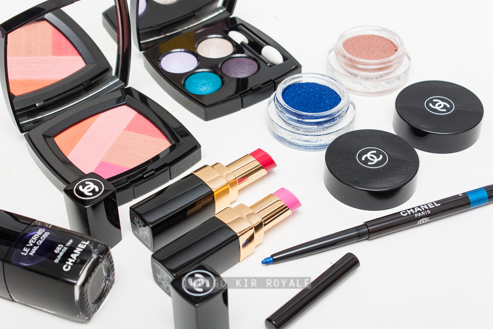
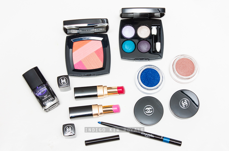
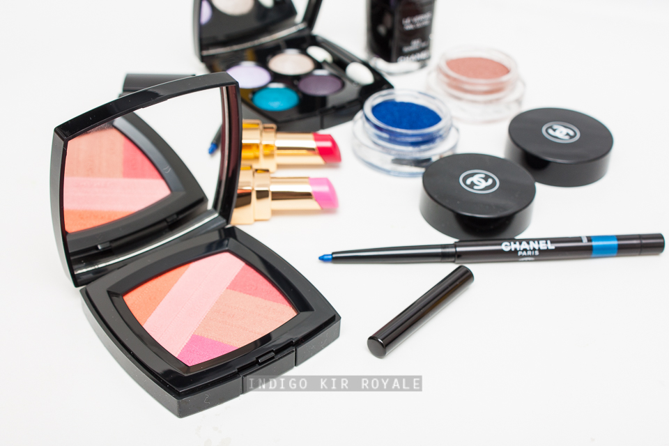
The new Spring 2016 Chanel colour "L.A. Sunrise" collection has started to trickle its way into select Chanel counters in across Australia!  And, I love this timing, because although it may still be mid-winter in the northern hemisphere, it's mid-summer down-under and it's exciting and enjoyable to be able to wear the new bright, happy colours of spring/summer.  Yay, for somewhat being in synch! ;-)  Here's the story behind the collection and a sneak peek of my picks.

"Discover a colour collection that reveals the vibrant mood of an endless Los Angeles summer. Flashes of purple, teal and green capture the city’s carefree spirit, while a dreamy spectrum of pink, coral and raspberry shades evoke the California morning skies."
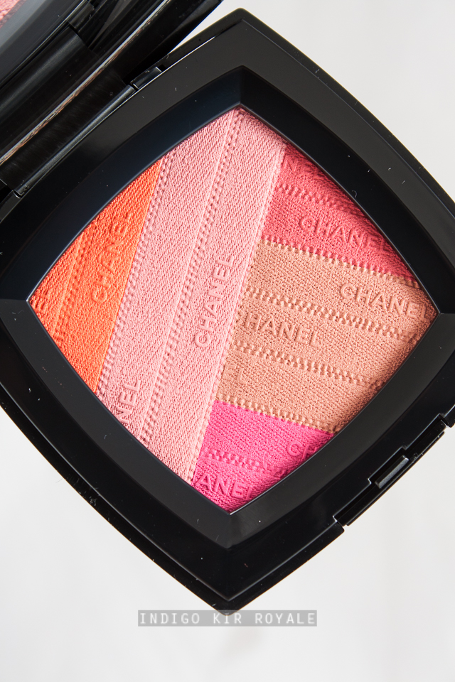
// Sunkiss Ribbon Blush Harmony [limited edition]
A blush of orange, pink, coral, lilac-pink and gold beige in an interlaced-ribbon design.

// Multi-Effect Quadra Eyeshadow in Tissé Beverly Hills (262) [limited edition]
Eye shadow quad palette of lavender, ivory, bright turquoise and aubergine.

// Nail Gloss in Sunrise Trip (683) [limited edition]
Dark purple gel-like fluid texture with high-shine, gloss.

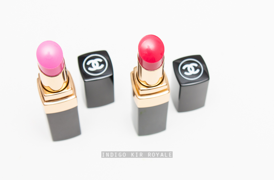
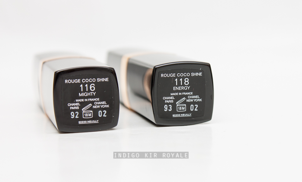
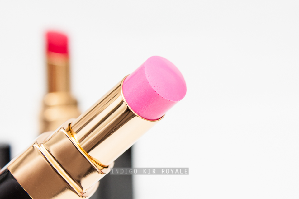
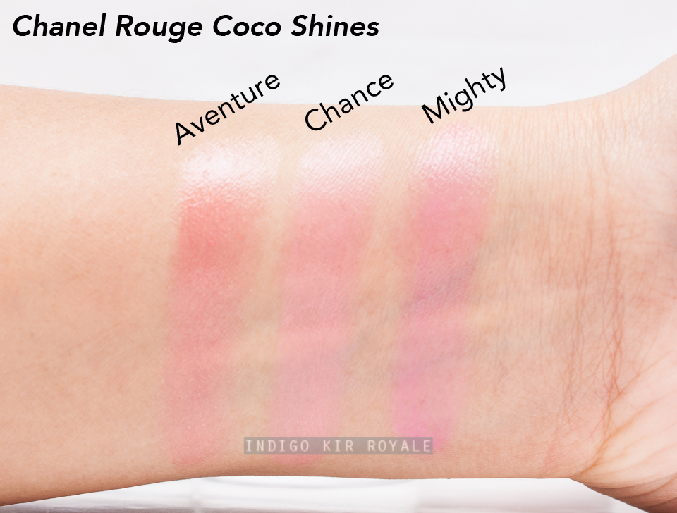
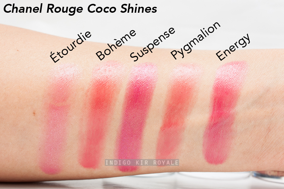
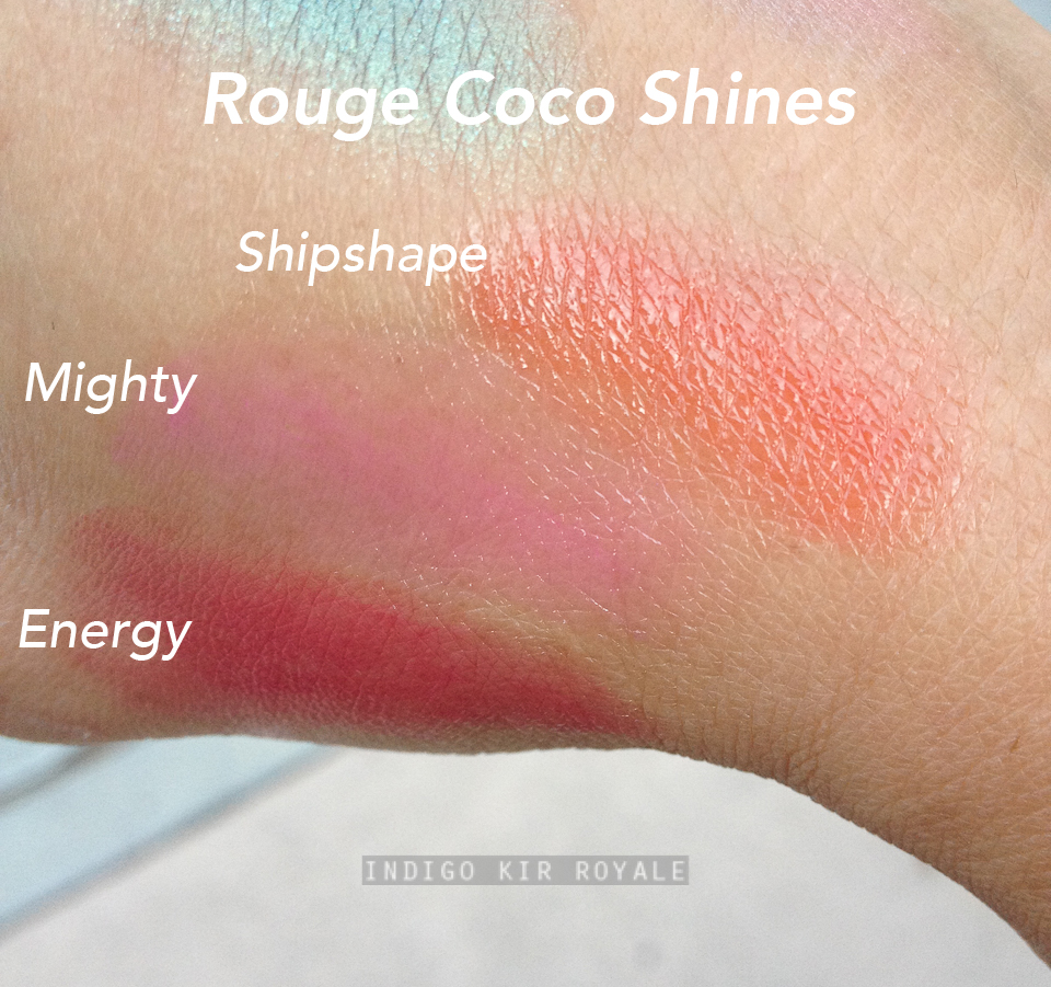
// Rouge Coco Shine in Mighty (116)
Fuchsia hydrating colour lip shine.

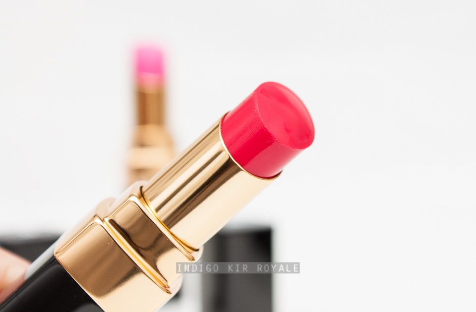
// Rouge Coco Shine in Energy (118)
Raspberry hydrating colour lip shine.

// Illusion D'Ombre in Moonlight Pink (118)  [limited edition]
Beige pink long-wear luminous eye shadow.

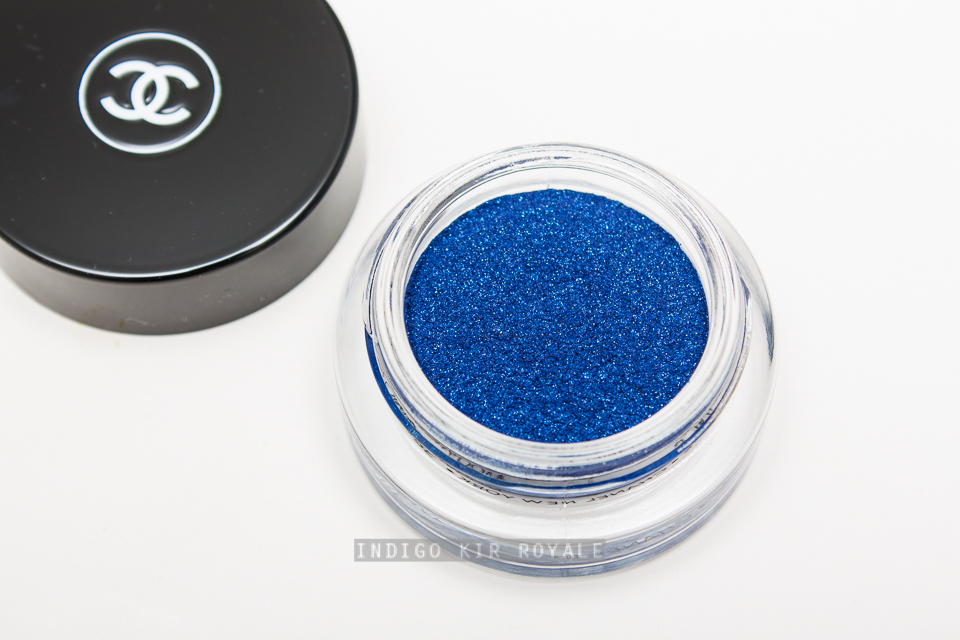
// Illusion D'Ombre in Ocean Light (122)
Bright blue long-wear cream luminous eye shadow.

// Stylo Yeux Waterproof in Fervent Blue (924)
Bright blue long-lasting waterproof eye liner.

Being a lover of bright shades, I really do love this collection even if it seems to have a sort of '80s vibe to it (hehe!) and just could not resist picking up several items. >_< I would have loved to pick up the Illusion D'Ombre in Griffith Green (126) as well. I know it's green and I'm usually averse to it, but this one is actually bright and fun yet wearable, especially if you anchor it with a neutral shade and to add depth (great for a summer evening out).  The brightness of it adds freshness and doesn't accentuate the green undertone of my olive skin, but really makes my brown eyes stand out.   I tried this on in store and walked around all day in it.  I'm not sure, I may just have to go back and get it... aaaarggghhh!  But, the SA have told me that this shade is new and permanent so I won't need to rush.  Apparently only the Moonlight Pink shade is limited editionIllusion D'Ombre.  I have noticed that all the shades on the Chanel U.S. site indicate they are limited, so either the information I've been given is incorrect, has changed, or differs between countries.  If anyone knows for sure, do let me know in the comments below.  Either way, please do consult with your local Chanel counter to confirm! I wouldn't want you to miss out on any of the items!!

I managed to swatch a lot of the items in the collection in store including a few that I didn't purchase, so I will share these with you along with more photos and my reviews of each of the items I purchased as soon as possible.  Stay tuned!


What do you think of this collection?  Any that take your fancy?


SPRING 2016 | CHANEL LES 4 OMBRES MULTI-EFFECTS QUADRA EYESHADOW IN TISSÉ BEVERLY HILLS (262)

Packaging
Above: the sleek, black lacquer of the compact that is also very lightweight and convenient to carry.
Image may be NSFW.
Clik here to view.

The palette comes with two mini sponge applicators, which are very useable and of high quality.  There's also a mirror for on-the-go application.
Above: the product description label on the bottom of the compact.

Shades, Finishes & Application
Image may be NSFW.
Clik here to view.

Clockwise from top left in the palette:
// Lavender (Iridescent)
// Ivory (this one has the most micro-shimmer in the palette)
// Bright turquoise (matte)
// Aubergine (slightly iridescent)

Personally, I wish there was more of a pearl in the shades to give the colours interest and complexity.  This would also help with blending and colour transition.  Usually, more pearlescent shades have more of a buttery texture compared to matte or glittery shades so they adhere to the skin better and blend better without completely disappearing.  However, in this case, the work-around is to use a soft, squirrel-hair brush.

This palette is extremely bold so unless you like to have fun with bright colours and are brave enough to wear it out then this palette is definitely not for you.

For the first day or two that I played with this palette, I was very annoyed with it and couldn't get it to work, especially using all four colours together.  I actually wanted to return it! >_<  However, I think I finally got the hang of it on the third day!  So, it's definitely a palette that you need practice with to see how you can work with the colours to make it wearable for you.  I never bother to look at the tiny instruction booklet that comes with the Chanel quads (I end up throwing them out), but in this instance, I actually found it useful!  So it's worth trying the looks in that booklet to appreciate the versatility of the palette.  These looks range from natural, almond-shaped, intense to a smoky look.

I also discovered in my experimentation which brushes work best for achieving different looks.  It is best to use either a dense, goat-hair flat eye brush (e.g. Mac 239), or the sponge applicator provided to lay the colour on the eyelids.  This gives the quickest and best colour pay off, especially when applying the product dry and then layering to build colour intensity.  I know lots of people don't like the sponge applicators and throw them out, but in this case, they are actually the best tool!  (I actually like to use these sponge applicators now and then and I find the Chanel ones are the best quality).  The alternative is to apply with a dampened brush (or sponge applicator), if you want the colours to really pop.  See the swatches below for the different results you get with the two application methods.  To blend and soften edges, or apply soft colour along the crease, use a soft, squirrel-hair brush.  If you want to have a really intense colour along the crease, then I would use goat-hair brush like the Tom Ford #13 brush or Mac 217). 

Here are a few examples of how I personally would wear the shades:

// The pale lilac lavender and the deep purple; or 
// The turquoise on its own on the mobile lid or as an eye liner; 
// The turquoise on the mobile lid with the ivory in the inner corner and lavender along the crease, then the aubergine in the outer corner for depth.
// The ivory in the inner corner.  The aubergine close to the upper lash line, then the lavender above that along the mobile lid and the bright turquoise along the crease.  To wear the bright turquoise along the crease, I prefer it soft so I would use a soft squirrel brush.  This gives a sheer hint of colour.  I personally wouldn't take it too far above the crease, or use a goat-hair brush though to prevent looking too dated, totally 80s and clown-like.  <Insert picture of Mimi Bobeck from The Drew Carey show> *grin* Of course, if you like that look then go for it! ;-)

Pigmentation & Texture
The pigmentation of the ivory and lavender are OK.  Note these two are soft, pale shades rather than bold intense colours so it's sufficient in my opinion.  However, the aubergine is a tad drier in texture so the colour pay off is a bit sheer.  The bright turquoise is the driest, so it's the sheerest and also patchy when applied.  It's workable though if you follow my brush and application recommendations I mentioned above, but overall, this palette definitely is not of the same calibre in quality as the eye shadow quads that Chanel have released since they've reformulated them in 2014 (though they're not as dry as the original baked eye shadow formula prior to 2014).  I would also highly recommend applying eye shadow first prior to your base or foundation as there is fall-out.

Swatches (Dry)
Below are the eye shadows swatched dry using the sponge applicator provided.  For reference, I currently have medium to tan olive skin (~NC30-35) and the swatches were photographed indoors using a strobe.
Swatches (Wet)
Below are swatches using dampened sponge applicators.
Image may be NSFW.
Clik here to view.
Overall
Very spring and summer appropriate although it does have the risk of being too retro 80s if not applied carefully.  This palette definitely isn't the easiest to work with in terms of creating wearable looks and dealing with dry texture and sheer and patchy pigmentation, particularly with the star colour in the palette.  It takes a bit of getting used to.  So, I'm sad to say that overall, it is a bit disappointing given the high standard of the other quads in Chanel's line-up and the fact that this is a luxury brand with a high price point.  However, if you absolutely love playing with bright colours then you may want to try this in store first before buying to see if you're happy to work with it or not, but I suspect there are probably more affordable options elsewhere.  The colour combination in this palette is unique in my personal collection and I've managed to be able to work with it after some effort, so if it weren't for that I would probably would have tried to return it (although, this is usually not allowed in Australia in a lot of places once the item has been used! >_<).

Just an observation, but I find it interesting that the colours used on the model on the campaign ad below does not represent those in this quad or any of the shades in the Illusion D'Ombres for Spring.  I wonder why!

Hope this review was helpful! :)


What do you think of this palette?  Will you be getting it?


SPRING 2016 | CHANEL SUNKISS RIBBON BLUSH HARMONY

"Exclusive Creation of the SPRING 2016 COLLECTION L.A. SUNRISE. 
A springtime blush harmony that draws its energy from the radiant light of California and its incredible art scene. A light-diffusing blush in shades of intense fuchsia, coral, fresh pink, reddish pink and coppery beige, imitating the coloured ribbons of a California dawn. Comes with an applicator brush." 
~ Chanel.com
Packaging
There's a blush brush provided (with its own black velvet pouch), which is made of natural hair and is reasonably soft.  The hairs are not the finest, so they will pick up a lot of powder so be sure to be light-handed with it!
 The brush is flat and has an angled shape to easily follow the contours of the cheeks.  This is nice to use with a contour powder as well.
The sleek, lightweight, black lacquered compact is the same size as Chanel's Joues Contraste blush compact.  It comes with a black velvet pouch as usual.  Below is the product description label on the bottom of the compact.
Size
You get a lot of product in this compact.  11 g / 0.38 oz to be exact.  Yay! :D
The blush powder is designed with colourful ribbon motif and Chanel logo.  Isn't it gorgeous! *_*  As usual, the compact has a mirror.
 Below are the micro shimmers captured in low light.  You can see that it's just the coppery beige shade that is most iridescent.
Swatches
Below are swatches of each individual shade in the blush harmony.  For reference they're applied on my current summer medium to tanned, olive skin (~NC30-35) and photographed indoors using a strobe.
Below is how the colour looks with all shades mixed together.  It's a very pretty peach pink.  The left has been applied with the brush provided and the right-hand heavy swatch is done with a clean finger. You can adjust the shade by picking up more of the orange, or more of the pinks, or more of the coppery beige using your brush.  I really like that versatility.
Comparison Swatches
Below is a comparison between Guerlain 'Blush G Serie Noire' Powder (a limited edition from Spring 2011) and Chanel's Sunkiss Ribbon Blush Harmony.
Above swatches (L - R): Guerlain 'Blush G Serie Noire' Powder and Chanel Sunkiss Ribbon Blush Harmony.

Pigmentation & Finish
The pigmentation is very good, so a little goes a long way.  The light rose pink has reasonable pigmentation, but gives a softer effect compared with the rest of the colours, which offer strong pops of colour, particularly the orange.  The blush has an overall satin finish so it gives colour to the cheeks with a touch of radiance.

Texture & Formula
The powder is talc and mica-based.  The texture is soft, quite buttery and smooth.  It blends out easily and evenly on the skin.

Scent
There's a fairly strong floral scent from the pan, but isn't noticeable to me after applying on the cheeks.

Made in France.

Ingredients
Click on the image above to enlarge.

Availability
Limited edition.  Available now in Chanel beauty counters in select Myer and David Jones stores and Chanel Boutiques across Australia.

Bottom Line
The powder is not only pretty to look at, but it consists of gorgeous spring/summer colours that can be worn together or adjusted for a variance in colour.  Love the versatility it offers along with great pigmentation and formula.  All-in-all, this is definitely a must-have from this year's spring collection - especially for the Chanel makeup collector.  Get it while you still can.


UNBOXING | FIRST MECCA BEAUTY LOOP L3 BOX OF 2016 & BIRTHDAY GIFT

The first Beauty Loop Box of 2016 is now available from Mecca Cosmetica for all Beauty Loop members. :)  Here's what's in store for those who are Beauty Loop Level 3 members.
Ren Satin Perfection BB Cream (3 ml deluxe sample)
"Silicone-free BB cream that leaves skin looking flawless, even-toned and luminous with a perfect non-oily, satin finish.  Perfect for all skin types and self-adjusting to fit most skin tones".

Nars Blush - Orgasm (3.5 g mini size)
Peachy-pink blush with golden shimmers.  The cult-classic, best-selling blush from Nars.

Chantecaille Brilliant Gloss - Love (1.5 ml mini size)
"Enriching lipgloss formula that combines a long-lasting hydrating finish with incredible colour for a perfect pout".

Look how adorable this cute, little mini lip gloss is!  It has a brush applicator.  Gotta love minis! ^_^
NEW By Terry Liftessence Trio (Global Serum, Daily Cream, Eye Contour) (Sample Sachets)
"The Liftessence collection contains active Ruby Rose native cells that deliver high performing anti-aging benefits.  Skin is regenerated, hydrated, firm and lifted."

Overall
I'm loving what's inside this beauty box!  I'm very excited to try the brand spanking new By Terry Liftessence skincare range (it's so new that the stock for purchase hasn't even arrived yet apparently!).  Who doesn't love a mini blush and mini lipgloss in pretty, universally flattering shades?!  And, although I'm sure everyone and their dog has one or more Nars Orgasm blushes in their stash, I think most would still be pleased to find another one in a cute mini size - either to gift or to keep! ;-)  And, I've not tried the Ren BB Cream before, so that's something else to look forward to.  Overall, this box has a great selection of fairly high-end brands worthy of being included in a Beauty Loop Level 3 box.  Very lush indeed. ^_^

Mecca Cosmetica Hands On Transforming Hand Cream (Full size 100 ml)
This is the birthday gift I received for my upcoming birthday.  Surprisingly early, well not that early as it's only a couple of weeks away and I only just realised it myself!  >_<  Gosh, time flies!!!  #oldfart  :P  Can't get enough hand cream these days, especially when you're another year older... *sigh*  Ha!  And, yay for the full-size.  Anyway, thanks Mecca!  It's nice to get a birthday gift in addition to the four beauty loop boxes every year, especially when one spends way too much money there already... LOL.  It'd be nice to get a different brand for the birthday gifts, too though (not just Mecca), but I suppose they have to promote their own brand somehow.  What do you think?


What's in your Beauty Loop Box?


SPRING 2016 | CHANEL ILLUSION D'OMBRE IN MOONLIGHT PINK, OCEAN LIGHT & GRIFFITH GREEN AND STYLO YEUX WATERPROOF IN FERVENT BLUE, PURPLE CHOC & PACIFIC GREEN

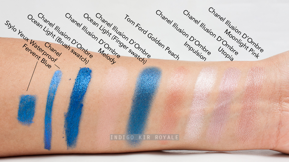
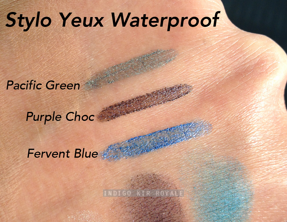
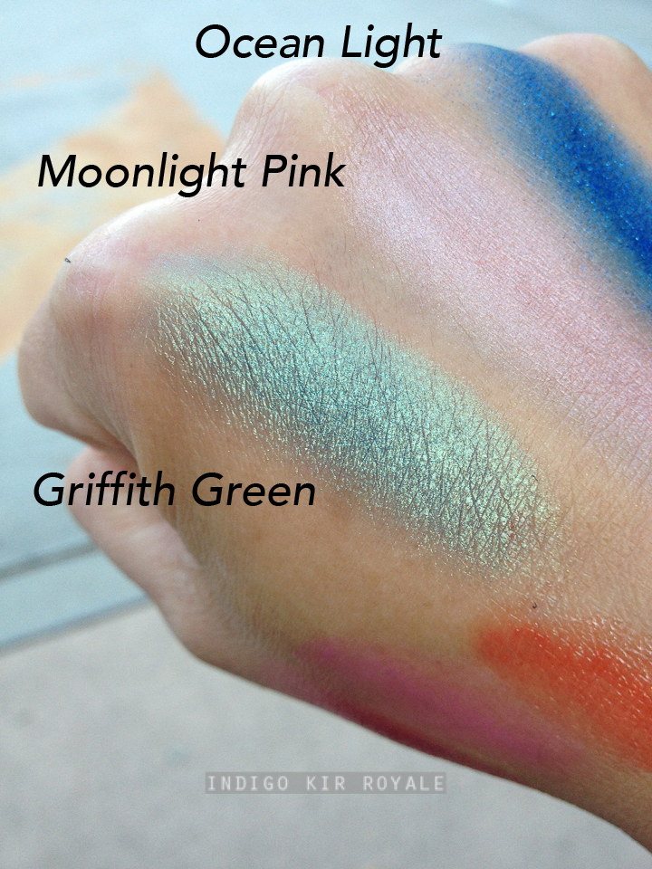
There are three Illusion D'Ombre Eyeshadows in the Chanel Spring 2016 "L.A. Sunrise" collection: Ocean Light, Moonlight Pink and Griffith Green.  I purchased the first two, but I've also got swatches of Griffith Green down below along with my quick thoughts on it since I tried it on my eyes in store.  There are also three Stylo Waterproof Eyeliner Pencils in the collection: Pacific Green, Purple Choc and the one I purchased - Fervent Blue.  I'll share my thoughts and swatches of all three down below.  (Click here to see the rest of my picks from the collection with links to individual reviews).

Illusion D'Ombre in Ocean Light
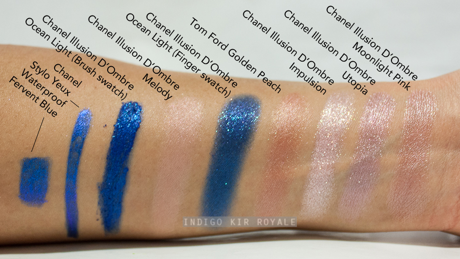
Ocean Light is a very bright blue with bright turquoise shimmer.
Illusion D'Ombre in Moonlight Pink
Moonlight Pink is described as a "beige pink" and is a limited edition shade.  The softness of the colour and subtle sheen gives it that overall "moonlit" effect.
Stylo Yeux Waterproof Long-lasting Eyeliner in Fervent Blue
Like Ocean BlueFervent Blue is stunningly vivid.  The latter is slightly lighter and not as sparkly.  Fervent Blue definitely a blue eyeliner that stands out as opposed to many that just "gives a hint of colour"!
There's a tiny little sharpener at the end of the pencil.
Below - a closer look at the sharpener.
Swatches & Comparisons
Here are some swatches and comparisons to hopefully give you a point of reference should you have any of the shades I've swatched.  As you can see, I don't have anything close to Moonlight Pink.  I don't own anything close to Ocean Light or Fervent Blue either.  It took many layers to give the finger swatch shown for Ocean Light.  As you can see, it's still not as vibrant as how it appears in the pot unfortunately!  Obviously, it took much less effort when using the brush applicator provided, but you would need to blend that all out with either a finger or blending brush.
Below are how the swatches look under low light with their shimmers.
Below are swatches of the three Stylo Yeux Waterproof pencils in Pacific Green, Purple Choc and Fervent Blue, which I took under natural light using my phone camera.
Image may be NSFW.
Clik here to view.

The colour and shimmers are gorgeous, but the formula is a little disappointing in that it does have a bit of "slip" to it so the pigment slides and can appear patchy and uneven.  Actually, all three of the Stylo Waterproof Pencil shades in the collection applied similarly - not just Fervent Blue.  You may notice this by the way they swatched above.  Fervent Blue is the only pencil I've tried and tested on my lash line (several times actually), and although it looks a bit patchy when you look real closely, from a distance you can get away with it, because of the shimmers that help detract that flaw.  (Note, I never use eye liner on my water line due to sensitivity, so I can't say how these perform when used in that regard).

Below are swatches of the Illusion D'Ombre in Griffith Green, which I took under natural light using my phone camera. 
Below, Griffith Green in full sun to see its shimmers in all its glory!
Below: Griffith Green, Moonlight Pink and Ocean Light in natural lighting.  You can probably see that Ocean Light is less pigmented and didn't swatch as evenly compared with the other two.
I used my finger to apply Griffith Green on my eye lids at the counter and I must admit, it did take quite a few layers to build the colour intensity on my medium to tanned skin, but not as much as Ocean Light did.  This is because the texture and formula is quite light, super fine, smooth and cushiony and not wet/sticky/tacky, so only the thinnest layer tends to go on at a time.  So, it takes a bit of patience and effort, but the result is stunning. :)

Overall
Chanel collectors may wish to check these out for the bright colours, but otherwise, the formula of the Stylo Yeux Waterproof pencils in this collection and Illusion D'Ombre in Ocean Light are a little bit of a let-down for what we expect from a luxury brand even though they are "workable". Chanel Illusion D'Ombres are among my favourite eye shadows, but Ocean Light is the first that has disappointed me (and hopefully the last!).  Similarly, the Chanel Stylo Yeux Waterproof Eyeliner pencils are usually among my top eye liners of all time, but the shades in this collection just didn't cut the usual mustard.  What happened?!  :(  Moonlight Pink Illusion D'Ombre and Griffith Green are the only eye products in the collection that perform well in terms of pigmentation and smooth and even application, so I recommend checking either/both these out.  Moonlight Pink is nice if you want a subtle nude colour on the lids with a bit of a "moonlit" sheen effect on its own or as a base.  Griffith Green is a bright green stunner and that's coming from someone who is normally averse to green eye shadow!  I also think it's slightly more wearable than Ocean Blue, especially when brown eye shadow is added in the outer corner for depth.  I would have purchased that too if only I had an unlimited budget. ;)


DO NOT REPUBLISH CONTENT OR PHOTOS WITHOUT PERMISSION


SPRING 2016 | CHANEL ROUGE COCO SHINES IN MIGHTY (116), ENERGY (118) & SHIPSHAPE (114)

Image may be NSFW.
Clik here to view.
Above: Mighty (left) and Energy (right)
Chanel Rouge Coco Shine lipsticks are among my favourite lipstick formulas so it was hard to resist picking up two of three brand new shades from the Spring 2016 "L.A. Sunrise" collection.  I purchased "Mighty" (116) and "Energy" (118).  A bright cool-toned pink is my weakness so of course "Mighty" was a no-brainer for me.  "Energy" is a raspberry pink and it has enough pink in it for my liking as it helps brighten my face.  The third shade that I didn't pick up is "Shipshape" (114) which is a bright coral red.  I have swatched all three below. :)

Chanel Rouge Coco Shine in Mighty (116)
On My Lips
For reference, I have naturally, blue-toned pigmented lips particularly along the upper lip line and the shades seem to give just enough colour pay off to even the lips out fairly well.
Comparison Swatches
All swatches were photographed indoors using a strobe and applied on my current medium to tanned olive skin (~NC30-35).
Chanel Rouge Coco Shine in Energy (118) 
On My Lips
Comparison Swatches
I love both shades, but I must say that "Mighty" is the one I've been reaching for the most.  The formula of the Rouge Coco Shines is lightweight, smooth, creamy and moisturising - a bit like a lip balm, but has more slip to it and not waxy.  It feels nourishing while it's on the lips, but doesn't really leave my lips feeling nourished once it has worn off, so I wouldn't use it to condition your lips unless you keep reapplying throughout the day.  The pigmentation is decent enough as far as sheer lipsticks go, but obviously doesn't last very long so you need to reapply.  I actually don't mind this as I find it quite addictive to keep reapplying - very moorish! :)  And, it's great for every day wear and it's easy enough to apply without a mirror.  Initially, I was worried that the bright, slightly white/pastel-toned "Mighty" would apply unevenly as I sometimes find with such colours, but I'm very happy to report that the pigment applies smoothly and evenly on the lips - for all three shades actually!  

Swatches of Shipshape, Mighty & Energy
Below are swatches of all three shades including Shipshape (114) - photographed using my phone camera in natural light.
Overall
I highly recommend checking these out from the collection as they will serve as great everyday staples.  It's also a great and easy way to wear bright colours without it being too much due to the sheer, but slightly buildable finish.  I'm sure I will definitely get a lot of wear out of the two I picked especially, Mighty.

Availability
Out now at Chanel beauty counters in boutiques and select Myer and David Jones stores across Australia.


CHANEL 2016 | CHANEL NAIL GLOSS IN SUNRISE TRIP (683)

"The limited-edition creation of the SPRING 2016 COLLECTION L.A. SUNRISE is a stunning gloss nail polish with a translucent texture and a mirror effect. Its deep purple shade, enriched with a glossy effect, dresses nails in intense shine." 
~ chanel.com
All Chanel nail polishes come in the square-shaped glass bottles. The square cap at the top can be removed and used to rest your finger tip on as you apply the nail polish.
The applicator brush is thin allowing for precise application. It makes it particularly easy for those with little or narrower nails.

On My Nails...
Below are shots of Sunrise Trip on my nails in two coats (no base or top coat used). For reference, I have medium to tan, olive (~NC30-35) skin and all images were photographed indoors using a strobe.
Above: You can see the nail line a bit due to the translucent formula, but it doesn't make your nails look "unfinished" or odd at all as it has this glossy, translucent finish all through out the nails.  It just looks beautiful!
I adore everything about this "nail gloss".  The formula is excellent.  It applies evenly in two coats.  It wears beautifully.  I'm currently on the fifth day of wear and so far, no chips at all, so I suspect this could go on for more than a week with no problems!  (I find that most Chanel nail polishes stay on my nails for 7 days with little to no chipping).  The colour isn't particularly unique, but the finish is just stunning with its slightly translucent, gel-like look and amazing glossy shine.  It really does remind me of a highly pigmented lip gloss!  Although the shade is dark, the translucent, glossy finish gives it "lightweight" feel and a fun edge that definitely makes it appropriate for spring.  It's kinda like wearing a dark purple, but sheer chiffon blouse in the spring. ;)

Size
13 ml / 0.40 fl. oz. of product.

Verdict
Sunrise Trip is undoubtedly, a must-have item from the Chanel 2016 Spring "L.A. Sunrise" Collection.  It has a gorgeous, unique finish!  I hope Chanel come up with more nail gloss shades in future.

Availability
Limited Edition.  Out now at Chanel beauty counters in boutiques and select Myer and David Jones department stores.


[ MY PICKS ] DIOR SPRING 2016 | GLOWING GARDENS COLLECTION

"SPRING FLOWERS

Dior cultivates the art of a beautiful glow in what are now considered must-haves, inspired by the techniques of professional makeup artists and the products they use backstage, like Lip Glow, the Colour Reviver Lip Balm. This spring, Peter Philips, Creative and Image Director for Dior Makeup, reinterprets the art of a gorgeous glow with a luminous makeup collection that teams new Backstage Pros essentials with eyeshadows and lipsticks in colours inspired by the flower gardens of Granville."

~ Dior.com


Here are my picks...

// Diorshow Colour & Contour in Iris (157) [Limited edition]
This is a dual-ended pen consisting of an eye shadow crayon and an eye liner.  There are 5 shade combinations available in the collection.  I picked "Iris" (157) which has a very shimmery, purply grey shadow and midnight/navy blue liner.  The other shade combos are "Water Lily" - a pastel green eye shadow and chlorophyll liner, "Orchid" - a luminous peach shadow and tobacco eye liner, "Twig" - a warm platinum shadow and brown liner, and "Hortensia" - a delicate lilac shadow and violet liner.  All the eye shadows have a very shimmery to frost finish.

// Dior Addict Lip Glow in Lilac (005) [Limited edition]
A lip balm that reacts to the unique chemistry of your lips to give a natural flush of custom pink that suits your skin tone.

// Diorshow Fusion Mono in Equinoxe (541) [Limited edition]
A weightless, cushiony textured cream eye shadow in a brown-toned champagne with a very sparkly finish.

// Dior Vernis in Bleuette (301) [Limited edition]
A baby blue nail polish with a hint of aqua green and a cream finish.  The other three shades in the collection are "Pivoine" (shimmering coral with a jelly finish), "Garden" (pale chartreuse yellow green) and "Lilac" (mid-tone cool lilac pink - looked much more pink than lilac to me).

As much as I love highlighters, the two in the collection just didn't grab my attention enough to want to buy any of them (I own many!).  If you don't own similar shades already they might be worth a look as they do look pretty and applied smoothly based on my swatches at the counter.  I also didn't get any of the two eye shadow palettes as pastel shades don't suit my medium to tan skin tone.  There are several other items in the collection including a blush, two Rouge Dior lipsticks, a few Rouge Brilliant (lip balm glosses), Rouge Dior Baume lipsticks, Dior Addict Lip Glow liner, Diorshow Waterproof Pro Liner in taupe and a Dior Addict It-Lash.

Meanwhile, I will post my thoughts and swatches of my picks soon if you're interested. :)

Have a great week! x


Did you pick up any from this collection?


DO NOT REPUBLISH CONTENT OR PHOTOS WITHOUT PERMISSION


DIOR SPRING 2016 | DIOR LIP GLOW COLOR REVIVER BALM IN LILAC

Image may be NSFW.
Clik here to view.
Image may be NSFW.
Clik here to view.

Image may be NSFW.
Clik here to view.

This is the first Dior Lip Glow I've tried - I actually purchased one quite a while ago, but I haven't been able to find it! >_<  So, it's a good excuse to buy it in this limited editionLilac (005) shade from Dior's spring collection. ;)  I can now really appreciate why a lot of people have loved this product over the years.  I've been using it most days and always keep it in my hand bag or pocket when I'm out and about.  The formula is lush and I do find myself applying and reapplying it a lot throughout the day as it feels so good and nourishing on the lips.  I apply it on its own or underneath lipstick.  It has a slight peppermint flavour and scent to it, which to me, is reminiscent of the Burt's Bees Tinted Lip Balms, but not as strong.

The Lip Glow range is designed to bring out one's natural lip colour, and it's one of those that reacts to the chemistry and moisture level of your lips to produce a colour that is customised to suit your skin tone.  On my naturally, cool-toned pigmented lips, the colour appears more pink with a slight reddish undertone to it.
Image may be NSFW.
Clik here to view.

It's pretty, but I kind of hoped that the lilac would show on me.  For reference, I currently have medium to tan olive skin (~NC30-35).  It probably does on other people depending on the chemistry of their lips I suppose.  Nonetheless, I've been really enjoying using it.  It would be interesting to know if and how the colour it gives me differs when using the other shade of Lip Glow that I purchased, which I believe is Pink (001)...I just hope I can find it!  The Beauty Look Book has comparisons of the Lip Glows on her lips in Pink, Coral (002) and Lilac.
"As if revived from within, the lips are fresh, full and radiant".
Dior says that the formula is enriched with "Wild Mango and Luffa Cylindrica", which aim to "protect and moisturise the lips throughout the day".  In my experience, my lips feel nourished while there is lip balm on it, however I did not find it continued to feel nourished once it wore off.  It didn't feel drier, but it didn't feel more nourished than I thought it might as claimed.  That's my only gripe.

I love the transparent, soft pink lipstick tube.  It's very feminine and delicate.

Bottom Line
A welcome new addition to my everyday staples.  Definitely, a must-have from the collection.


Have you tried this range?  How does it look on your lips?


Viewing all 377 articles
Browse latest View live