Quantcast
Channel: Indigo Kir Royale
Viewing all 377 articles
Browse latest View live

THOUGHTS & SWATCHES OF MY PICKS FROM THE MAC ALLURING AQUATIC EXTRA DIMENSION EYE SHADOWS (MINI)

$
0
0
I picked up five of the six new Extra Dimension Eye Shadows from the Mac Alluring Aquatic Collection.  This is my first to purchase this formula from the brand, which can be used wet or dry, and I must say the pigmentation (even when dry), longevity and smooth texture are impressive.  The colours are lovely and the packaging is pretty, darn cool!
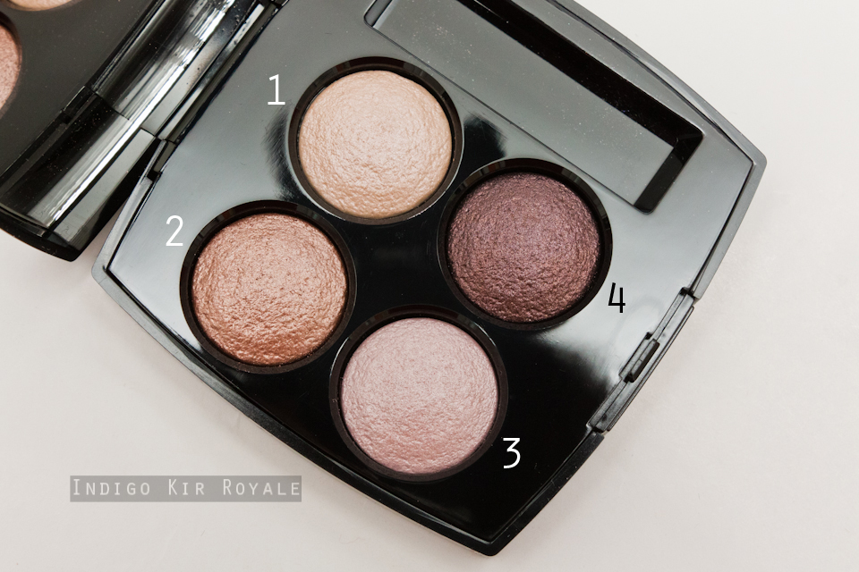
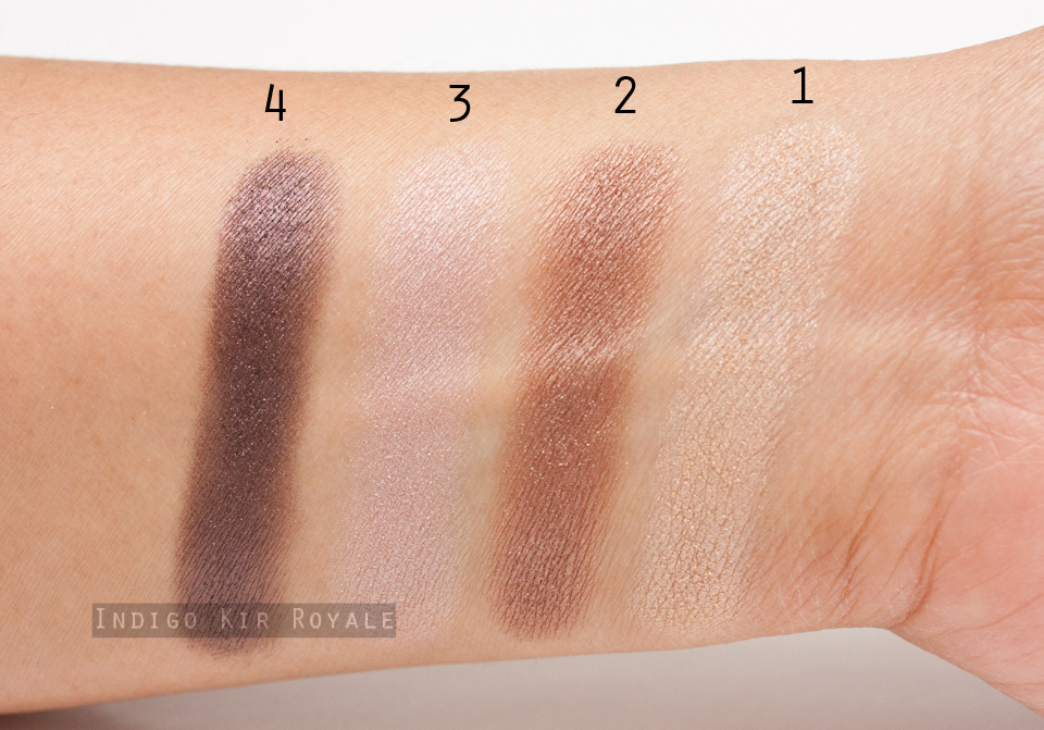
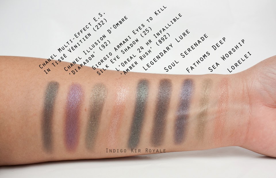
First up is 'Lorelei', which I thought I could give a miss, but surprisingly, I don't have a shade exactly like it and it's really beautiful for every day wear.  I'm glad I picked it up in the end!  It's said to be a "golden beige" - to me, it's a light to medium, copper peach and it has a slight metallic sheen finish.  It probably has the least metallic sheen out of the others here though.  The closest shade I have is L'Oreal 24 hour Infallible Eye Shadow in 'Amber Rush', which is warmer, orange-toned and has a frost finish, so 'Lorelei' is much more wearable in comparison (see swatches down below).
'Fathoms Deep' is described as a "deep blue", but is actually a cool-toned, deep, slightly blackened deep purple with a metallic, shimmery finish.  Some shimmers appear a bright pink purple.
'Soul Serenade' is described as a "deep plum brown".  it's a deep, cool-toned smokey taupe with a slight metallic sheen (not as strong as 'Fathoms Deep'), so it's still a great shade for adding depth in the outer corners of the eyes without being too disco-like.  If you look closely, some of the shimmers in it are plum, but not that noticeable when applied on the eye lids.
'Legendary Lure' is described as a "deep cerulean".  It's a deep, pine green with metallic sheen similar in strength as 'Fathoms Deep'.
Last but not least is 'Sea Worship', which is said to be a "tarnished olive".  I'd liken it to an antique brass with a metallic sheen that's somewhere between 'Legendary Lure' / 'Fathoms Deep' and 'Soul Serenade'.  Pretty.

Below are more close-up photos of each of the shades.
Swatches
Below are the eye shadows swatched dry on my medium, olive (~NC30) skin tone.  All photographed indoors under artificial lighting.  The first set of swatches were taken without a strobe to capture the shimmers.
Comparison Swatches
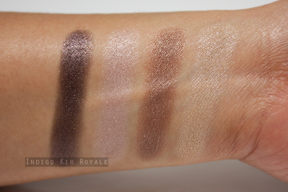
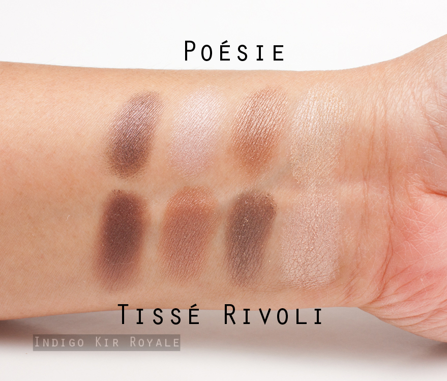
Below are a few comparison swatches photographed with a strobe. I compared them to the closest shades I have in my collection, which turned out to be not that similar. /:-\    These include the bottom right shade of the Chanel Multi-Effect Eye Shadow Quad in'Tissé Vénitien' (232) [reviewed here], Chanel Illusion D'Ombre in 'Diapason' (92) [reviewed here], Giorgio Armani Eyes to Kill Silk Eye Shadow in #25, and L'Oreal 24 Hr Infallible Eye Shadow in 'Amber Rush' (892).  Unfortunately, I couldn't find anything close like 'Legendary Lure' so I didn't have a comparison swatch for that.
All the shades I picked up in the new released Extra Dimension eye shadows were smooth and are easily applied even with a clean finger!  Gotta love that. :)  They also lasted all day on my eye lids which have normal (neither oily or dry) skin condition without a primer.

RRP & Size
AUD$37.00 for 1.3 g / 0.04 oz of product each.

Availability
Out now.  Limited edition.  Some may already be out of stock - typical of Mac releases!  Hurry and check your local Mac counter.

Bottom Line
Simply beautiful.  Grab at least one (if you can manage only one LOL) before they're gone!  But, if I had to pick my favourite shades, they would be 'Legendary Lure', 'Sea Worship' and 'Lorelei'. ;)

Hope this was helpful.


Thanks for looking. :) xo


MAC ALLURING AQUATIC NAIL LACQUER IN 'SUBMERGED'

$
0
0
I welcome my first ever and only nail polish from Mac - 'Submerged'. :)  This is one of three new, limited edition nail polish shades from Mac's Alluring Aquatic Collection.  'Submerged' is described as a "dark teal chrome".  In the bottle, it is an interesting and lovely mix of dark, deep sea goodness - purple, deep blue, blue-green and chrome micro-shimmers.  It's mysterious and mesmerising - very fitting indeed for this "alluring aquatic" colour collection.  On the nails in direct light it appears more blue-green, and in indirect light it emerges more as a deep blue with a hint of purple.
It comes with a thin applicator brush for precise application.
On My Nails...
Below is how 'Submerged' looks in 2 to 3 (I applied the second coat a tad thicker) coats against my medium, olive (~NC30) skin tone.  All photographs were taken indoors under artificial lighting and using a strobe.
'Submerged' isn't the easiest of nail polishes to apply.  It goes on very thinly and sheerly in the first coat, but thankfully fully opaque after the second.  It's worth waiting for the first coat to completely dry before applying the second to ensure the brush doesn't drag off and remove the existing layer.  Though tempting (especially for impatient persons like myself), it's also advisable not to have too much on the brush in an attempt to achieve full coverage instantly.  Once that's all sorted, the result should be fairly good (i.e. smooth, even and opaque). :)  I also found it to dry fairly quickly.

I haven't yet worn it long enough to test its longevity, but so far it's only shown barely visible tip wear on the third day.  So I suspect it'll probably have fairly decent wear time of at least 5 days.

Overall
'Submerged' is both alluring and aquatic!  Love it.  I think it's a must-have from the collection.  Oh and have I mentioned the awesome packaging already?! ;)

Hope this was helpful.


Thanks for looking. :) xo


Did you pick up anything from this collection?  Do you have a favourite Mac nail polish recommendation?  Do share in a comment below.  Would love to hear. :)


CHANEL LES BEIGES HEALTHY GLOW MULTI-COLOUR SPF15 / PA++ IN NO. 01

$
0
0
ABOUT
"Lightweight, multi-stripe powder offers a palette of effortless effects. Acts as a highlighter, sculpting powder, bronzer and blush — all with a sheer, natural finish and broad-spectrum sun protection.

Formulated with a complex of rose and cotton extracts, HEALTHY GLOW MULTI-COLOUR becomes one with the skin to soothe it and protect it against environmental damage.  
Contains UVA and UVB filters: SPF 15/PA++"

NO. 1 SHADE SELECTION
Above:  The powder palette up close.  The top strip consists of a very pale highlighter, which in the pan appears to have very subtle micro-shimmers (not noticeable on the skin though).  The middle strip is a light to medium, yellow-toned, matte contouring shade and the bottom stripe is a very, pretty soft, warm peachy pink blush with a satin to matte finish.  It gives the cheeks a fresh, brightening, youthful flush of colour.
Above: the palette photographed in low light without a strobe to capture the very subtle micro-shimmers in the highlighter.

 I was pleasantly surprised that the blush in particular had pretty good pigmentation.  Overall, the colours are true to pan and maintains the same throughout wear.  I found that the blush works particularly well with my current winter skin when I'm a couple of shades lighter.  The effect is a soft, natural, warm pink flush against my medium, olive (~NC30) skin tone.   It's my favourite part of the face palette. :)  The contouring shade, however is a little too light for my skin tone, but does work fine to give a subtle warming colour to my skin.  The highlighter is also extremely subtle.  I'm still very happy I chose this No. 01 shade as I'm really enjoying the blush in particular.  It is so flattering!

All three products can also be swirled together as an alternative, and applied all over the face as a setting powder (with a slight hint of warmth and glow) on my medium complexion.  It's great to touch up with as well to refresh the skin and remove any excess oil that develops throughout the day.

Those who want a deeper contouring shade or those with deeper, warmer skin tones would be better suited to the darker and much warmer No.02 palette.  I personally found the No.02 palette too warm for my liking so I didn't pick it up.

TEXTURE & LONGEVITY
The texture is exquisite.  It's the finest, smoothest and most lightweight of powders, that makes for effortless and flawless application.  It's so fine, that the powder particles are imperceptible on the skin and you are left with a beautiful, natural flush of warmth, colour and glow.  I found the blush in particular (since it was the most noticeable on my skin tone), stayed put throughout the day from morning through 'til late in the evening with only subtle fading.  This experience is based on my current, normal to dry winter skin tone and in cold, dry weather conditions.  Overall, I'm pretty happy with this as I don't need to touch up!

APPLICATION
"The three shades can be applied separately or together with the half-moon brush on bare skin or over a day cream, LES BEIGES ALL-IN-ONE HEALTHY GLOW FLUID or foundation. 
• Mix the three shades and apply with the RETRACTABLE KABUKI BRUSH to entire face for a radiant healthy glow.
• Apply the light shade as a complexion highlighter to areas which catch the light: brow bone, top of cheekbones and the rounded area of the forehead.
• Apply the blush shade to cheekbones with the half-moon brush to revive the complexion.

Adapt the application to suit your mood. "

PACKAGING
Above: the outer pale beige box packaging.
Above: the traditional black velvet pouch with the Chanel logo that can be used to house the palette in during storage or travel.  I don't usually use these though as they easily attract any stray powder from the compact after use as well as any lint and dust.  (I do sometimes re-purpose them though - e.g. for storing ear phones as shown in this previous post ;) ).
The palette is a pale beige - the timeless and exclusive beige that Gabrielle Chanel loved so much.  This is in contrast the signature Chanel black lacquer and it's consistent with the Les Beiges range of products.
Above: the product description label on the bottom of the compact.
Flat, moon-shaped brush with natural bristles is included and I actually find this one pleasingly softer than the usual Chanel brushes included in compacts.  It's also the perfect shape for blush, contouring and highlighting due to the flat and slightly curved shape that fits with the contours of the cheeks.  And it's easy enough to just select one of the powders (e.g., just the blush part) because it's thin.  I've been using this brush every single time for application as it's proven to be quite useful and convenient. :)
Above: Mirror included for on-the-go application and touch ups.

SWATCHES
As you can see, each of the powders in the palette when swatched individually are quite soft.  These were photographed indoors under artificial lighting and using a strobe.
 Below is an even softer effect when all three products in the palette are mixed together such that it's barely noticeable on my medium, olive skin tone - but makes for a lovely setting powder as mentioned.
SIZE
11 g / 0.39 oz of product.  The compact itself is the same size as the permanent Chanel Les Beiges Powders (see them reviewed here and here).

INGREDIENTS
AVAILABILITY
Out now in Australia and internationally. Limited edition release as part of the Reflets D'été De Chanel (Summer 2014) Collection.

OVERALL
I really enjoy the lightweight, exquisite texture, versatility of the palette, and the gorgeous blush!  If you appreciate a natural, healthy glow and cheek flush, then I personally think this is worth the splurge.


Hope this was helpful. :)


Thanks for stopping by! ^_^ xo


CHANEL ILLUSION D'OMBRE IN 'MIRAGE', 'UTOPIA' AND 'NEW MOON' FROM SUMMER 2014

$
0
0
There are three new Chanel's llusion D'Ombre Long Wear Luminous Eyeshadows from the Reflets D'été De Chanel (Summer 2014) Collection.  I brought all of them home with me. ^_^

'Mirage' (95) - new and permanent, is a beautiful bronze with a metallic sheen finish.  If you tried to get a hold of the limited edition 'Initiation' (827) from the Christmas / Holiday 2013 collection (see review of it here) and missed out, then be sure to grab 'Mirage' as it's a similar shade, but much more appropriate for day wear.  It has a metallic sheen as opposed to the more glitzy silver and golden shimmers of 'Initiation'.  Of course, being permanent there is no rush, but I'm sure if you tried this beauty, you'll wanna take it with you ASAP. :)  It is medium to dark toned so it can easily be used all over the lid on its own, or in the outer corners for depth during the day.  It felt very soft and smooth compared to the more shimmery shades in the Illusion D'Ombre range - making it a breeze to apply and blend with a clean finger.  It also had excellent colour payoff.

'Utopia' (96) - a limited edition, cool-toned, medium to dark lilac with more of a frosty finish and subtle silver shimmers.  It can be applied sheerly or built up a bit more, though not to the same extent as 'Mirage'.  Applying this shade in the inner half of the eye lids pairs well with 'New Moon' in the outer half to give that glamourous summer look.

'New Moon' (97) - is another limited edition.  It's a very glitzy, warm/red toned, coppery brown.  It's quite shimmery - even almost glittery perhaps and you can see it and feel it a little in its texture compared to the others.  Still, it goes on smoothly enough than most, traditional (chunky) glittery eye shadows.  'New Moon' is probably the most popular of the three shades in this collection.  It gives such a stunning sparkle to the eyes in the evening (just on its own on the lids) and so perfect for a sexy, bronzed goddess look.  You know, the one that makes you look like you're on an expensive summer holiday. ;)

All three shades wore well on my eye lids (with normal skin condition) from morning through 'til evening with hardly any fading (and no primer used), but I did notice that 'Mirage' had a little more longevity than the other two.

Swatches 
All swatches below are applied on my medium, olive (~NC30) skin tone.
Comparison Swatches
Above swatches from left to right: Giorgio Armani Eyes To Kill Silk Eye Shadow in #26, Chanel Illusion D'Ombre in 'Diapason' (92), 'Impulsion' (93), 'Initiation' (827), 'Mirage' (95), 'Utopia' (96) and 'New Moon' (97).

Overall
As a fan of this formula, I'm glad I purchased all three, but I would have to say my favourites are 'Mirage' for a faultless, easy day wear and 'New Moon' for an effortless, yet ultra glamourous evening sparkle to the eyes.  I absolutely adore wearing these on their own.  Takes seconds to apply yet they give maximum impact appropriate for the time of day.

Hope this was useful. :)


Thanks for visiting! ^_^ xo


What are your picks from the Chanel summer collection?


CHANEL LES BEIGES ALL-IN-ONE HEALTHY GLOW FLUID SPF 15 - NO. 40

$
0
0

What is it?  It's described by Chanel as an "ultra-light, sheer colour achieves a luminous, healthy-glow makeup result, as it smoothes and evens the complexion. Hydrates skin while providing broad-spectrum sun protection".

This is a new product added to the Chanel's Les Beiges line.  [To see my review of the Les Beiges Healthy Glow Sheer Powders, click here and here.  There is also a limited edition, Les Beiges Healthy Glow Multi-Colour palette for summer 2014, which I've reviewed here].  The available shades will vary from country to country.  In Australia, I believe there are currently three shades available (No. 10, 20 and 30), while in the USA and the UK, there are more shades that go up to No. 60).

More about this product from Chanel:
"With its luminous shades, the ALL-IN-ONE HEALTHY GLOW FLUID embellishes the complexion with a natural glow, as if you just spent an afternoon outdoors. Its light and comfortable formula leaves the skin soft, moisturised and protected against environmental damage. 
• Formulated with a complex of cotton flower and white rose plant cells (Open Air Care Complex), the ALL-IN-ONE HEALTHY GLOW FLUID becomes one with the skin to soothe and protect it.
• Contains UVB filters: SPF 15
• A hyaluronic acid derivative ensures comfort and instant hydration.
Oil-free – Dermatologist-tested – Non-comedogenic – Tested on sensitive skin."
Comparison to Chanel Les Beiges All-In-One Healthy Glow CREAM SPF 30 / PA+++
Late last year, Chanel released a cream version (as opposed to a "fluid") of the Healthy Glow range with SPF 30 / PA+++.  This cream version is still available, but only in Asia (e.g., Singapore and Hong Kong).  I purchased mine from Hong Kong from the Cosme-de.com.  This product is only available in shades No. 10 and No. 20.  I have the latter which I have done a full review of here.  Below are photos comparing the Fluid SPF 15 to the Cream SPF 30 / PA+++ versions.
As you can see, the tube packaging of the Fluid version is slightly larger in size, but both contain 30 ml / 1 fl. oz of product.

You'll notice that the Healthy Glow Cream is labelled as a BB Cream on the back of the tube.

The Cream version has a thicker consistency to the Fluid version, so they are aptly named.  The cream is also has more coverage - light to medium and has a luminous (but, not dewy) finish, whereas the fluid provides a sheer, barely there tinted coverage - also with a slightly luminous, natural finish.

Both products contain a hyaluronic acid derivative, white rose plant cells and cotton flower and sun protection.  However, the cream provides a higher sun protection than the fluid.

Overall, the two products in my opinion do fall under the BB cream category in that they both all-in-one / multi-tasking products that act as your primer, serum/moisturiser, light to medium coverage foundation and suncream in one.  Your choice will come down to your preferred level of coverage and sun protection level.  I think that if you have very dry skin that the Fluid may feel more comfortable than the Cream, but the Fluid is indeed very lightweight, so you may still need something more rich, thick and moisturising underneath if you can be bothered. 

I have been loving mixing both the Fluid in No. 40 and the Cream in No. 20 to give me my perfect, winter shade.  My skin has mostly been in good condition thankfully (normal to dry with only minor blemishes), so the medium coverage is perfect for me, and love that the effect is very natural looking and keeps fairly fresh throughout the day. 

Swatches
Below are swatches of the Healthy Glow Fluid on my medium, olive (~NC30) skin tone. Photographed indoors under artificial lighting and using a strobe.
Below is the Fluid when it is blended out on the skin.
Ingredients
Comparison Swatches
Below are comparison swatches from left to right:
- Chanel CC Cream in 20 Beige
- Chanel Vitalumière Aqua in Beige 30
- Chanel Les Beiges All-In-One Healthy Glow Fluid SPF 15 in No. 40
Below are comparison swatches from left to right:
- Becca Mineral Tint SPF 30+ in 'Medium'
- Chanel Les Beiges All-In-One Healthy Glow Fluid SPF 15 in No. 40

Those with very dry skin and prefer a more dewy, but not shiny finish might prefer the Becca Mineral Tint SPF 30+.
Below: semi-blended.
Below: fully-blended.
Overall
Personally, I prefer a little bit of coverage than this Healthy Glow Fluid can achieve on its own and a higher SPF.  However, by mixing this darker shade in No. 40 with the Cream version in No. 20 that has a greater sun protection - it gives me just the right amount of light to medium coverage and a perfect shade to match my current winter shade.  I also find both shades worn together last all day on my normal to dry skin in this current winter weather.  I love the slightly luminous, natural finish and ultra lightweight feel.

If you have normal to combination skin and are into BB creams or sheer, multi-tasking products, then the Healthy Glow Fluid might be something you might be interested in if it's within your budget.  Otherwise, for more coverage and better sun protection, I would recommend checking out the Cream version if you have fair skin, or other alternative that suits you.


Hope this was useful. :)


Thanks for visiting! ^_^ xo


Are you a fan of BB creams? Have you tried this product? If so, what do you think of it? Do share in a comment below!


DIOR 5 COULEURS EYESHADOW PALETTE IN 264 RIVAGE / VOYAGE TO SAKS

$
0
0
Voyage to Saks (also known as 'Rivage' #264) is an eyeshadow palette of blues and sunset golds released this summer as a limited edition and is exclusive only to Saks.
Above: you can see the name of the palette on the palette label is different from the name on the box.
Colours, Pigmentation & Swatches
The colours in the palette and their corresponding swatches are as numbered below.

1. Gold shimmer highlight (sheer to medium coverage)
2. Light sky blue with the slightest seafoam green undertone (subtle sheen finish).  It has medium to buildable coverage.
3. Royal blue with light blue iridescence (sheen finish).  It has medium to buildable coverage.
4. Light to medium periwinkle blue (sheen finish).  Also with a medium to buildable coverage.
5. White with pale blue undertone (satin finish).  It has a sheer to medium coverage.

All eye shadows felt a little dry in texture, but still applied smoothly and evenly.  The #3 royal blue shade felt the driest in the palette and felt a little coarse in comparison to the others.  You might be able to tell from the swatch of it below that there are some powder particles that have separated from the act of swatching (if that makes any sense!) - see the top and outer edges of the swatch in particular.  As a result, it did not swatch as smoothly and evenly has it could have.
I found it best to apply with the sponge tip applicators provided, a clean finger or a natural-hair, dense, flat brush to really pack on the product and get the best colour intensity.  You only need to blend the edges light-handedly and not too much to avoid removing too much colour.  You may also wish to use a damp applicator to achieve the most colour opacity and apply an eye primer/base underneath.  For me personally, I don't need it as I find the colours bright enough already! ;)

On my normal eye lids (i.e., neither oily or dry) and in cold, dry winter conditions, I found the eye shadows wore fine with only slight fading by the end of the day without a primer.  The vibrancy of the royal blue shade was just a touch lost on my medium, olive (~NC30) skin tone, but then again, a lot of blue eye shadows do that.  Nonetheless, I must say this palette is still one of the more vibrant blue shade combinations I own in my collection.

Overall
Not the best textured eye shadow palette that we're used to with Dior, but the colours are still eye-catching and nautical/summery that I'd still use it - especially, when summer comes round in Australia.


Hope this was useful. :)


Thanks for visiting! ^_^ xo


Have you tried this palette?  What did you think?  What is your fave blue eye shadow?  Do share in a comment below! :)


DIOR MANICURE TRANSAT NAIL POLISH & STICKERS DUO IN 'SAILOR'

$
0
0
'Sailor' (700) is one of three new, limited edition shades released for Dior's Summer 2014 'Transat' Collection.  It comes packaged with a set of transparent stickers that feature the 'CD' logo and white maritime stripes to go with this season's nautical/cruise theme.  'Sailor' is an eye-catching vibrant medium to dark royal blue with a cream finish.  The other two shades released in the collection are'Yacht' (210) - a 'rope beige' and 'Captain' (750) - a 'vibrant red'.
 Let's take a look at what's inside the box...
You get one set of 'Transat Couture Nail Stickers', the nail polish in 'Sailor' and a mini Dior nail file for filing away the excess sticker once it's been applied on the nail.
On My Nails...
Here's what 'Sailor' looks like against my medium, olive (~NC30) skin tone.  It took two coats for full opacity.  I only applied the sticker on my ring finger nail for an accent. :)  [Note, all were photographed indoors under artificial lighting and using a strobe].
Comparison Swatches
As you can see from the swatches below, Dior 'Sailor' has a depth of colour that sits in between Revlon's Top Speed Nail Enamel in 'Royal' (darkest of the three) and YSL's 'Bleu Majorelle' (18) (the lightest of the three).
Application
The nail polish itself applied easily and flawlessly in two coats.  However, I had issues with the nail stickers.  Initially, I found it quite tricky to peel the backing off the sticker!  The plastic backing is fairly thick.  I had to cut around one of the nail stickers first then peel the backing.  It was also a little tricky to then place the sticker onto the nail without getting any air bubbles, especially since my nail bed is curved!  If you do get an air bubble, you can try to smooth it out, but the flaw is still noticeable unfortunately - especially against as deep and vibrant a shade like 'Sailor' is.  Any such flaws can make it look a little naff (not what you'd want, especially from Dior!).  :-(

Overall
Dior 'Sailor' may not be anything unique or complex in shade, but I love blue (it's my favourite colour), so I'm still quite excited by it.  I think it's a classy shade of blue for summer...or winter!  The maritime style stickers add a bit of fun albeit quite difficult to apply without any issues.  Perhaps a stencil would have worked better?


Hope this was useful. :)


Thanks for stopping by! ^_^ xo


NET-A-PORTER BEAUTY HAUL & UNBOXING THE NET-A-BEAUTY BOX | THE SUMMER KIT

$
0
0

Net-A-Porter's one of my favourite online places to shop. ^_^  I've always had good experience with them, and returning or exchanging goods is a breeze. *knocks on wood*  As soon as I got an email about their latest Beauty Box - I had to check it out.  I liked what I saw and I'm a sucker for good value beauty sets.  I'm most excited to try something as luxe as this because it's a great way to try new products without having to commit and invest in individual, full-sized products.  Although, I'm very happy to find that three of the seven products in the box are full-size!  Woot!  So I added the beauty box to cart along with a couple of products from RMS - a brand which I've been keen to try for some time. :)  The package arrived super quickly via DHL and it was only AU$10 (to Australia)!  Gotta love that!

The packaging is just divine.  All their packages come boxed like this (unless you specifically request not to have it at checkout) - see photo above.  However, the Beauty Box also came in the same packaging (but slightly smaller), so I ended up having two of the black, ribboned boxes (i.e. a box within a box)!

Let's start with the Beauty Box.  Here's what Net-A-Porter have to say about it...
"EXCLUSIVE TO NET-A-PORTER.COM. NET-A-PORTER has curated a selection of our favourite summer essentials to bring you this limited-edition beauty box.  This set includes seven must-have luxury products– all perfectly sized for travel - that will keep you looking and feeling your best on a holiday or last-minute getaway.  Quantities are limited."

Let's unbox and take a look at what's inside!
So, inside the larger, black box is the Beauty Box and my two new RMS products packaged well in a clear plastic, zip-locked bag that's lined with bubble wrap.
Below is the little card with details about the Beauty Box contents.
Everything in the Beauty Box is also packaged securely in a similar but much larger, clear, bubble-wrapped bag.
A couple of the Beauty Box items below were bagged individually.
Ta-da!  Here they all are... ^_^
So pictured above from left to right, we have the following Beauty Box products...

Rahua's Ungurahua Oil-enriched Voluminous Shampoo & Conditioner Set (travel sizes of 2 x 60ml / 2fl.oz.)  These are meant to add weightless moisture, body and bounce to your hair.  Just what I need! *fingers crossed*

Eyeko + Alexa Chung's 'Eye Do' Liquid Eyeliner in waterproof Carbon Black (full sized 0.8ml / 0.03oz. - RRP US$19 / AU$27.95).  Hoping this will give my eyes the perfect feline flick ala Alexa Chung style. ;)

A "universally flattering peach shade" (kinda reminds me of Nars' Orgasm with the shimmers in it too!), Hourglass' satin-smooth Extreme Sheen High Shine Lip Gloss in Lush deeply hydrates to prevent cracking and chapping (full sized 5g / 0.17oz. - RRP US$28 / AU$42)

Ren Skincare's Moroccan Rose Otto Bath Oil (travel sized 30ml / 1.02fl.oz.)

Kahina Giving Beauty's 'Fez' Body Serum to "nourish dry, tired skin with responsibly sourced Argan Oil and Vitamin E" (travel sized 15ml / 0.5fl.oz.)

SACHAJUAN's Hair Repair formulated with Ocean Silk Technology - a unique blend of Sea Algae-derived proteins and minerals (travel sized 100ml / 3.4fl.oz. - RRP US$16) - designed to "intensively condition stressed and damaged strands".

Verso's retinol 8-infused Day Cream (full sized 50ml / 1.69fl.oz. - RRP US$100 / AU$134!!!)

Below are photos of the products with respect to my slightly smaller than average hand - just to give you more of an idea of the sizes.
Hourglass Extreme Sheen Lip Gloss in 'Lush' + Swatches
Below: swatches of the gloss on my medium, olive (~NC30) skin tone.  Photographed indoors under artificial lighting and using a strobe.
I agree, this is definitely universally flattering.  This will definitely join my easy, every-day wear lip gloss collection...so into the makeup-bag it goes! ^_^

One more to show the glossiness factor. :)
RMS Beauty Product Purchases
Now for the RMS beauty products which I purchased in addition to the Beauty Box...  RMS is an organic makeup line.  I purchased one of their most loved products - a highlighter called the 'Living Luminizer' (this is one of the key products used on J.Crew models - I love their makeup, and who doesn't want that "J.Crew Model Glow"?!).  I also picked up their Lip Shine in a gorgeous pink shade called 'Sublime'.  I cannot wait to try these! >_<
I highly recommend the Beauty Box!!!  It's an amazing value for money set full of the ultimate luxe beauty products - three of which are full-sized and the rest are decent travel sizes!  All for only AU$50!!!  Oh-em-gee!!!  I'm tempted to get another!  *sigh*  It's limited edition as mentioned, so be sure not to miss out.

Anyway, I hope you enjoyed my "haul reveal" and unboxing beauty box post!  I'm SUPER excited to try everything here...and share my thoughts of some of them with you.

It's FRIDAY tomorrow!!  WOOHOO! ^_^

Thanks for stopping by! ^_^ xo


What have you hauled recently from the beauty counter?  Have you tried any of the products I purchased above?  Let me know what you think of them in a comment below. :)


DO NOT REPUBLISH CONTENT OR PHOTOS WITHOUT PERMISSION


NOTD | MY CONTINUED OBSESSION WITH MANICURE INSPIRED BY CHANEL SUMMER 2014

$
0
0
How I Created the Look
Step 1: Apply two coats of Chanel Nail Colour in 'Eastern Light' (re-promoted nail colour for the summer 2014 collection [see a review of it here]) all over each nail.  Concentrate more on getting the outer edges of the nails right as this is what will be seen.

Step 2: Once 'Eastern Light' has dried completely, apply two coats of Le Métier de Beauté's 'Wild Ginger' (a bright, almost neon, medium to dark orange) from the centre of each nail outward making sure to leave a gap all the way around the edge of the nail except for the tips.  I only left a fairly thin gap when I applied mine here, but I find that the larger the gap, the more striking the look is due to the contrasting colours. :)  [Note, 'Wild Ginger' is no longer available, but bright orange you have will be perfect].

[The Chanel promo images used the orange shade in 'Mirabella' (623) which is a limited edition from this summer 2014 collection.  However, I did not purchase this].

Step 3: Apply a top coat of your choice for extra longevity and shine.  I chose Guerlain's Le Top Coat Gel'.
Other Colour Combos
To see lilac on white manicure combination - click here.
To see a bright fuchsia on white manicure - click here.

Hope this inspires you!

Thanks for stopping by! ^_^ xo


What's your current favourite nail look?  Would love to hear in a comment below. :)


DIOR SUMMER 2014 | DIORSKIN NUDE SHIMMER INSTANT ILLUMINATING POWDER IN 'ROSE/PINK' (001)

$
0
0
ABOUT
___________________________________________________________________________________
"The nude skin effect glowing with a halo of freshness and light.
Subtle combination of mother-of-pearl and pigments, Diorskin Nude Shimmer can be used as a light veil on the rounded areas of the face to catch the maximum amount of light and create a naturally dazzling glow."


PACKAGING
___________________________________________________________________________________
The compact is ultra luxurious looking.  Very typical of Dior!  It's a round compact with a very reflective, mirror-like surface.  The top of the compact features the famous Cannage pattern, which is found on Christian Dior's Napoleon III chairs, and is also used on the iconic Lady Dior hand bag.  The compact is made of plastic, so it's not very heavy at all.  I prefer this as it's more convenient to carry and travel with.  So it's a very practical, convenient design without sacrificing the luxe, expensive look.  :)  There's a convenient mirror on the underside of the compact lid.  The compact has a secure magnetic closure.

The compact comes with a velvet pouch (not pictured - sorry!) and a cute, mini kabuki brush, which also has a velvet cover. :)  Great for keeping in a small pocket in your handbag for on-the-go application.  The bristles are made of soft, natural hair - excellent for buffing the powder onto the skin without the harshness.  It's quite dense, too.  The brush handle is also the matching reflective silver finish and the Dior 'CD' logo is embossed on the bottom.


COLOURS
___________________________________________________________________________________
The palette contains four colours: white, blush pink, medium pink and a medium to dark dusky pink.  You can use the lighter tones or darker tones by brushing your applicator diagonally across the palette.  Or, you can just mix all shades together.
When using the upper right or bottom left quadrant of the powder, the result is a medium to deep rose  blush shade.  Using the upper left or bottom right quadrant gives a very pale pink highlighting shade.  Mixing the entire palette together gives a light to medium pink.

As you can see in the last photo of swatches below, the overall effect of the shades are quite soft and natural.  You can build it a bit more, but I don't recommend you apply too many layers because the colours will still maintain their medium and soft shade.  It's also a highlighter, so if anything, the more you apply, the stronger the sheen and more shimmers will be visible and can emphasise any large pores.

SWATCHES
___________________________________________________________________________________
Below are swatches of each of the four shades that appear in the palette.  [For reference, I have medium, olive (~NC30) skin tone and all photographs taken indoors with a strobe under artificial lighting].
Below are the three swatches that have been blended onto the skin completely.
FINISH
___________________________________________________________________________________
Medium to strong sheen with some visible shimmers when viewed closely.  As mentioned, too much application can emphasise any large pores.  The effect is kinda like a 'nude' as labelled in that, it isn't as strong a colour as a lot of blushes are.  The sheen and shimmers do give the effect of a healthy glow to the skin, so it is also a highlighter.  Overall, it makes you look like you've been out in the sun, your cheeks have warmed up a little and you look healthy.

TEXTURE & APPLICATION
___________________________________________________________________________________
The powder is very finely milled and has an ultra smooth, silky texture.  As such it applies and blends well.

SIZE
___________________________________________________________________________________
10 g / 0.35 oz

VERDICT
___________________________________________________________________________________
Diorskin Nude Shimmer is another one of those "bonne mine" products that are aimed at giving the skin an instant, natural-looking, healthy pick-me-up or glow.  It certainly delivers in that regard.  Shade 'Rose/Pink' will be more versatile for those with light to medium skin tones in that it can give a bit of colour and highlight, whereas darker skin tones may only find this useful as a highlighter.  A great product for summer.  Not recommended for those who want a punch of colour that traditional blushes give, or those who have large pores in the areas they want to apply the product due to its sheen and shimmery finish.

Hope this was helpful.


Thanks for stopping by! ^_^ xo


TODAY'S SKIN CARE HAUL

$
0
0
Who doesn't love a good sale?  ^_^  For you Aussies out there, Priceline is again having one of their awesome 40% off Skin Care sale for today and tomorrow (29th - 30th July) only.  It's a great time to stock up on skin care staples or try new products without paying the full RRP - just in case it doesn't work out for you.

For me, I stocked up on some of my personal favourites / staples:

* QV Hand Cream - mentioned this a few times on my blog already - including this post here.

* La Roche-Posay Effaclar Duo[+] - love this new "anti-marks" formula as much as the original formula I mentioned here.  It aims to help reduce the appearance of redness and dark spots.

Avène Thermal Spring Water Spray (travel size) - see comparative reviewed here.

* Yes To Cucumbers On-The-Go Hypoallergenic Facial Towelettes - a couple for my purse and a the normal pack size to keep at home.  These are my favourite facial towelettes at the moment as they don't leave any greasy residue on the face and they're handy for a quick, initial facial cleansing and freshening up during travels.


I also picked up some new goodies for me to try:

* Sanctuary Spa Ultimate Facial Cleansing Oil.  I'm on the hunt for a good, affordable facial cleansing oil.  The Shu Uemura Skin Purifier High Performance Balancing Cleansing Oil has been a staple of mine for years and while I absolutely love it for taking off all my makeup without stripping my skin of moisture leaving it soft and supple, it is rather expensive and hard-to-get (I have to go interstate to re-purchase it).  Anyway, this was the only facial cleansing oil they had at Priceline.  I've never heard of the Sanctuary Spa brand before, but apparently it is British.  I hope it's a good 'un.  If you've tried it let me know what you're thoughts are on it in a comment below! :)  I have also been meaning to try the Body Shop Camomile Silky Cleansing Oil, too which seems to have received a lot of good reviews.

* La Roche-Posay Lipikar Cleansing Oil - designed for extremely dry skin and is suitable for babies through to adults.  It can be used in the shower and bath.  I think I've mentioned that La Roche-Posay is my favourite skin care brand as they have a lot of products that work for me, so I'm looking forward to try this out.

* Yes To Cucumbers Gentle Milk Cleanser - I love the cucumber range (I can't stand the scent of the other ones).  While I'm not a huge fan of milk-type cleansers, this one has the Allure approval sticker on it, so it can't be too bad. ;)  I'm hoping this one will be fitting for my morning facial cleanse when I need something gentler.  Love the convenient pump dispenser, too.


Oh, and Sally Hansen was at 50% off at Priceline, too...so I picked up something fun and glittery (and something different from my norm).  It's called 'Red, White & Hue' from the limited edition Color Frenzy collection - and it's described to give a "unique splatter effect with multi-dimensional glitters."


Hope this was somewhat interesting and if you're going to the sale - enjoy!  Let me know what you picked up, too. :)


Thanks for stopping by! ^_^ xo


A SPOT OF SATURDAY SHOPPING | SYDNEY

$
0
0
Work has been hectic (hence, the lack of blogging recently) and a couple of Saturdays ago I just felt like visiting Sydney for the day just to get out of my usual environment.  I spent most of the day walking around window shopping.  Unfortunately, there were no windows to be had.  I mostly shopped for food!  LOL. I did have a mission to try Diptique's Ombre dan l'Eau in person and hoped to bring it home with me, but unfortunately they didn't have the bigger sized bottle so mission aborted (for now).  However, I was very excited to find the Chanel Fall/Autumn 2014 makeup collection at the counters that day.  Actually, they were out the day before!  They don't usually come out til August or thereabouts here in Australia.  Woohoo!  So, of course, I was in my element...swatching away and had a brief make-over at the Myer Sydney Chanel Makeup Studio using the latest pretties.  I ended up taking three of the products from the collection:  Chanel Joues Contraste / Powder Blush in 'Innocence' (160), Multi-Effect Quadra Eyeshadow in 'Poésie' (234) and the Nail Colour in 'Orage' (631).  I shall review these soon. ^_^  I also had fun strolling around Haymarket (China Town).  My other "mission" was to try to get a hold of the famous makeup brush remover (reviewed by Sarah on A Beautiful Story) from the Daiso Japanese store over there.  Alas, they were sold out. :(  I must say that particular Daiso store didn't have much at all when compared with the Daiso store in Melbourne for example, which was a shame.  I did discover Dolly Wink 'Koji' Liquid Eye Liner (another much-raved Japanese beauty product) in another Asian beauty shop nearby.  Very glad to get a hold of that. :)  Finally, I couldn't take my eyes off this gorgeous Coach bag at David Jones.  It's the Coach Madison Small Christie Carryall in Saffiano Leather.  I love everything about it, but I was/am particularly taken by its colour, which is called "Soapstone".  I think it's unique.  Depending on lighting it can vary between a cool-toned white, a pale grey (as photographed) to a very pale powder blue.  It's so me! *grin*  It was their last one, so I had to take it home with me. ;)  I love that uber bright, red orange shopper bag it came in, too.

Glad to be blogging again!  Hope you've been well. x


Been out and about shopping recently?  What were your happy purchases?


DO NOT REPUBLISH CONTENT OR PHOTOS WITHOUT PERMISSION


BY TERRY AQUA-PRINT EYESHADOW IN 'BLUE FIESTA' (5)

$
0
0
Aqua-Print Eyeshadow is an eye shadow pencil from By Terry's French Riviera Summer 2014 Collection (see what else I picked from the collection here and more product reviews here and here).  It's basically a cream eye shadow that comes conveniently packaged in pencil form for easy application and is also precise enough to be used as a kohl eye liner.

"This print eyeshadow enhances eyes, brings out the pupils and makes the iris dazzling white in a single gesture."~ By Terry

There are six shades available - all beautiful and bright for summer (for swatches of all six shades, see the Beauty Professor).  I chose it in'Blue Fiesta' (5) - a bright and vivid, royal blue.  I love the fact that it applies true to colour on my medium (~NC30), olive skin tone - what you see is what you get.

The Aqua-Print Eyeshadows are waterproof, smudge-proof and claim to have an incredible hold of 16 hours.  I've only tested it up to 11 hours and I must say it held up extremely well with only a touch of fading - barely noticeable.  So, I can imagine it would definitely last quite a bit longer than that with no problems.

The texture is on the firmer side without being too hard and it glides on fairly smoothly and evenly on the lids without tugging on the skin or the product breaking.  You have about a minute or so to blend it with a clean finger or a synthetic brush you prefer before it sets.  I loved that it didn't transfer or crease during the day.

I do wish the pencil was an automatic twist-up kinda product to avoid any wastage and for convenience, but unfortunately you do have to sharpen it.  It does come with a sharpener though.

Swatches

Size
4.85 g of product


Availability
I purchased mine from Harrods.com.  If you are in the UK or USA, you can also get it from Space NK.

Bottom Line
I know I'm going to love wearing this on weekends in summer or on summer holidays.  It's bright and I'm not usually this daring, but actually if you only apply this on the mobile lids and keep the rest of your face minimal - it looks modern and dare I say it, bloody awesome!  It looks even more amazing against brown eyes.  If you want less - wear it as an eyeliner on the upper or bottom lash line.  If you love blue, you are gonna LOVE this! ^_^


Hope this was helpful.


Thanks for stopping by! ^_^ xo


MAKEUP INSPIRATION // BLUE EYELINER

$
0
0
As you may or may not already know, I absolutely adore a vibrant blue on the eyes.  This week I was inspired by an image of the beautiful Cara Delevingne.  The makeup look is from Just Cavalli spring/summer 2013 runway collection.  I am in love with this simple, understated look that's embellished with a striking, metallic, navy blue just on the upper lash line and shimmering white in the inner corners of the eyes.  Bushy eye brows held in place by a gel.  Not much else where - perhaps a subtle contour and soft, nude lips - or natural as per the second model below.  SO. COOL.
The makeup artist used MAC Marine Ultra Chromaline Eyeliner plus a shiny blue pigment over the liner on the models, however, I don't own these products so to recreate the eye look I lined my upper lash line with Lancome Khôl In Love Eye Liner Pencil in 'Deepwater Blue' (10).  I then applied the metallic denim blue eye shadow from the Chanel Multi-Effect Quadra Eyeshadow Palette in 'Tissé Riviera' (224) using a dampened eye smudge eye over the top of the blue eye liner.  Unfortunately, I didn't have a Mac white pigment on hand, which is what the makeup artist used for the inner corners of the eyes mixed with a mixing medium for an intense highlight.  Instead I used Chanel Stylo Yeux Waterproof Long Lasting Eyeliner in 'Silver Light' (87).  To further intensify the silver, I layered the metallic silver from the same Chanel quad palette over the top.  I curled my lashes using my favourite Chanel Eye Lash Curler, and applied Le Volume de Chanel Waterproof Mascara in 'Noir' (10).  For my naturally black eye brows, I used Suqqu Eyebrow Liquid Pen in 'Moss Green' (01) - my holy-grail brow product for the most natural looking brows and precisely drawing individual brow hairs in any sparse areas.  Then I brushed through them and set them in place using Dior's DiorShow Brow Styler Gel (was a limited edition from the Dior Fall/Autumn 2013 collection).

Below are the inspirational images of the cool and chic blue and white eye liner look from www.fashionising.com.
 For more strong eye liner trends in action by makeup artists, check out this video. :)


Hope this inspires you to play with colour!


Thanks for visiting. ^_^ xo


What makeup look has inspired you the most recently?  Did you try to recreate it?  Do share in a comment below. :)


CHANEL LES 4 OMBRES MULTI-EFFECT QUADRA EYESHADOW IN 'POÉSIE' (234)

$
0
0
Poésie (234) is the new limited editionLes 4 Ombres Multi-effect Quadra Eyeshadow released for Chanel's Fall/Autumn 2014 'Collection États Poétiques'Makeup Collection.  Note, this palette is in the new reformulated baked eye shadows which are far more superior in quality to its predecessor (for key points about improvements in the new formula, click here). :)

Packaging
Packaging-wise, all is the same as the original Les 4 Ombres palette. A beautiful, simple, lightweight, sleek black lacquered compact.
A handy mirror and two good quality (usable) sponge tip applicators are included.
Colours & Finish
Poésie is a harmony of plum-toned neutral shades that leans on the warmer side.  Here are the colours as numbered in the photo above (anti-clockwise):

1. Pale yellow beige, shimmering highlighter.
2. A warm, light to medium shimmery bronze.
3. Soft, shimmering lilac that looks kinda yellow-toned in the palette but applies with a slightly cool-undertone on me.
4. Deep brown plum - also with iridescence.

As with the original European baked eye shadow formula and this new reformulated range, the finish tends to be on the sparkly side compared to the original "non-baked" formula available in the USA.  They are beautiful, sophisticated, sparkly iridescence though!

Swatches
Applied on my current medium, olive (winter) skin (~NC30) and photographed indoors under artificial lighting using a strobe.  These were swatched dry (with no primer, etc), using a clean finger and minimal number of swipes (2-3).  The swatches below are numbered according to their corresponding shade in the palette in the above photo.
Below: photographed in low light without a strobe to capture the sparkly finish.
Comparison Swatches
Below is a comparison swatch of Poésie (in the top row) and Tissé Rivoli, which is the palette I thought was most similar from my collection (swatched in the bottom row).

The Beauty Look Book has comparison swatches of Poésie with Chanel Rives, Raffinement, Kaska Beige and Tom Ford Orchid Hazehere.  A Delicate Rosie Beauty has a comparison of it to the Chanel Mystic Eyes Palette here.

Texture, Application & Longevity
As with the rest of the new Les 4 Ombres Multi-Effect Quadra Eyeshadow palettes in the permanent line (introduced here with links to individual reviews of four of the palettes on the same post), I'm very impressed with the pigmentation of Poésie.  I only need to go over the eye area once to get decent colour pay-off.  When applied, the colour stays true to what you see in the pan.  The texture is super smooth, slightly creamy even (compared to the previous formula which was much dryer and even a bit coarser in texture and needed a damp brush to soften the product and to get better colour intensity).  In fact, it's so smooth, I could just as easily apply the eye shadows with a clean finger tip and apply it well!  It adheres to the skin and blends easily.  I experienced no fall-out during application.  The wear time is excellent.  Lasting from morning and through evening with hardly any fading on my normal (neither oily or dry) eye lid condition and without the use of eye primer.

RRP & Size
£40.00 for 2 g / 0.07 oz - a little more than the original Chanel quads, which weighed 1.2 g / 0.04 oz.

Overall
Personally, I find Poésie a more wearable version of Tissé Rivoli, which I found too warm for me and easier to wear for evening with the depth, intensity, stronger frosty sheen and smokiness it gives than for every day wear.  Overall, the harmony of shades, texture and pigmentation in Poésie make it very easy to wear for day or night.  I do think Poésie offers a bit more versatility in that regard and has better contrasting shades such that you can pair the lilac and brown plum as a duo or the yellow beige with the bronze, etc.  Whereas Tissé Rivoli has three mid to dark shades that are quite close together in colour and doesn't provide much of a contrast on the eyes.  Anyway, while the formula and pigmentation is outstanding, I don't think the colours are as outstandingly exciting and only recommend it as a must-have if you don't have plum-toned neutral palettes in your stash already that are of decent quality.

Availability
Limited edition.  Available in Australia now - at least in the Myer Sydney City Chanel counter and Chanel Makeup Studio (also inside Myer Sydney City).  Other Chanel counters should have them out soon if they don't already.


Hope this was useful. :)


Thanks for looking. ^_^ xo


Did you pick this limited edition up?  What did you think?


You might also like...

CHANEL JOUES CONTRASTE / POWDER BLUSH IN 'INNOCENCE' (160)

$
0
0
Innocence (160) is a newly released powder blush for Chanel's Fall/Autumn 2014 'Collection États Poétiques' Makeup Collection.

Packaging
The blush compact in the signature Chanel black lacquer with a black velvet pouch.
Above: Compact mirror, powder blush and provided natural hair applicator brush.

Colour & Finish
A pretty tea rose colour with a mauve undertone (muted, slightly warm-toned medium pink).  It has the subtlest iridescence found in many Chanel Joues Contraste blushes, but is hardly noticeable once applied on the cheeks.  It appears more of a semi-matte / satin finish.  This shade will suit most skin tones - warm, neutral or cool.

[See how it looks on the cheeks with fair skin tones (in action) on Lisa Eldridge.  See how it looks just as beautifully with a deeper skin tone on the Makeup and Beauty Blog].
Swatches
Below are swatches applied on medium, olive (~NC30) skin tone.  Photographed indoors using a strobe.
Comparison Swatches 
I am pleased to find that Chanel 'Innocence' is unique in my blush collection. :)  Probably the closest shade I have is Chanel's Rose Initiale, but the latter is brighter and more pink (not mauve).
Texture, Application & Longevity
Like with other Joues Contraste shades released in the last couple of years, I found this particular Joues Contraste very soft and silky smooth.  It does kick up quite a bit of powder in the compact if you use the supplied brush which is rather coarse.  So beware and just gently tap (rather than sweep) the provided brush on the product and this will pick up enough product at a time to build to your desired intensity.  Otherwise, I recommend using a softer or finer bristled natural hair brush.  (I use my all-time fave Suqqu Cheek Brush).  I suspect they have changed the formulation of these baked powders as they used to be quite hard and the supplied brush was more suitable to this hard texture. Not that I mind of course, because I do prefer the softer powder for its ease of blending. :)  Hopefully, they will offer softer brushes at some stage.  Overall, I love the soft texture of this powder - it just applies and blends like butter on the cheeks! ^_^  I found the blush lasted well on my dry skin (in current cold, dry winter conditions) from morning through 'til evening with the slightest fading, which is a plus.  Hopefully it will last for most of the day in summer through the heat and when I tend to have combination skin. 

Scent
All the Joues Contraste blushes have a fairly strong, but beautiful rose scent, which disappears after a while.

Verdict
A blush that works on many skin tones and all sorts of makeup looks.  A versatile shade that has a wonderful, smooth, soft and silky texture that blends and melds well with the skin.  Great longevity.  Innocence is hard to fault.  I think this is THE must-have item from the collection. :)

Availability
'Innocence' is a new addition to Chanel's permanent powder blush range.  I purchased mine in Chanel Makeup Studio, Myer Sydney City when the Chanel Autumn Makeup collection was released a few weeks ago.  They should be out in the rest of the Chanel counters by now hopefully.


Hope this was helpful. 


Thanks for stopping by! ^_^ xo


You might also like...

DIOR 5 COULEURS EYESHADOW PALETTE IN 'BAR' (056)

$
0
0
'Bar'(056) is one of 13 new eye shadow quints released this Fall/Autumn 2014 season from Dior.  There are of course, new Rouge Dior Lipsticks and Nail Polishes to coordinate with these eye shadow palettes.  I  did not pick up any of the nail polishes but purchased 2 of the lipsticks in 'Bar' and 'Rose Tutu' (to be reviewed soon).
Packaging
The new eye shadow palettes have a new, thinner, sleeker and simpler look.  The lacquer is darker to match the Dior Rouge lipstick packaging released late last year (see here), so overall, it all looks more consistent, but the luxuriousness remains.  While I appreciate the sleeker design, I must say that I do still slightly prefer the older packaging with the holographic 'CD' monogram - I think it adds interest and it's very cool!  You can see the changes in the old versus the new packaging in the images down below.  There's also a very soft, has a lot (perhaps too much) give, and not dense brush end on one of the applicators as a new inclusion.  While I like the softness of the new brush as it's less harsh on the eye area, I do wish it were denser so it does a better job of blending.  (Luckily, the eye shadows in this palette are textured such that it makes it easy anyway).
Colours, Finish & Pigmentation
As numbered above and in the swatches below, we have in the palette the following shades:

1 // Neutral white iridescent highlighter.
2 // Medium, neutral grey with a satin to sheen finish.
3 // Light to medium rose taupe with a satin finish.
4 // Matte black.
5 // Sheer, very pale, warm-toned pink with white/silver iridescence.

All shades have decent to excellent pigmentation.  In particular, the light rose taupe shade in the middle applies ultra smoothly and perfectly evenly.  The #5 shade can be used as a light wash over the lid or as a highlighter.  The matte black is great in this one compared to many matte black eye shadows I've encountered in the past. :)

Texture & Longevity
I found the texture of all the eye shadows to be quite good.  Soft, ultra fine and smooth, which makes them easy to apply, blend and meld well with the skin.  I didn't experience any fall out, and I found the eye shadows lasted through most of the day with little fading on my eye lids which have normal skin condition (neither oily or dry) and without a primer.

Swatches
Below are (dry) swatches applied on my medium, olive (~NC30) skin tone.  No primer used.  Photographed indoors under artificial lighting and using a strobe.
Below - the swatches photographed in low light (without a strobe) to capture the iridescence in the eye shadows.
Overall
A lovely grey neutral palette with soft, pale pink and rose mauve hues to give it a touch of femininity and class.  That subtle hint of colour helps to lift and brighten the eyes.  Overall, very pretty, easy to wear shades that's hard to fault save maybe for the high price point.  Nonetheless, it isDior! ;-)

I have been eyeing 'Trafalgar' and 'Cuir Cannage' next - if I can get a hold of them!

Availability
Available now in Dior counters in Australia.  'Bar' (056) is permanent!

Hope this was helpful. :)


Thanks for visiting! ^_^ xo


DO NOT REPUBLISH CONTENT OR PHOTOS WITHOUT PERMISSION


DIOR AUTUMN 2014 | ROUGE DIOR IN 'ROSE TUTU' (354)

$
0
0
Packaging
First off, the packaging...sleek, simple, beautiful to look at!  Take a moment and stare at the images below to admire its beauty. *_*
Colour
Rose Tutu appears a warm, rose-tinted soft pink in the tube, but it actually applies more neutral to blue-toned on me - particularly on my lips where I have natural pigmentation and blue undertones.  As it is slightly translucent, it may appear more warm or more blue depending on your skin tone.  It is quite bright in colour, but not neon-bright so it is perfectly wearable for the day time.

Formula
Rouge Dior has an ultra smooth texture, which makes it extremely easy to apply with even coverage.  It's also lightweight, so it feels very comfortable on the lips.  It's not drying nor is it too creamy or emollient that it moves too much and goes out of place!  It's justright.  It's definitely one of my favourite lipstick formulas.
"The Rouge Dior voluptuous care formula, enriched with marine crista, smoothes and reshapes the lips, maximizing the expression of each nuance."
~ Dior.com
Swatches
Below are swatches applied on my medium, olive (~NC30) skin tone.  Photographed indoors under artificial lighting and using a strobe.
Coverage & Finish
Rose Tutu has medium, buildable coverage - not full opacity as it's slightly translucent.  It has a satin/sheen finish.
Above: Sheen finish captured when the light hits it at an angle.

Comparison Swatches
Rose Tutu is the brightest baby pink I have in my collection of soft, pale pinks.  It's definitely appears more blue-toned compared to the others below - and is closest to Tom Ford Lip Color Shine in 'Quiver' (03), but the latter is slightly cooler toned.
Size
3.5 g / 0.12 oz.

Overall
I'm surprised and happy(!) to find that 'Rose Tutu' is unique in my collection.  It's a pretty, flattering, every day colour and also suitable in pairing with a smokey eye in the evening.  I think I need more baby pinks in my life. ;)  Great formula.

Availability
Available now in Dior counters in Australia, but it is a limited edition.

Hope this was helpful. :)


Thanks for visiting! ^_^ xo


DIOR AUTUMN 2014 | ROUGE DIOR IN 'BAR' (317)

$
0
0
Packaging
Sleek, simple, beautiful to look at!  It has a traditional lipstick lid that just clicks securely into place - nothing fancy - just practical.  So far, I have not found it to become loosely attached in my hand bag, which is important. :)
Colour
Bar is a unique, pale, rose taupe nude shade.
Coverage & Finish
It has cool-toned/silver shimmers (as captured in low light in the photograph below) and when applied, gives a slightly frosty finish that gives added dimension to the lips and stops it from looking completely dull and flat.  Great if you have thin lips like me and want the appearance of (fuller) lips as nude shades can make them look non-existent! ;-) The shimmers add a more mature, sophisticated look.
Formula
Rouge Dior has an ultra smooth texture, which makes it extremely easy to apply with even coverage. It's also lightweight, so it feels very comfortable on the lips.  It's not drying nor is it too creamy or emollient that it moves too much and goes out of place!  It's just right. It's definitely one of my favourite lipstick formulas.

"The Rouge Dior voluptuous care formula, enriched with marine crista, smoothes and reshapes the lips, maximizing the expression of each nuance."

Swatch
Applied on my medium, olive (~NC30) skin tone. Photographed indoors under artificial lighting and using a strobe.
Comparison Swatches
As you can see below, I have nothing even remotely close to Bar!  Of course, I don't own that many nude-type shades since I do normally gravitate towards colour.  However, I've just compared it to a few soft, semi-sheer shades to give you some kind of an idea how different it is.
 Below: Sheen finish captured when the light hits it at an angle.
Size
3.5 g / 0.12 oz.

Overall
A unique, rose taupe nude shade with a slightly frosty finish that overall, gives an understated yet 
sophisticated look.  Bar is certainly worth checking out if you want something different and appreciate nude shades with a great, lightweight, comfortable formula.  Bar pairs well with the new Dior 5 Couleurs Eyeshadow Palette also named 'Bar' (056), particularly when applied as a more intense smokey eye look for the evening.  (I prefer 'Rose Tutu' for the day when paired with a softer look using the same eye shadow palette).

Availability
Available now in Dior counters in Australia, but it is a limited edition.


Hope this was helpful. :)


Thanks for visiting! ^_^ xo


WEEKEND SWATCHFEST: NEW DIOR 5 COULEURS EYESHADOW PALETTES IN CUIR CANNAGE, TRAFALGAR & MONTAIGNE

$
0
0
Hi lovelies!  Hope you had a great weekend and good start to the week so far. :)

I've visited my local Dior counters a few times to see if they had finally restocked a couple of the new Dior 5 Couleurs Eyeshadow Palettes from the autumn collection I wanted to purchase.  The palettes are 'Cuir Cannage' and 'Trafalgar'.  Alas, my visits were to no avail, but I have managed to find 'Trafalgar' and placed an order online (fingers crossed they don't suddenly come back and say it's out of stock!!! >_< ), and will have to do the same for 'Cuir Cannage' in the next day or so.

Meanwhile, I thought I'd share some swatches of the two said palettes as well as the palette called 'Montaigne', which is perhaps the fourth (and most natural-looking) palette I had my eye on.  You can see the first palette, called 'Bar' which I have purchased and reviewed by clicking HERE.  These new palettes were released in Australia about three weeks ago I think.

I hope these will be useful to you if you are considering purchasing any of these new palettes!

Note the swatches are numbered from 1-5 and correspond to the shades in the palette anti-clockwise from top right to bottom right and shade number 5 refers to the middle shade.  For reference, the swatches were applied on my hands which have a medium to tanned, [~NC30-35] olive skin tone (naturally a bit darker than my face).

Cuir Cannage (796)
Cuir Cannage (796) with Comparison Swatches
I compared Dior's 'Cuir Cannage' with Chanel'sTissé Rivoli (reviewed HERE) and Poésie (reviewed HERE).
Apologies about the lower quality for the two photos below which were taken with my phone camera taken with in-store lighting (I have adjusted the white balance as best as possible).

Montaigne (646)
Trafalgar (876)
I'll try to do a proper full review of 'Trafalgar' and 'Cuir Cannage' once I get my hands on them and tried them out properly! ;)


Thanks for stopping by. ^_^ xo


Any of new Dior 5 Couleurs take/have taken your fancy?


Viewing all 377 articles
Browse latest View live